All posts by symphonyux_jfcorb
Protected: RETAIL MEDIA: Self-Service Advertising
Customer Driven Innovation (CDI)
What does it mean to be customer-obsessed?
After working at a customer-centric company that gathers VOC feedback on a large scale, I’ve developed a few new skills. My short answer is understanding customer needs through deep empathy and offering solutions that improve lives. Do you need someone who prioritizes the customer, understands business goals, and knows how to advance them with great design? By thinking beyond the status quo, I generate visionary ideas that can transform your product into a game changer – that’s my mission.
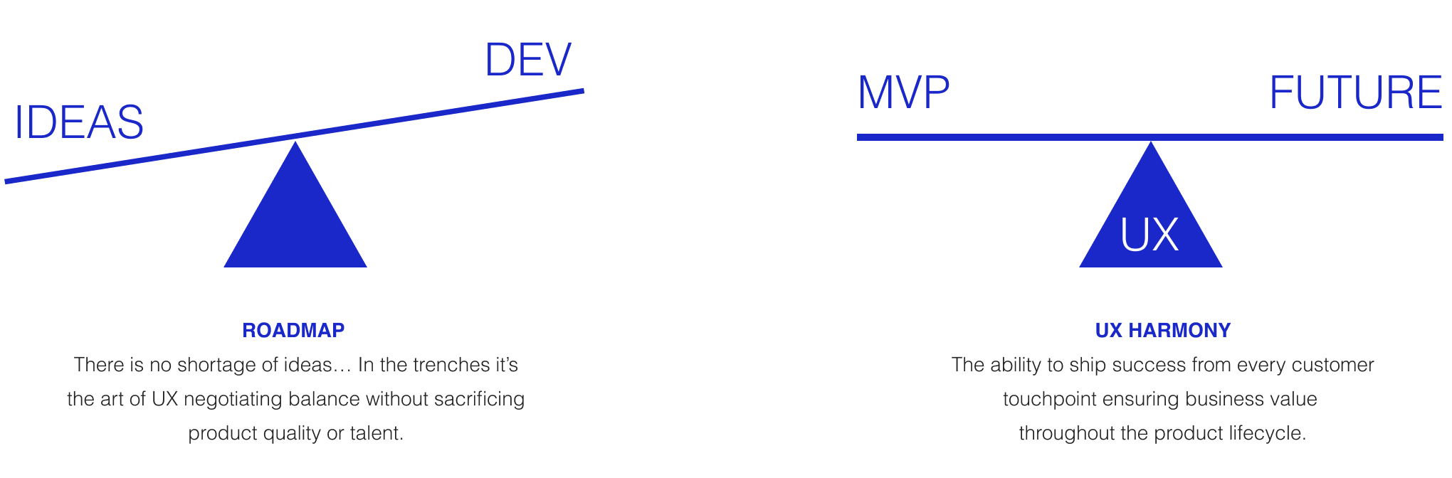
Experience Maturity – When UX is empowered to influence product decisions by listening to internal and external customer opinions, it can visually communicate those voices back to the business. High-performance teams are customer-focused and can prioritize the roadmap from an informative, customer-centric perspective.
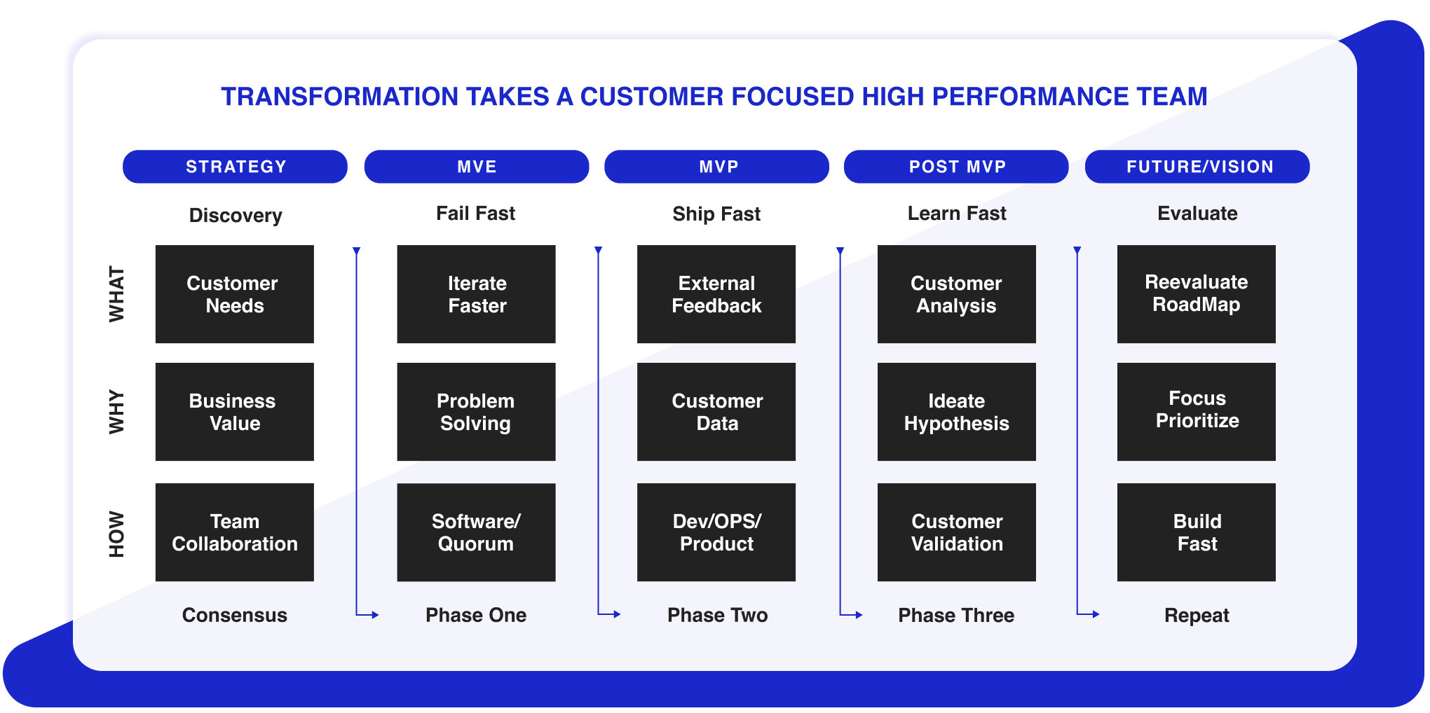
Customer Synthesis – Build customer relationships and loyalty by conducting 30-minute interviews to quickly validate small features. Nothing beats talking directly to your target audience. The insights you gain are priceless, and no amount of quantitative data can provide the same level of understanding.
Customer Advisory Board (CAB) – I’ve presented and demonstrated high-level product initiatives using UX storytelling to validate features with customers. In an open forum, familiar customers were given the chance to share their opinions on what quality mattered most to them, thus influencing the prioritization of features on the agile roadmap.

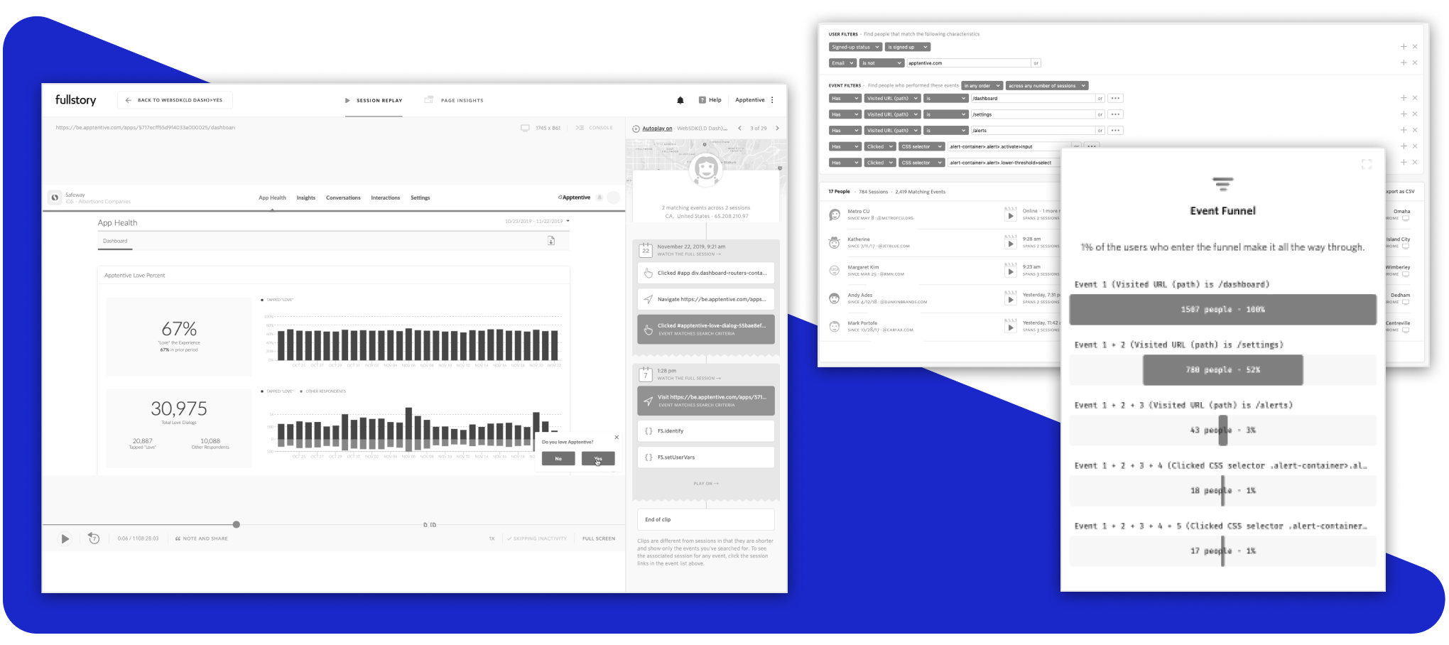
Customer Insights – I utilize multiple SaaS feedback tools to more effectively track customer behaviors, frustrations, and usage patterns. I’ve created advanced queries and funnels to gain deeper insights into the customer journey and support product decisions.
Agile Methodologies – I am certified in Agile to help facilitate development processes. I have been able to break down overly complex initiatives into manageable delivery sprints that provide value to the business and customers throughout the product lifecycle. Knowing how to focus and collaborate with the development team builds trust and fosters a high-performance, software-focused Agile team.
Featured Product (DD) Process – My process starts with the customer and loops back to the business. As my workflow diagram illustrates, I prefer using the double-diamond design process, which enables the product team reach consensus on developing predictable feature outcomes during each design sprint.
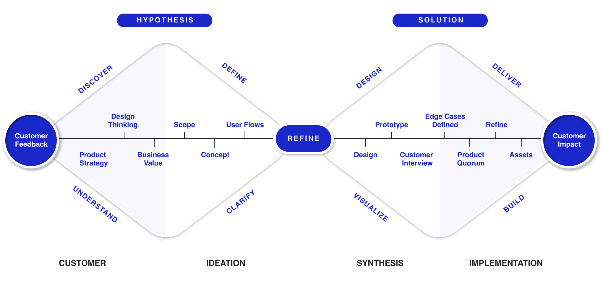
Design Thinking – To become a product domain expert, one needs customer empathy and a deep understanding of what customers truly want, not just what is perceived as their desires. Using design thinking methodologies helps facilitate all the requirements more effectively than anyone else in the room, enabling the team to create experiences that customers truly desire.

Past Start-ups that successfully launched.
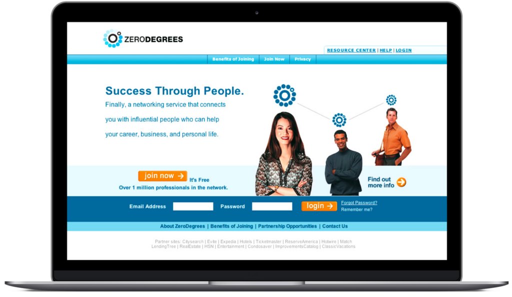
ZeroDegrees.com (Business Social Network)
ZeroDegrees.com was one of the first business social networking sites before LinkedIn dominated the industry. Extensive research was conducted on the company to understand its business strategy and brand focus and to deliver an image that sets it apart from its competitors. I successfully redesigned and launched the site, and soon after, a large corporation purchased all the business social networking sites and their IP and shut them down. Three years later, Microsoft bought LinkedIn for 8 billion.
RESULTS
Investors received 20X return upon sale with the help of website redesign.
Inclusivity was way ahead of its time.
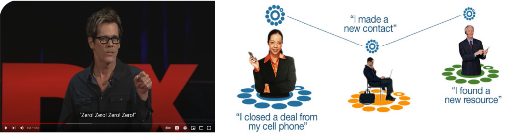
Throughout the site, I used a variety of visual and eye-candy graphics to reinforce the idea of making a connection through multiple devices.
The vision
ZeroDegrees was one of the first sites to prove and validate the number of degrees from Kevin Bacon. The company was located in the heart of Hollywood, across the street from Tower Records. It went viral, with thousands of customers wanting to know the number of separations they have from other celebrities.
Google It: “Six degrees from Kevin Bacon” is still a trendy topic.
ZeroDegrees is an online business networking service that allows members to add the names of business and personal contacts to a searchable database. It was one of the first business social networking sites. Its IP and its user base made it very attractive to VC.
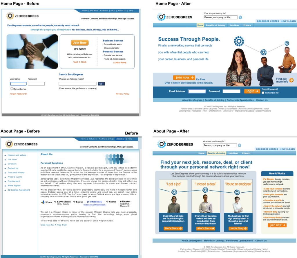
Before/After – The original Zerodegrees.com website looked amateur. I was the sole designer responsible for redesigning the website to make it more modern. I hired a copywriter and launched the new site that directly increased the user base. The VP of marketing and CEO gave me a bonus upon the sale of the dot-com. A 20x VC return.
Dreamworks (SKG) – Pop.com (UGC Video site)
The beginning – Pop.com was a collaboration between Steven Spielberg and other top A-list Hollywood filmmakers. Microsoft co-founder Paul Allen backed the company to produce original online social content entertainment. DreamWorks, David Geffen, and Jeffrey Katzenberg are joining Ron Howard and Brian Grazer, who created Pop.com, envisioning and embracing the future of online (internet) entertainment. Pop.com is an OUGC social entertainment company.
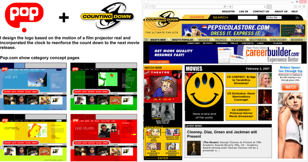
THE MAKING OF SUPERFANS
DREAMWORKS (SKG) – My original assignment was to help create a web presence for Pop.com, showcasing original digital shorts from A-list celebrities. Due to rising costs, the original content creation was put on hold. The business pivoted, and I was pulled into another acquisition—a community fan website called countingdown.com hosting Pop.com’s original content from A-list celebrities. I was responsible for the re-brand and a complete UX/UI redesign. Countingdown’s online success was based on a ticker timer that counts down when a movie is expected to release into movie theaters. The goal was to build movie hype through its user base. I still have the original Adobe Flash files.
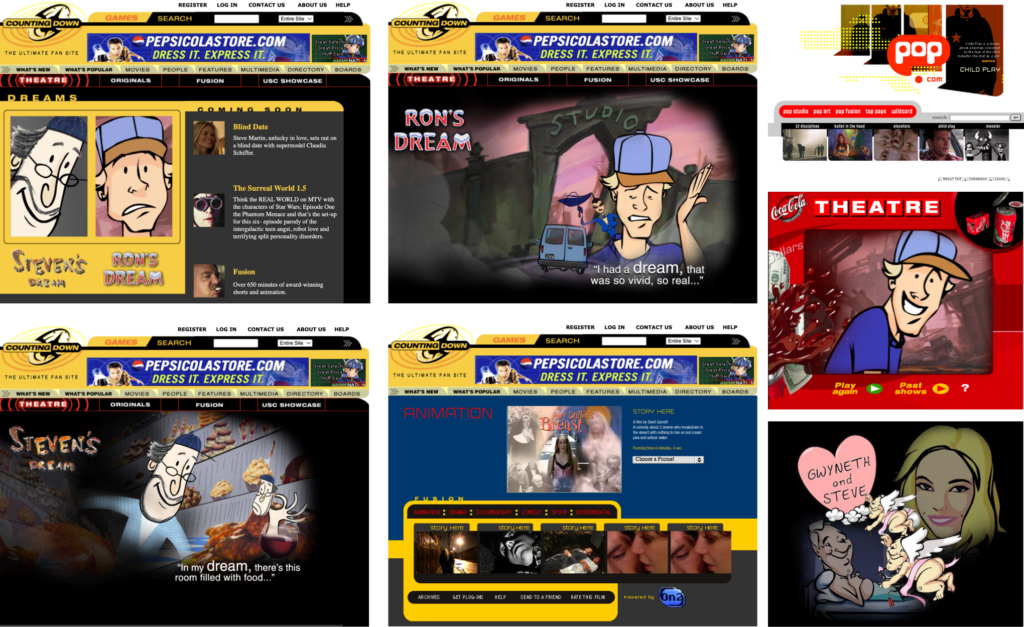
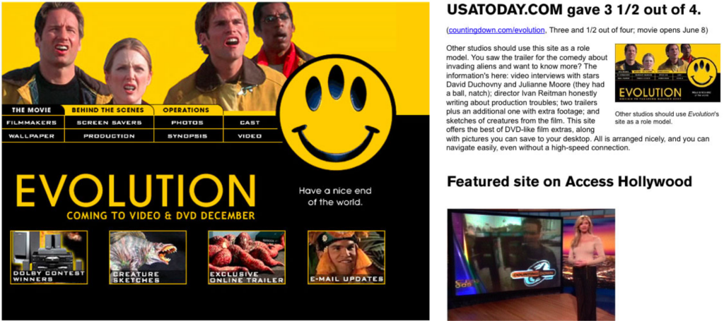
DREAMWORKS (SKG) – EVOLUTION MOVIE SITE
Also, during that time at DreamWorks, the vision was to create movie sites affiliated with the pop.com and countingdown.com to give super-fans behind-the-scenes movie access. I art directed the movie “Evolution” website directed by Ivan Reitman. Instead of launching the typical beautifully finished movie website, the site was uniquely designed to be a rolling release where content changes daily. Fans had behind-the-scenes access to content with hooks into the fan community drove its success. I was literally changing content on the fly based from community feedback.
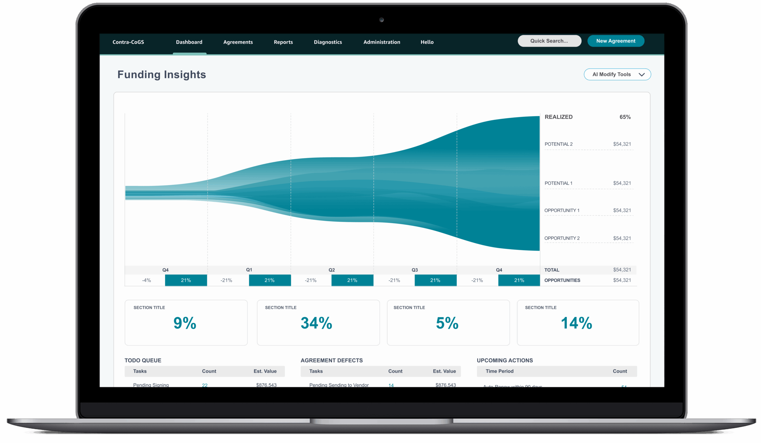
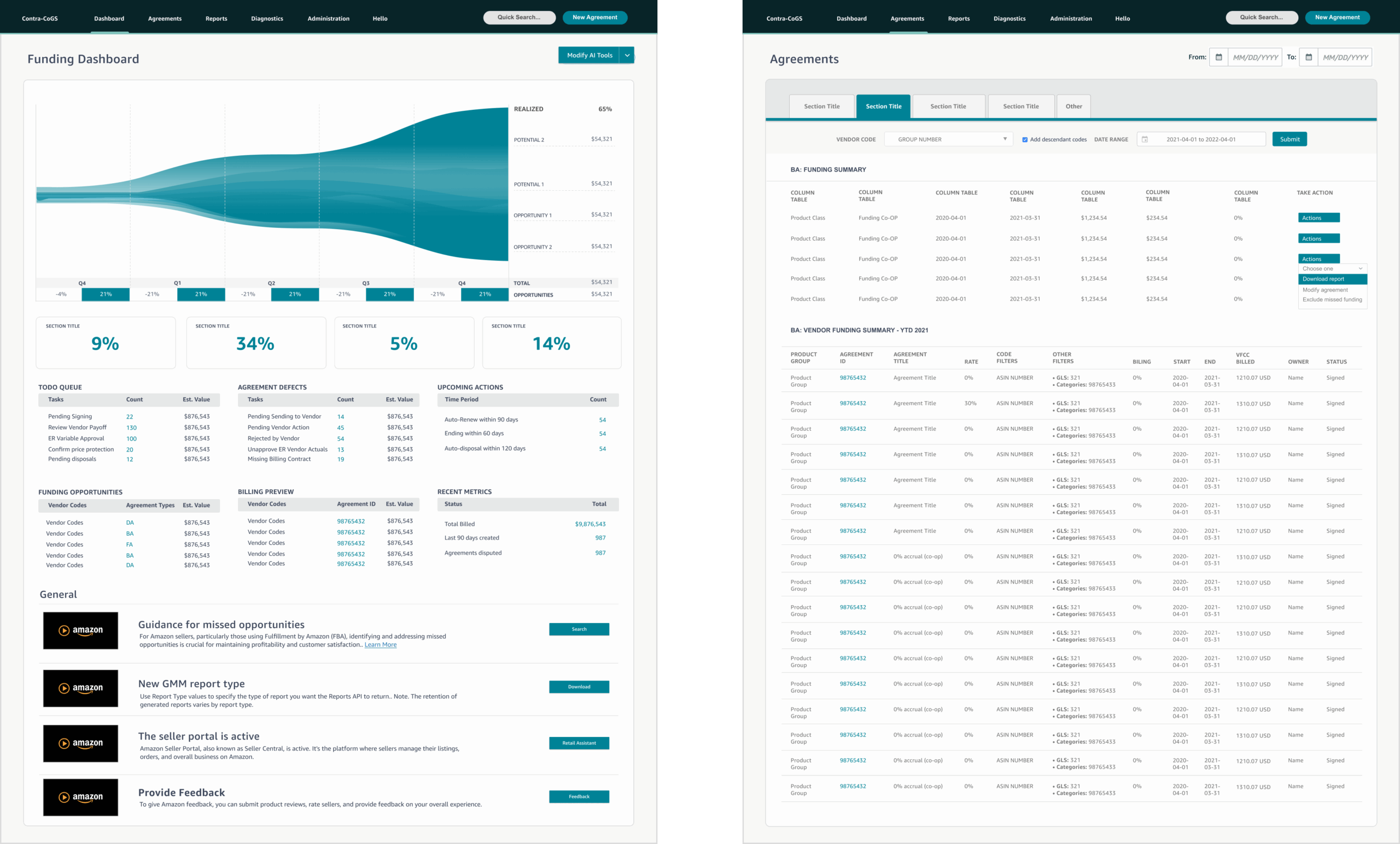
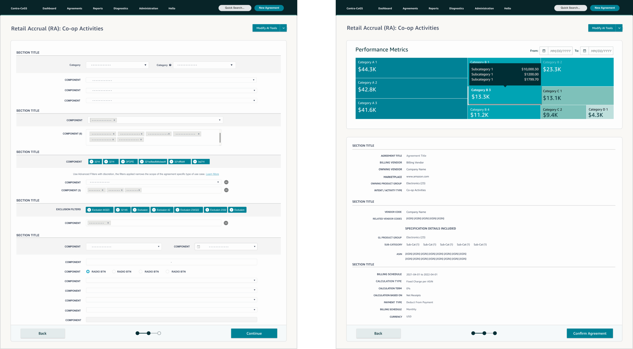
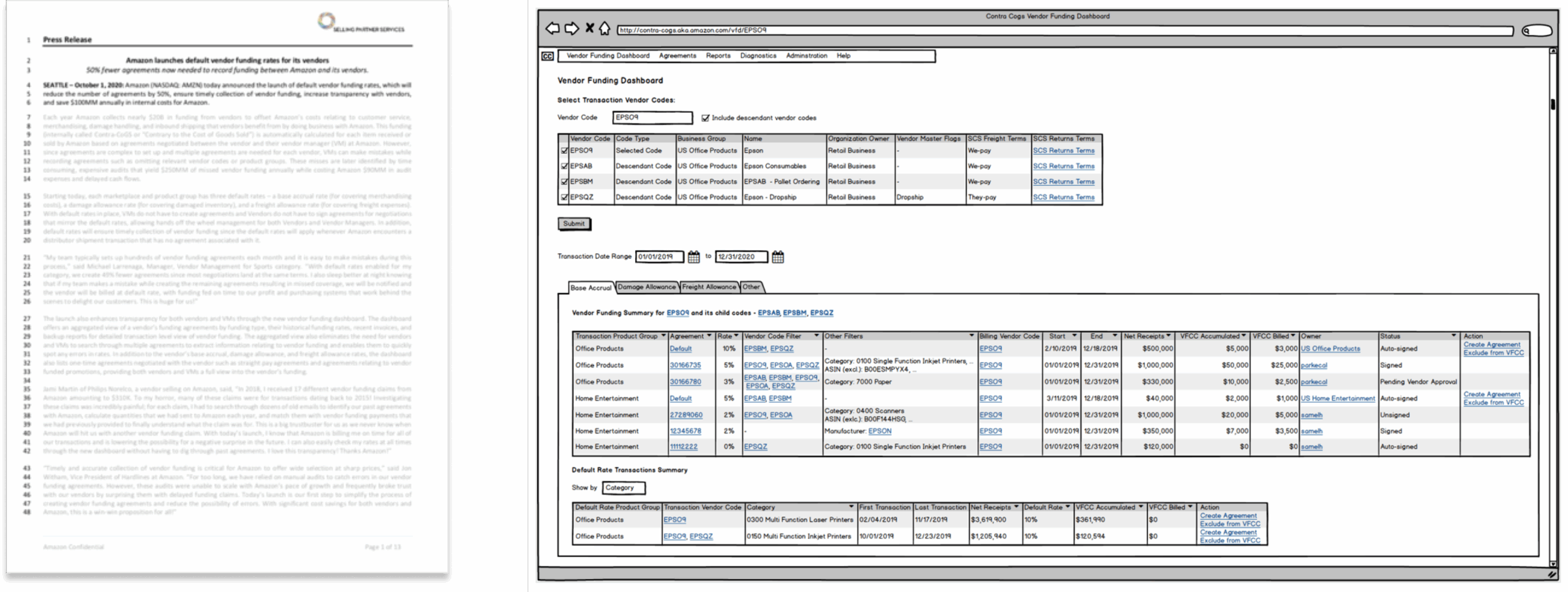
Retail Media Redefined: Contra-Cogs (AI/ML)
Most retail media companies are unaware of how Amazon’s retail Co-Op agreements directly influence algorithmic promotional marketing, including allowances for advertising and other strategies to boost product visibility through increased traffic and sales, aside from sponsored product conquesting. These systems generate over $20 billion in free cash flow (FCF) for Amazon’s retail division.
Responsible for contributing to the FY21 platform strategy.
Dashboards – Developing predictive analysis dashboards using AI/ML technology to evaluate vendor relations for new customer opportunities and enhance business efficiency and monetization. Drive improvements that keep the mothership flywheel offering increased transparency for both internal and external customer relationships on a high-performance, customer-focused software team.
Becky Scott, UX Manager
Quote: “Geoff was the sole designer on a product that helped us manage our vendor relationships. He was asked to deliver several features but also took ownership of user research and suggested additional user delight features. He was responsible for every aspect of the design and prototyping for testing and presented his work to leaders in design and products.”
Customer interviews
Responsible for conducting 1:1 interviews with vendor managers to validate the experience hypothesis. Customer feedback directly affected the product roadmap, and some features in the PRFAQ were challenged by customer feedback which influenced future product decisions.
Customer Quotes from UX findings:
Nine feature areas received positive feedback from customer interviews.
• “Frequently amount of codes are created by a different team, and I had no idea.”
• “Proactive suggestions would be great.”
• “The chart would save me time than going to Excel.”
Customer Journeys – end-to-end workflows
The performance metrics offer a snapshot of the potential success of the customer agreement, guiding business decisions and highlighting missed opportunities. Account managers were particularly interested in the idea that AI/ML could predict how well a customer agreement would perform.
Customer Relations
On a large scale, the controls manage the core business algorithms that directly influence vendor promotions across various systems, channels, categories, and classes. They use AI/ML alerts from vendors to improve operational efficiency and discover new customer opportunities, ultimately boosting sales growth.

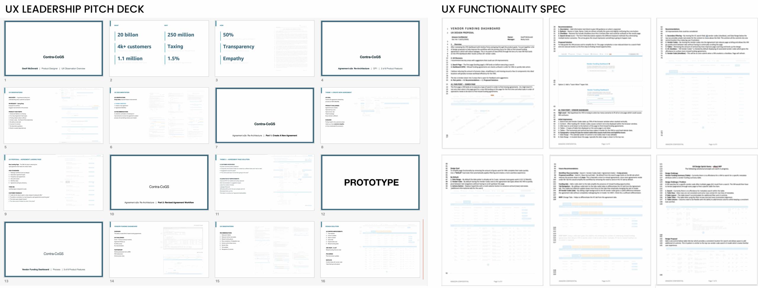
Vision OP1: Retail Media (CO-OP Incentives) I presented a deck to leadership that directly contributed to OP1’s future innovation features. The deck explained why we need to improve the experience. I also developed a working prototype and UX/UI outline spec to support new product features.
Amazon’s software development team is unlike any I’ve worked with. I was genuinely impressed by how quickly my UX solutions could be implemented. After I presented my solutions to leadership, my features were shipped within a few weeks or months. One of Amazon’s principles that always stood out to me was the “Disagree and Commit” principle, which helped the team make faster software decisions.
Systems UI Kit (NEW): Amazon aimed to transform internal platforms to reduce costs and improve digital efficiency. I focused on upgrading the platform, testing Amazon’s system patterns and components library — designed to scale for enterprise platforms — and exploring how AI/ML could inform better decisions. Amazon’s principles and UI guidelines were so detailed and robust that they made it easy for me to identify the best solutions.
Discovery – Beta Site
UX Challenge: Based on the documentation, experience workflows, UI interactions, data, and customer interviews, I developed a hypothesis. The goal is to simplify the overly complex experience to reduce missed opportunities and boost future monetization potential.
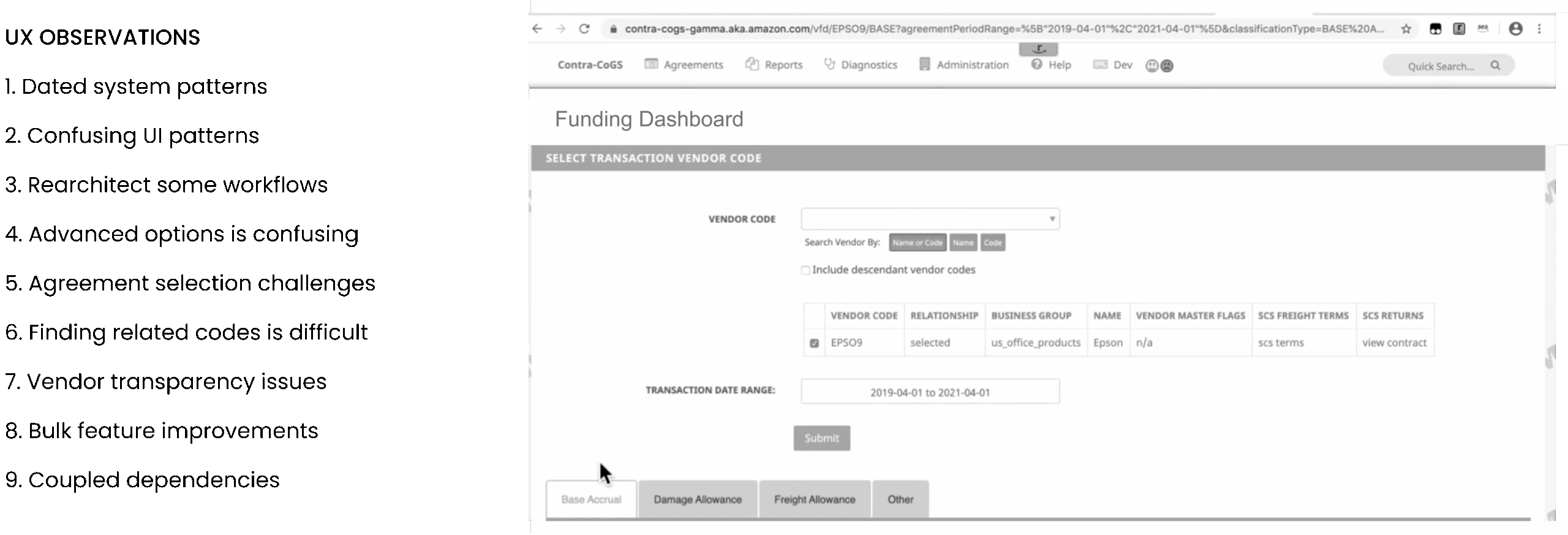
The Beginning (PRFAQ): The Amazon Way (Working Backwards) My journey begins with a PRFAQ, a detailed document that explains the “what” and “why” behind the business investing in new feature improvements. Working closely with the PM, I received an initial wireframe as part of the product requirements documentation.
Mobile WEB (SDK) – New Innovation
Digital Feedback – (Mobile Apps, Web Apps, Kiosks, QR codes, APIs)
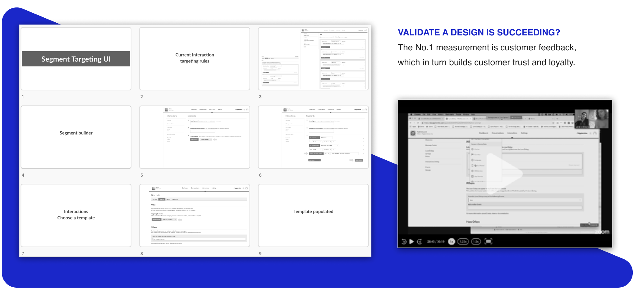
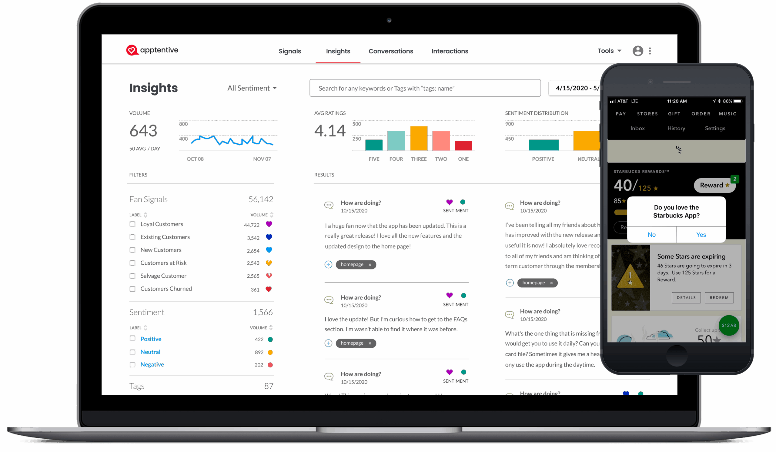
Apptentive’s suite of products was complete after launching the Web SDK. The next step was to join Fan Signals (Love Dialog) with customer sentiment. Running the open-ended feedback through AI, we analyzed customer data and augmented it with Fan Signal to give customers clear insights into their customer segments.
WEB SDK – Usage Examples
I can install the Web SDK for any web app in under five minutes. I worked with a developer 1:1 and modified the JavaScript source code to trigger the love dialog with any feedback form initiated by the QR code. Supporting QR codes for mobile phones was gaining popularity, and Apptentive had the technology to track customers’ insights from a simple QR code.

GTM – Customer Love Summit
The Customer Love Summit is a yearly conference that showcases Apptentive’s latest products. I improved the event by showcasing future product feedback interactions in real-time, powered by attendee participation. The event’s CEO could switch to a dashboard displaying the number of people who participated. This was a huge success, all thanks to a hackathon project.

Demo Table
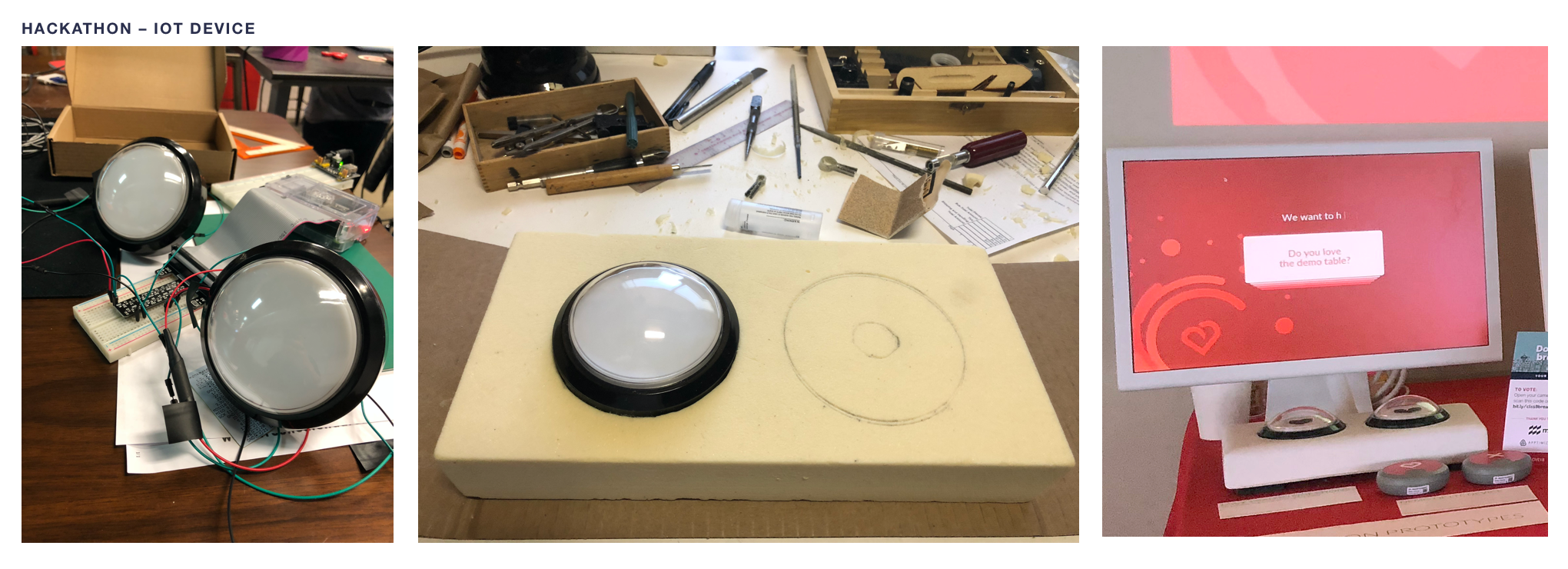
I was responsible for the customer summit demo table, spearheading a variety of feedback devices, including my hackathon hardware project using a Raspberry Pie OS., iPad (Kiosks) Table Tents (QR code), and an Amazon LTE Device.
The Results – Customer interactions, participation, and enthusiasm were high. Everyone involved loved the feedback mechanism, from customers to the CEO. Prospect customers (attendees) were sending feedback in real time. Investors and attendees gave the demo table high marks by watching the GeckoBoard live.

Customer Love Summit
Using the platform’s Web SDK, I customized different feedback types once a participant triggers the dialog window from the QR code. For example, I coded the QR code, “Did you love lunch?” Each lunch table at the event had a table QR code to see real-time triggers at the conference on the monitor.

Hackathon – How does a hypothesis become a product?
I participated in a company Hackathon. Using the new Web SDK, I conceptualized, designed, and built a responsive web app to complete the project. I called it a progressive survey using skip logic. Customers can iterate through various modal windows that use hardware buttons to capture binary Yes=True and No=False feedback questions. Using some of my coding skills, I used a Raspberry Pie OS and video game hardware buttons connected through GPIO ports to complete the hackathon project.
Customer Feedback
After successfully shipping the WebSDK e2e experience, I transitioned to customer interviews to get honest customer opinions to validate the business value.
The Results—Six months after launching the WebSDK product, sales could close new revenue deals, and the business could support Mobile Apps (iPhone/Android) and Mobile Web, completing the product suite across all form factors.

New Product Opportunities: (Mobile Web, Kiosks, QR-code)
I was on point to design the first WebApp SDK to influence the platform’s capabilities using the new APIs. As a product producer, I worked with the Devs 1:1 to create product parity in the platform to support all the new features, which allows customers to customize the feedback forms to match their brand.

The UX Proposal:
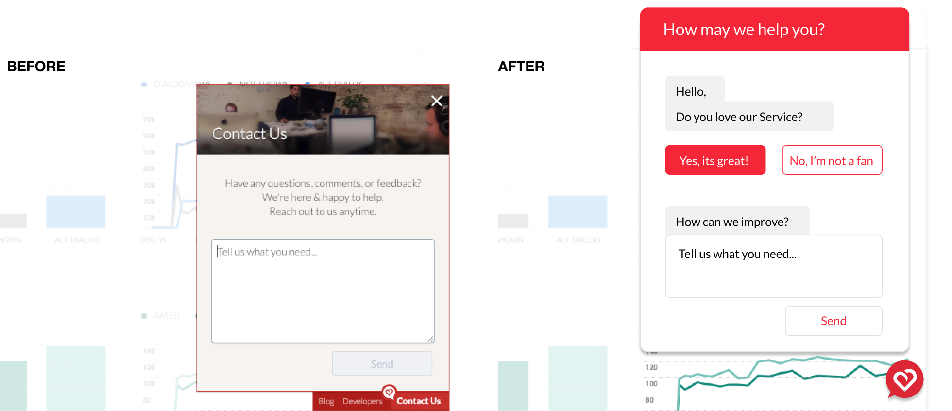
Appentives’ company’s core business is a customer feedback business that should be dogfooding its tooling. The original feedback button looked amateurish. It had a picture of the office and one contact form field, which was hard-coded. I proposed that the product team invest in a WebSDK for broader customer reach and feature parity with the MobileSDK (iPhone/Android). The business agreed to do the work.
Cloud Migration PLATFORM
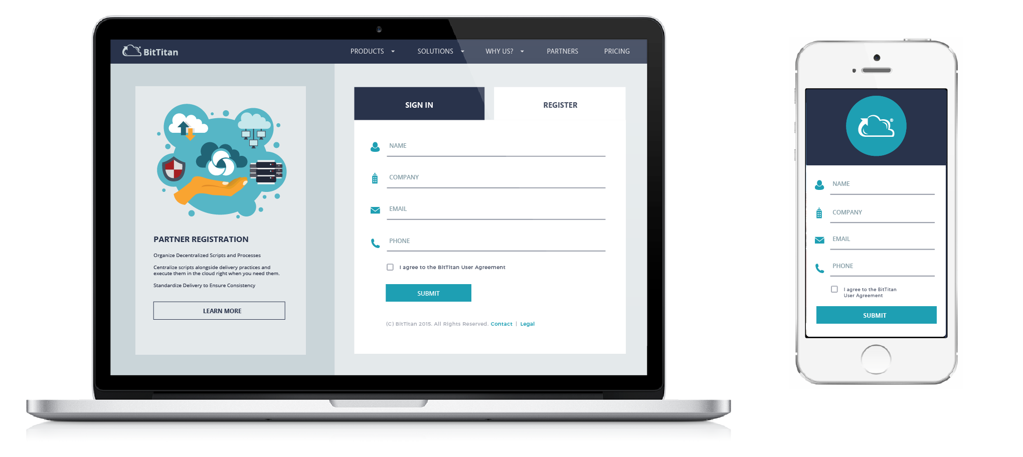
As on-premises servers are being phased out, BitTitan is developing services to facilitate easy migration to the cloud. Entire organizations can transfer a variety of files (emails, documents, databases, systems, etc.). In the modern age of cloud computing, customers can save costs by migrating from Azure, Google Cloud, AWS, and full-platform systems in weeks, rather than the traditional 3-6 month migration. No more loyalty to be gated by one enterprise system.
Public Launch (GTM): Two Years
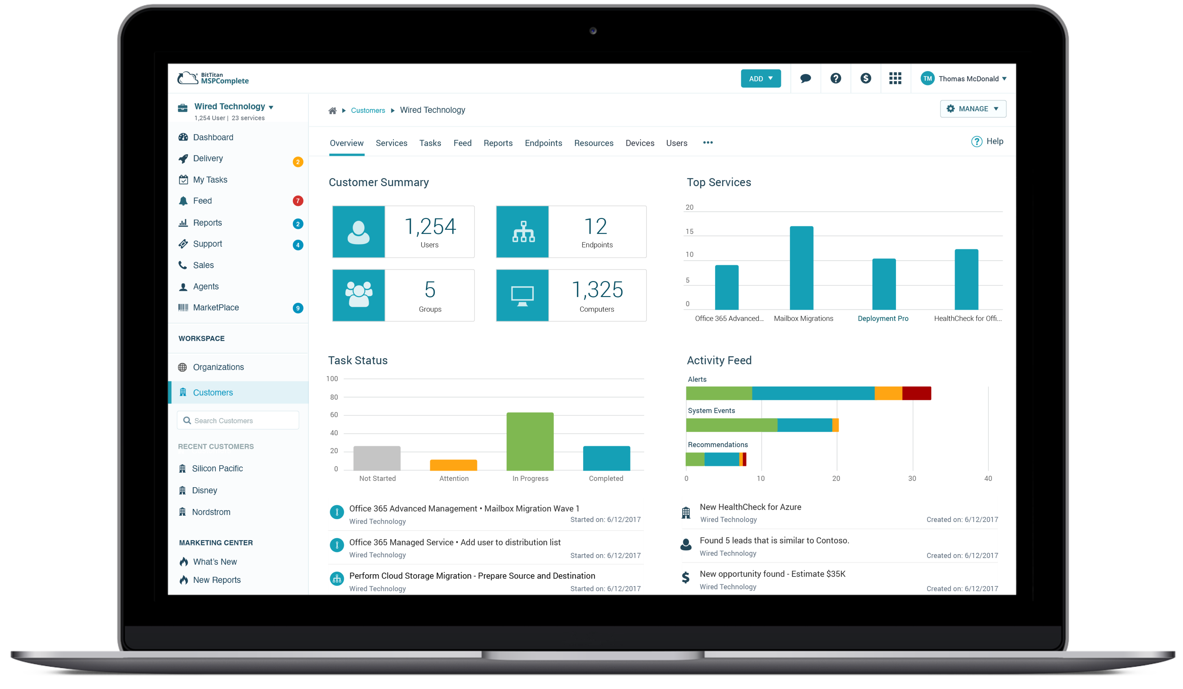
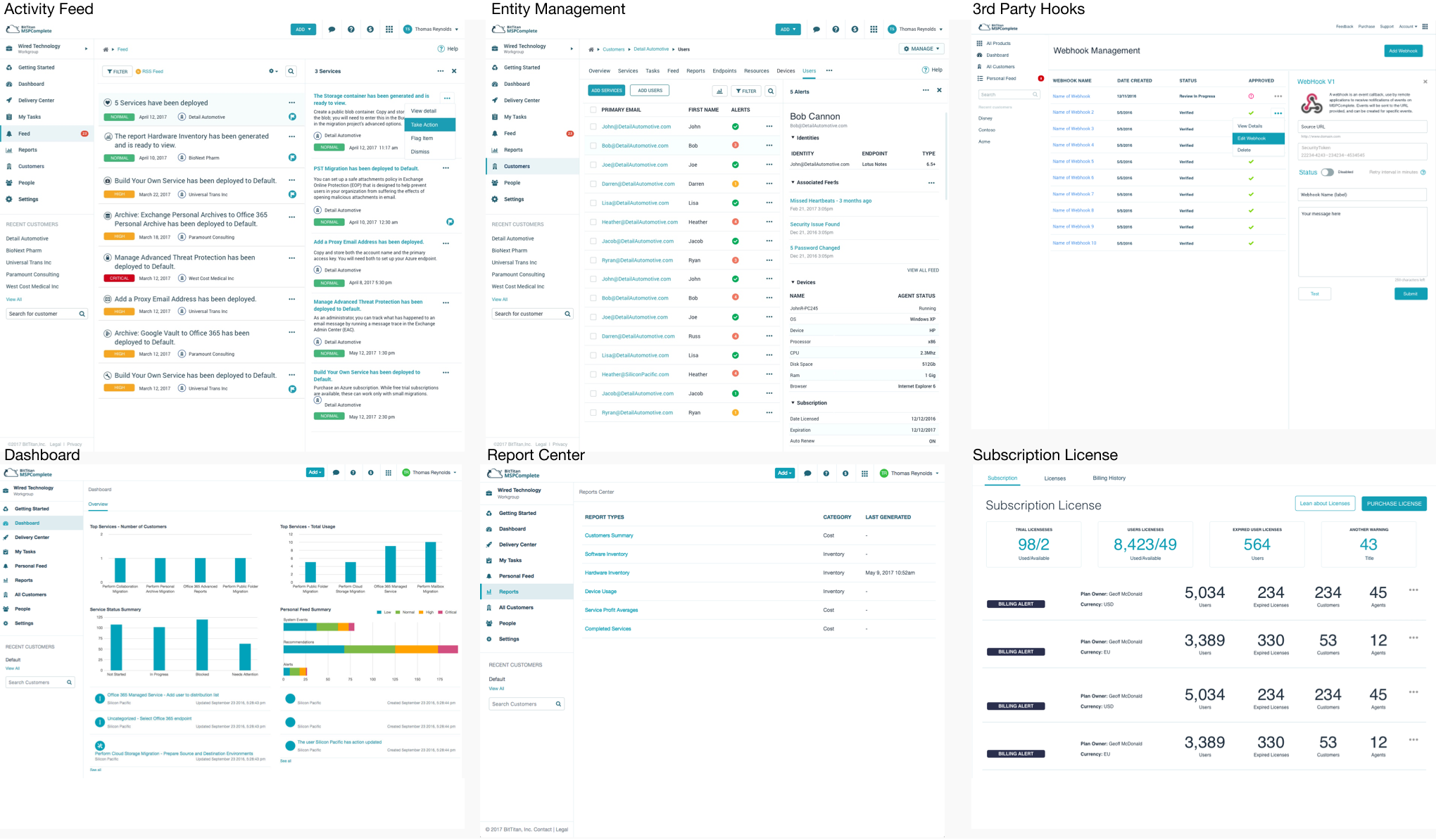
As the lead design manager, I was responsible for the entire user experience. I owned key platform features, and once the UI Models (MVP) were established, I interviewed and hired three UX designers to facilitate the handoff of new features, enabling rapid platform scaling. Subsequently, I concentrated on updating the Dashboard, Delivery Center, Entity Management, Activity Feed, Subscription Billing, and third-party OEM task workflows.
Results – Sold for 16x
Building a new platform from scratch in two years is a challenging task. Still, by employing design-level thinking methods and modern design principles, I created a sleek, user-friendly platform that has the potential to transform the IT industry.
Seattle Business Magazine
I was on stage when BitTitan received the #1 award for Best Company to Work For. The team culture and product focus were among the highest-performing software teams I have worked with. As Employee #24, I helped the company grow to over 200 employees and managed a team of four designers.

Dominic Pouzin – CTO
Quote: “Geoffrey is a very talented senior UX designer and would be a huge asset to any company, especially those with a focus on enterprise products. At BitTitan, Geoffrey helped our product UI evolve from “amateurish” to professional / on-par with top SaaS solutions. Geoffrey’s key strength is creation of new UX concepts and high-level look-and-feel experience for enterprise products.
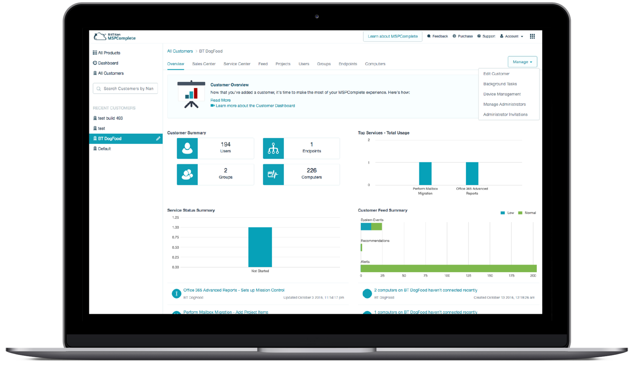
Beta Launch – Among the improvements made by adopting the new UI-Kit were the Dashboard, Service Center, Activity Feed, Subscription Billing, Delivery Center, and Cost Reporting, along with the implementation of approximately 20 new IT service solutions.
Key Page Integrations – Once a new UI kit was implemented, the platform started to come alive. The new kit helped speed up design and development time since UI system patterns and common controls were consistent across the platform. We also made additional layout changes to simplify the experience by adding detailed fly-out panels and inline accordions.
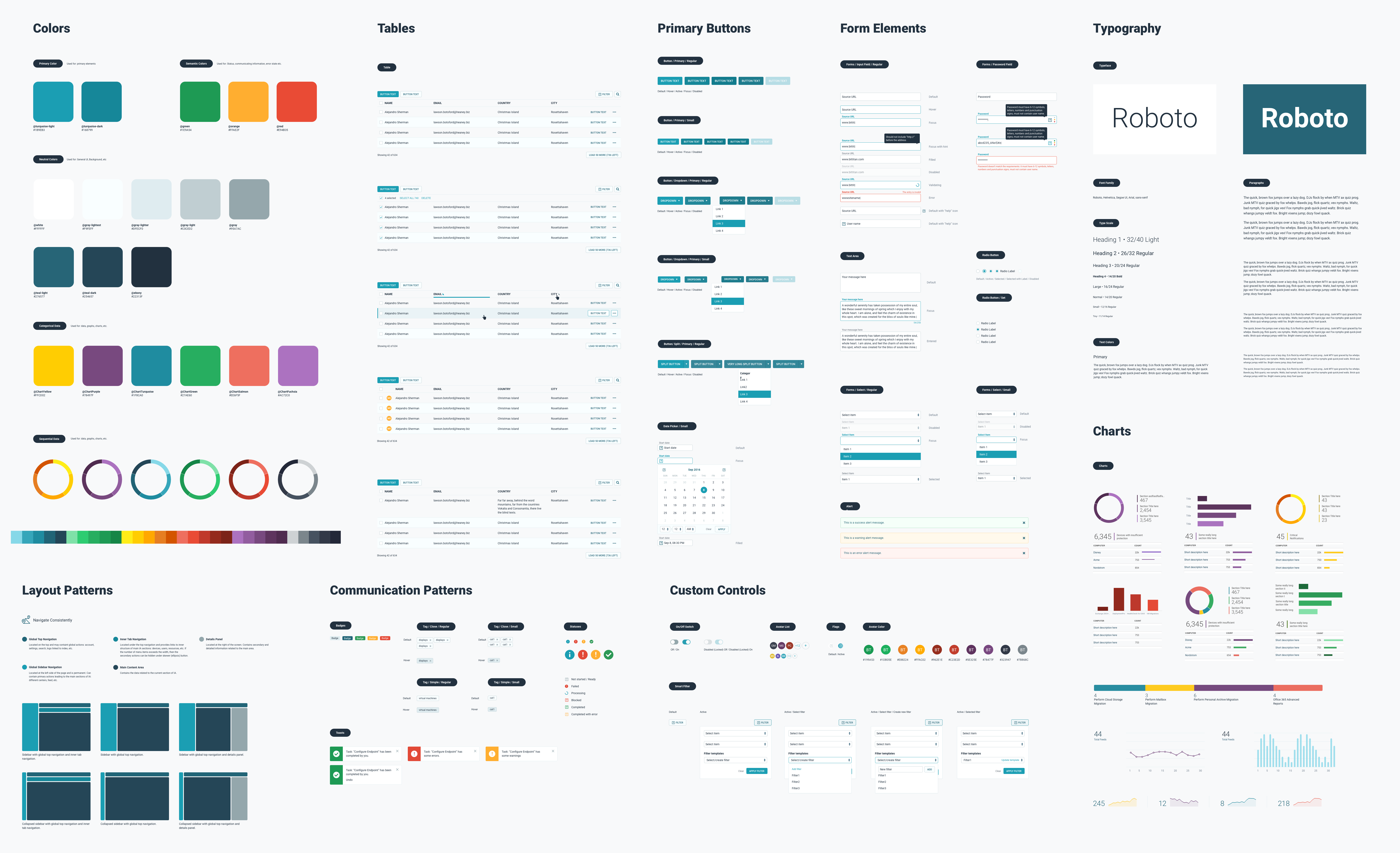
Systems Library Redesign – One challenge was created with an old UI kit. I knew I had to modernize the platform to help BitTitan serve as a trusted SaaS application. I made it a company goal to develop a modern UI Kit—since the existing gray navigation and overall site felt like a typical Seattle day to me. I always knew the future of the site would need to be much more modern.
Preview Launch – Once the platform MVP framework was in place, it was time to start integrating new feature services and onboarding new customers. The first step is to go external and begin dog fooding the product to gather real customer feedback. This was an exciting time for the company, working with a fast-paced, high-performance, phased-agile development team. The culture and collaboration fostered solutions that benefited the greater company interests. BitTitans’ motto was: “Get Shit Done!”
New Feature Development – Once the platform MVP framework was in place, it was time to start integrating new business service workflows into the platform. One challenge was built using an old UI kit. I knew I had to modernize the platform to help BitTitan serve as a trustworthy SaaS application. I began visually exploring new designs and hired a few top-tier UX designers, while we also focused on designing new features such as Dashboard, Service Center, Device Management, OEM Services, and Activity Center. The product machine operated at high performance, utilizing remote development shipping features in 2-3-week sprints.
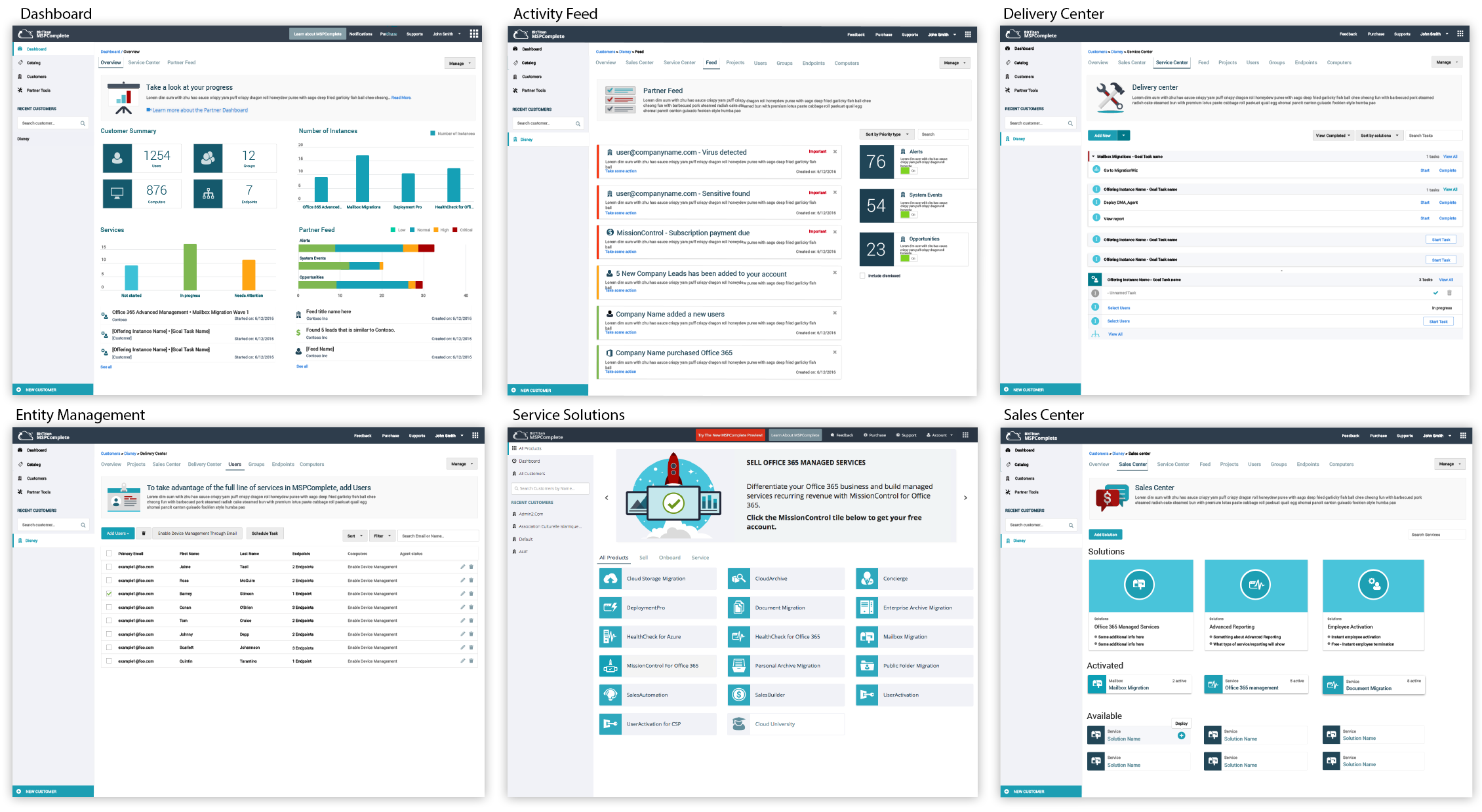
Alpha Platform (Customer Onboarding) – After several requirement meetings, presentations, and wireframes, we launched the Alpha platform UI, delivering the minimal set of features needed to achieve an MVP. Simultaneously, I supported the development of numerous new services on the existing platform. The system needed to scale for new services while enabling App-Switching (drop-down menu) into MigrationWiz, Sales Automation, Deployment Pro, Data Encryption, SSO/Registration, User Management, App Launcher, Purchasing, and the ongoing development of new Cloud Services.
The Big Picture (Discovery) – A lot of research went into understanding the new business direction. BitTitan’s flagship product MigrationWiz (MW) had six-plus years of technology behind it, including multiple types of Migration services, Shopping Cart, Licensing, Support, SSO/rBac, and Account Management. It would be too risky for the company to build on the current MW platform to avoid service disruptions.
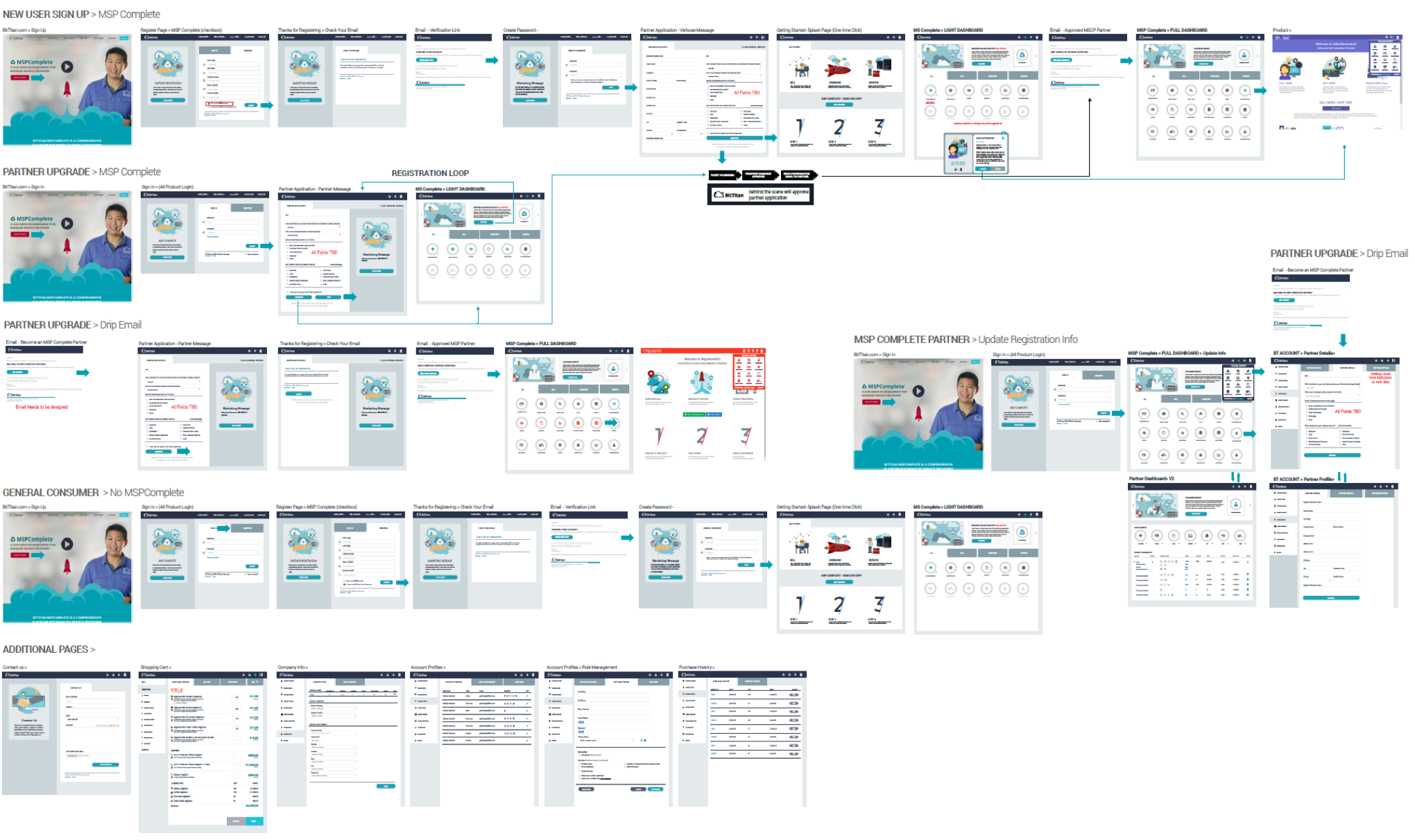
The Process – The decision was made to create a new platform from scratch, use the latest framework (ember.js), but still be on a cloud platform (Azure). The wireframe below shows the initial breakdown of how the two platforms could co-exist as features need to be migrated or re-architected to the new platform. We needed hooks to other systems using Federated SSO while being Hippo compliant. This was a data migration platform that migrates Fortune 500 companies. Customers wanted to reduce costs by switching cloud providers seamlessly.
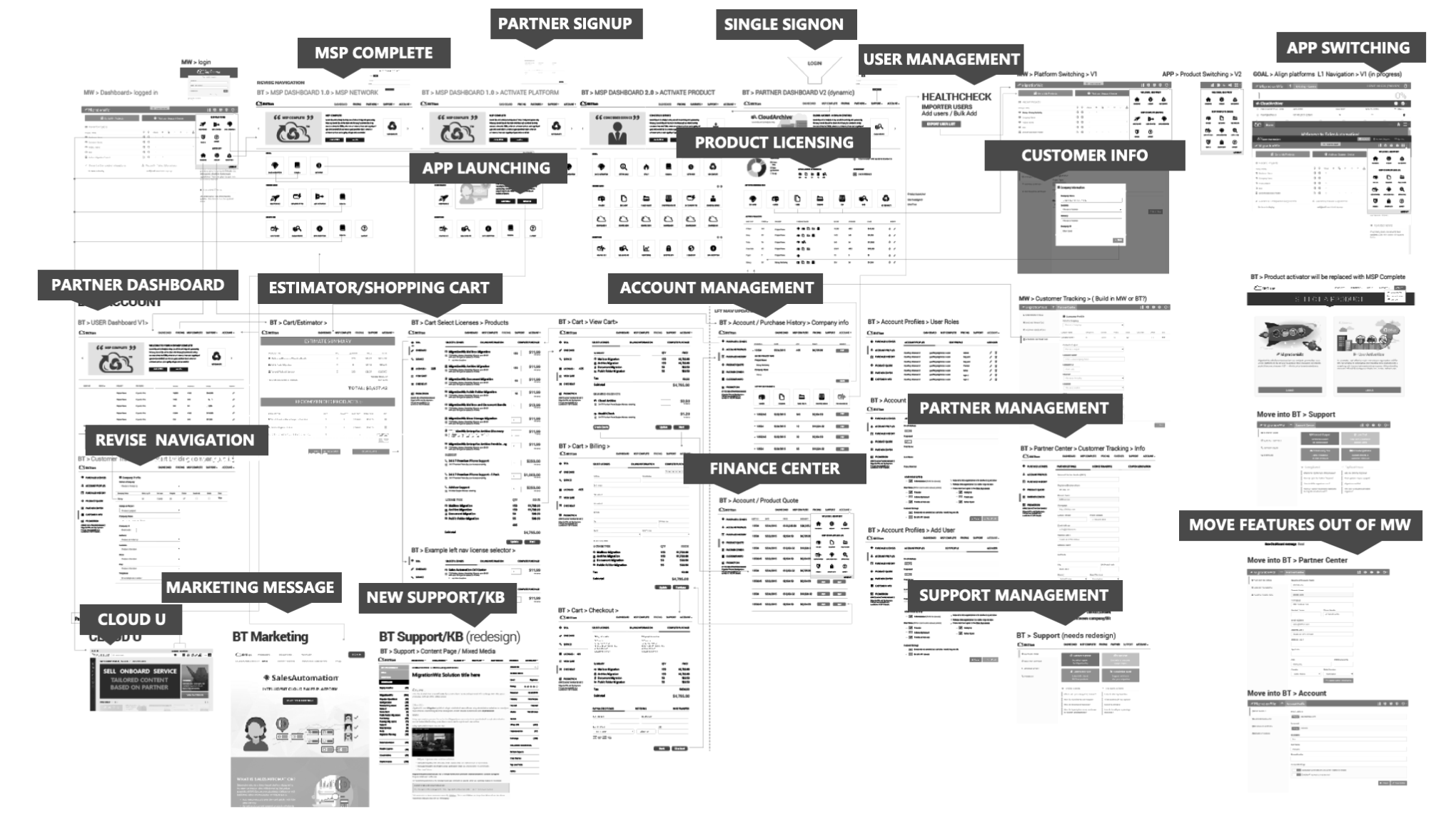
The Business Pivot – The CEO made a business decision to leverage MigrationWiz (cash cow + partner base) and pivot the company to Managed Service Provider (MSP). This was perfect for enterprise customers needing a way to migrate legacy data to the cloud to be on a modern tech stack (AWS, Google, Azure, etc.)
The Collaboration: UX + CEO
The CEO, who came from Microsoft, quickly recognized the importance of UX in the process and understood the value of design. He had a clear vision for the business and realized that the on-premises computer landscape would be phased out, with the focus shifting toward cloud computing and AI. Since UX lacked a technical background, he spent a few weeks working closely with UX designers to fully understand his vision. UX was able to quickly develop a comprehensive map of the entire platform, including all key features. We then presented this vision to the product and development teams using prototypes and customer journey workflows.
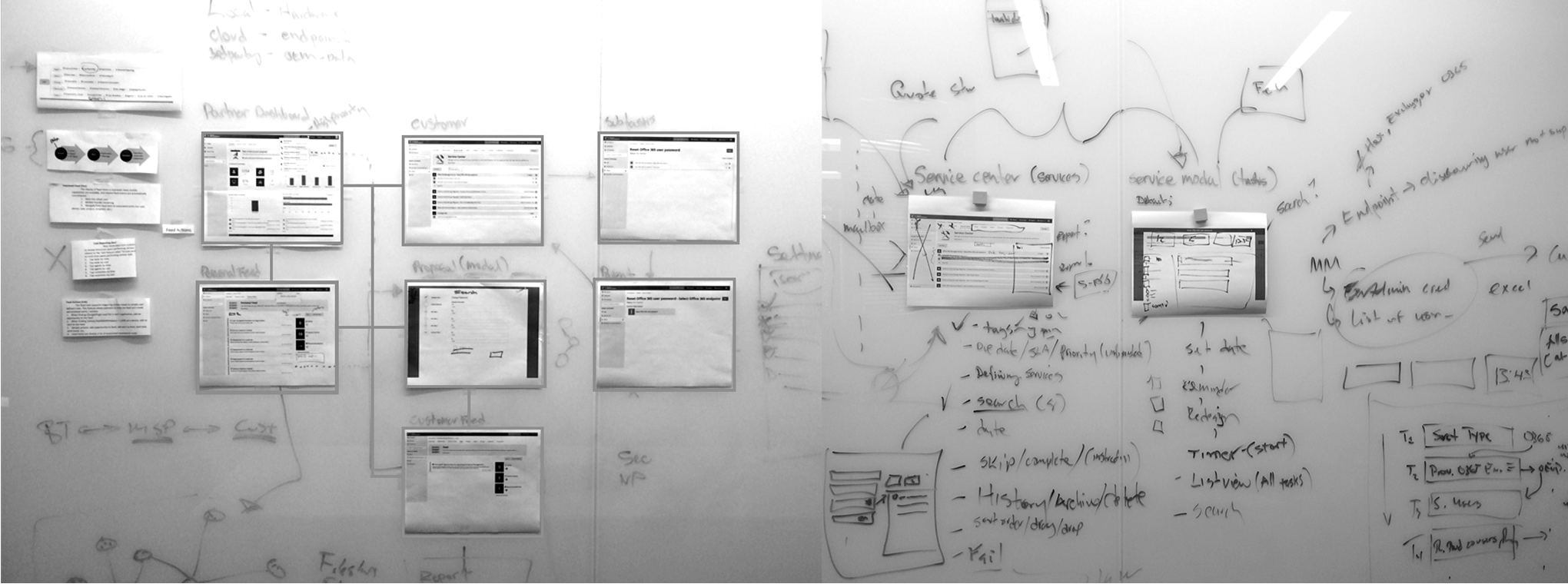
The Collaboration
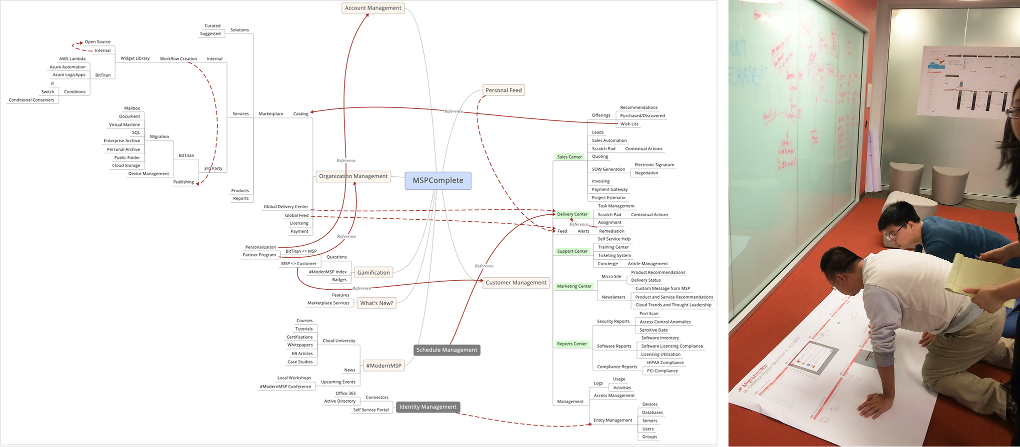
UX design was embedded in the development team. I asked the CEO if we could buy a large-format printer to print out the experiences based on the dev sprint the team was on. We were shipping features every month. I took this picture when the developers collaborated on the floor on how best to solve the development challenge. It was incredible that we were shipping features every month.
MigrationWiz: UX/UI Refactor
My solution is redesigning the task management workflow to be a vertical list on the left navigation rail to track completed steps. This has been highly successful, reducing the number of support tickets and increasing customer confidence in achieving a migration. The introduction of the left navigation for task management provided the baseline for future workflows for MSP Complete.
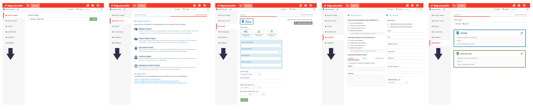
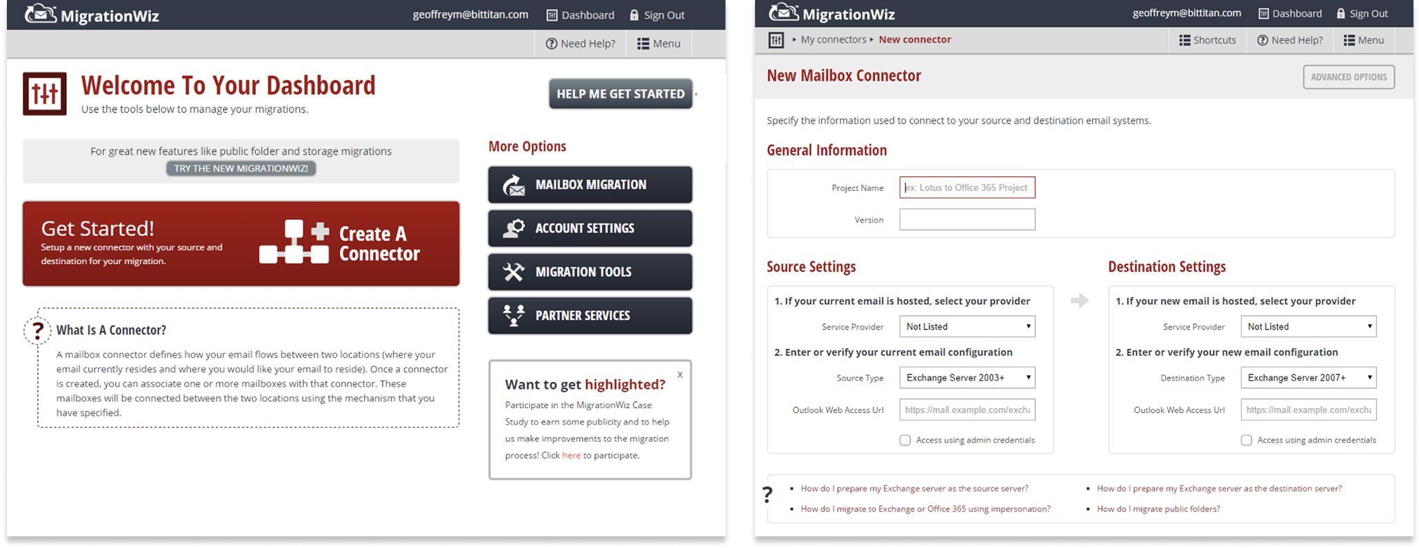
The Platform (Discovery) – The original MigrationWiz functionality was a wizard-type UI model. The amount of customer confusion and support tickets was a real pain point for customer support. The platform served well (initially) as an email migration service. However, the UI model was never expected to scale beyond that as the business grew. The UX started to break down when new features were bolted on. I was the sole designer responsible for re-architecting and modernizing the migration workflow experiences.
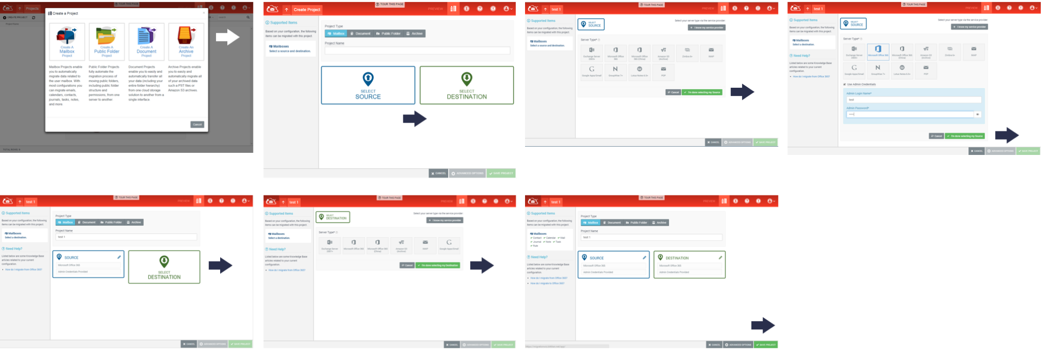
The Beginning – When I joined the company, the original MigrationWiz platform appeared amateurish and was built on an outdated tech stack, which hindered innovation. The business decided to redesign the tech stack using a more modern framework.
WINDOWS APP STORE – App Publishing Platform
Microsoft faced pressure from Apple concerning its App Store. As a result, Microsoft shifted its business focus toward modernizing the Windows OS and developing an App Store to compete with Apple. My role transitioned to the Windows design team.
Led the UX design for the initial public release of the Windows App Store publishing platform. Responsible for applying the Windows 8 Metro Design language to enhance all platform features and align with the new UI kit system patterns.

I partnered with a UX researcher to conduct in-depth customer research and validate scenarios. On the ground, I created an HTML prototype to test the entire customer workflow. The UX research facility was fully equipped, featuring a two-way mirror and eye-tracking software. UX research praised the prototype, which helped make the customer interviews more efficient. During interviews, I received detailed analysis reports. Watching and listening to customers discuss their experiences gave valuable insights that guided design improvements.
App Publishing Workflow – Responsible for managing the onboarding workflow pages for app submission to publish a Windows Store App, whether for free or as a paid download.

Customer Feedback Feature — From the App Store, customers can have two-way conversations with the App Developer by allowing them to send a private message. The goal was to help developers improve the quality of the App. I prototyped the idea and pitched this leadership as an innovation to improve the product experience.

The Insights – From my own experience publishing Oscar’s Adventure as an early adopter, I received a few negative comments. I wish I had been able to respond to customer feedback.
· Decrease the amount of negative app feedback displayed in the app store.
· Improve the perception of the Windows App Store as a bug triage location.
The concept – In the Windows App Store, customers can communicate directly with developers and receive real-time feedback instead of voicing customer feedback publicly in the Windows App store.
.

Problem Statement – The Windows App shell/SDK (tech stack) was still in early development, causing apps to crash, which wasn’t necessarily the developer’s fault. App crashes were difficult to test in the production environment since Windows was in private beta mode, leading customers to provide public feedback through ratings and reviews.

Business Partnership – Due to the number of images and the time I could dedicate to the application, I arranged an advertising partnership with Dreamstime.com. In return, I gained full access to their entire illustration library. I also provided them with a splash screen advertisement that appeared during each game transition. This was a significant business deal and a win-win for both parties.

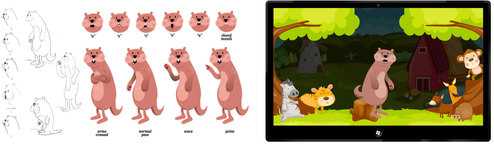
Taking Initiative – While working on the App developer publishing platform, I was curious about publishing my Windows app and gaining a better understanding of customer pain points. I reached out to a developer, and we agreed to create Oscar’s Adventure, a children’s learning app for ages 3-6. We successfully designed, built, and published the app in less than a month. The process helped me understand the customer journey, allowing me to influence product decisions since I was a customer.
Oscar Sketches – Some early concept sketches of Oscar the Otter to the final .svg variations.
WINDOWS OS – DIGITAL TRANSFORMATION
Windows – Metro Design Language
When I was part of the Windows Design Team (XDR), the mission was to reimagine every customer touchpoint digitally for Windows OS and Web Apps. A key part of my role was to modernize the systems to align with the Metro Design Language, ensuring all pages and components reflected the new UI kit for the Windows App developer platform.

The Vision – To build an App Store marketplace that supports multiple technology platforms through integration. A redesigned Windows publishing system could onboard Windows XAML apps, Xbox, Win32, Web Apps, and Android via a single ingestion pipeline.
The Insights – Apple leads the industry with innovative design, and the Windows organization was pressured to attract the trendy crowd back to stay competitive. Rumors suggest that if Apple allowed its OS to be installed on any PC hardware (hypothetically), it could significantly impact Microsoft’s revenue from its Windows OS.
Design Challenge – The Beginning: When I joined the Windows App Store team, a product manager from the India Development Center (IDC) showed me a PowerPoint deck featuring the dashboard concept. I spent the next few years directing art and influencing product decisions while working with a remote team.

WINDOWS APP Store – App ANALYTICS / API KB SYSTEM
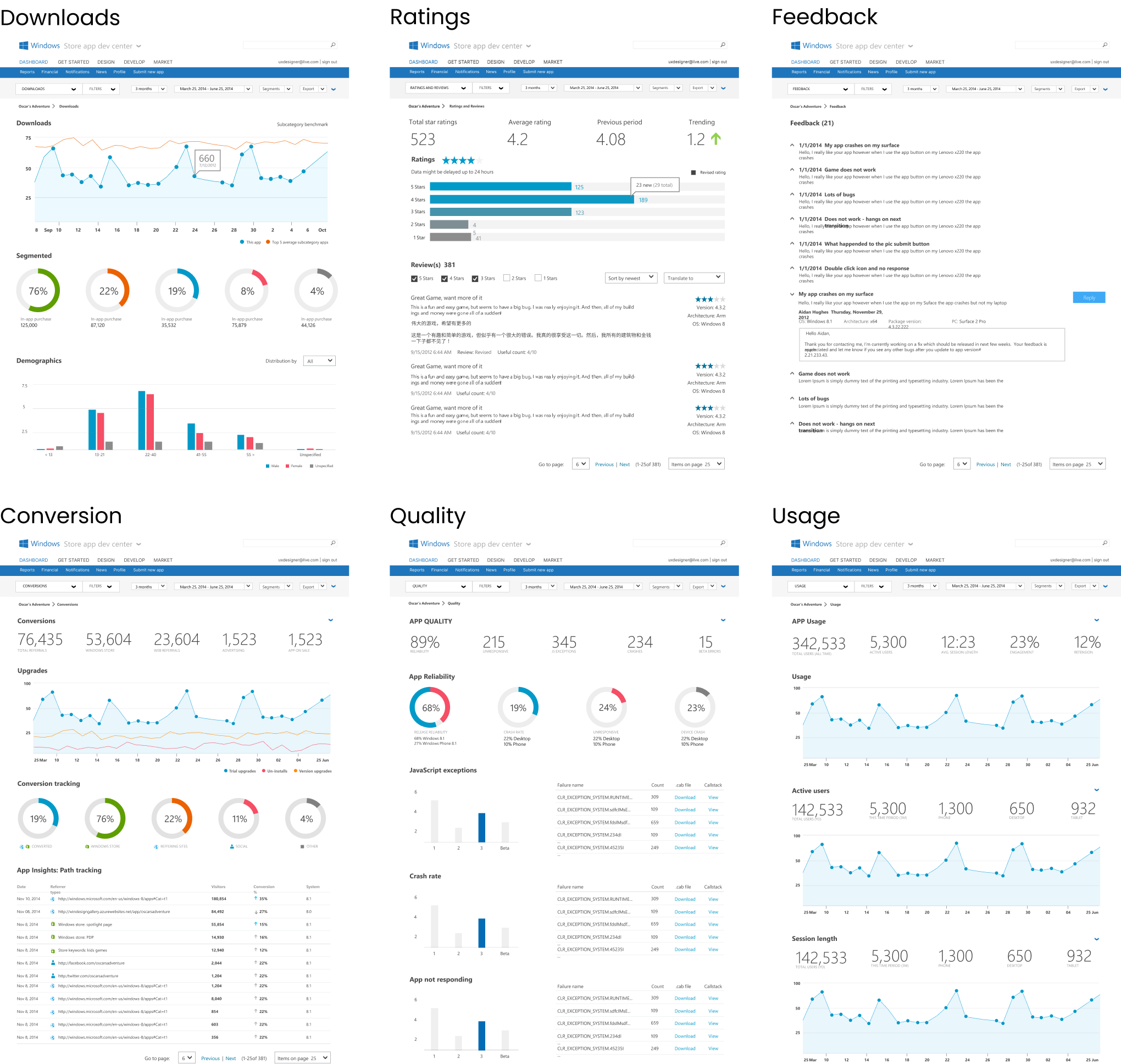
Windows Store app analytics – After launching the App publishing platform, I was transferred to the Windows Store app analytics team to demonstrate the app performance metrics. App publishers and developers needed essential analytics to measure an application’s success. I was responsible for designing the first Windows Store App analytics pages.
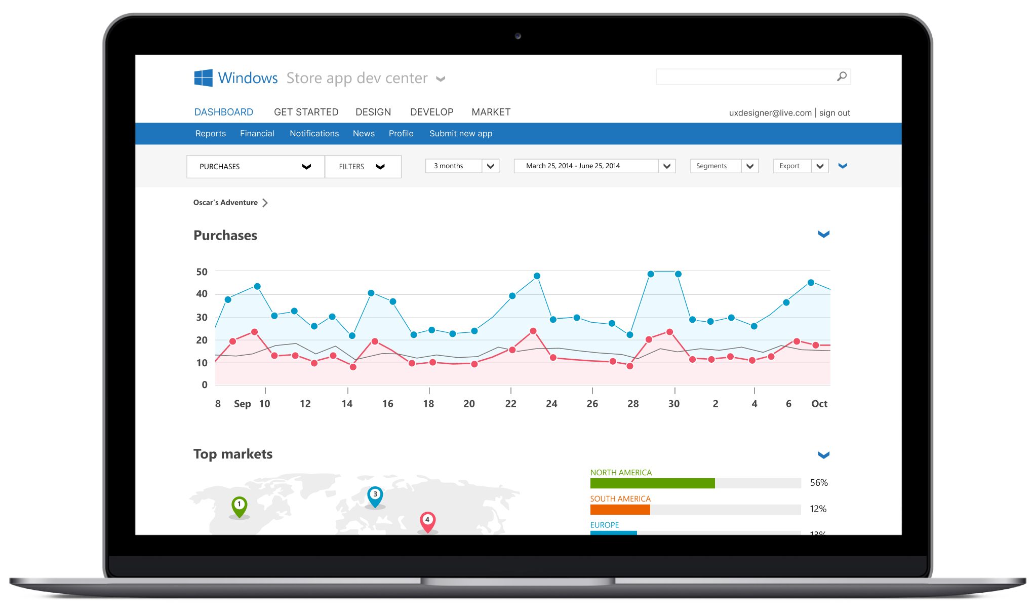
Analytics Key Pages – I was responsible for designing and architecting the entire end-to-end analytics pages. Key metrics pages include Downloads, Usage, Purchases, Conversions, In-app Purchases, Financials, App Quality, and In-App Advertising. The data provides detailed analysis and insights, including source path tracking, store listing pages, Store spotlight pages, and Social references, while aggregating data from top locales.
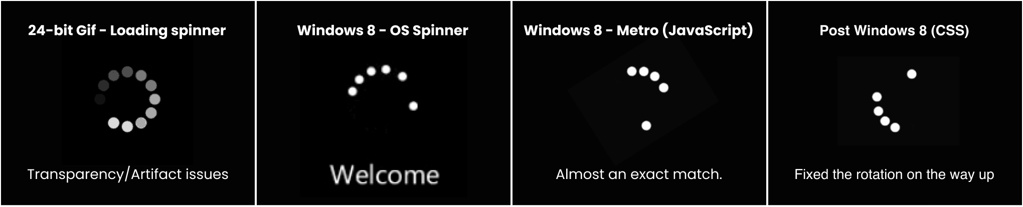
Loading Spinner – One contribution to the Windows UI Metro UI kit was the loading spinner. The original animated 8- or 24-bit (.gif) loading spinner was outdated technology. I worked with a developer to modernize the animated .gif image into vector code and align it with the Windows OS spinner. I can say that millions of people have seen the new component, which appears on hundreds of web pages across the web app ecosystem.
MICROSOFTS DIGITAL TRANSFORMATION
WINDOWS – METRO DESIGN LANGUAGE
When I was part of the Windows Experience Design Research Team (XDR), one of our main goals was to digitally reinvent every customer touchpoint for the Windows OS and Web Apps to update those experiences. The entire Windows Design Organization was responsible for establishing the Windows 8 Design Principles and Metro Design Language as the core foundation for modernizing the Windows ecosystem.
Design Challenge – App Analytics
The beginning – when I joined the Windows Store Dev team, I was paired with a product manager from the India Development Center (IDC), and he presented a PowerPoint concept deck that showed the dashboard and described the vision.
I spent the next few years art directing and influencing product decisions while collaborating with the offshore team. Another change was refactoring the system’s library UI kit. At that time, Microsoft didn’t have any prebuilt React component libraries. We had to develop the systems library alongside building the technology. Fortunately, I had already worked on the framework Windows Metro Design Language.
WINDOWS STORE APP (API) – FULL RESEARCH CASE STUDY
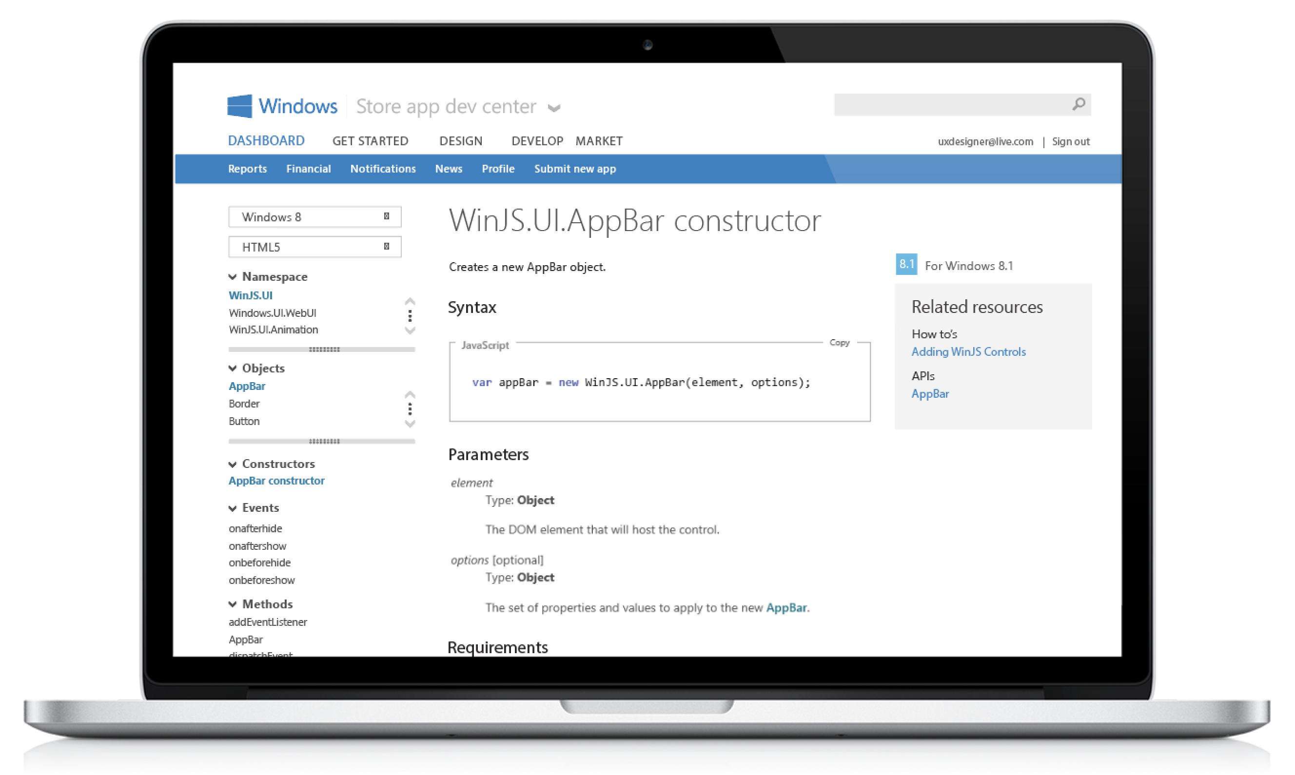
Windows Apps API Documentation
To help developers create successful Windows Store Apps, they need to quickly find relevant APIs, which improves app quality.
I led the redesign of the navigation system to boost developer productivity and reduce frustration. This allows developers to focus more on important tasks like coding instead of wasting time searching through engines, hubs, blogs, and MSDN for APIs.
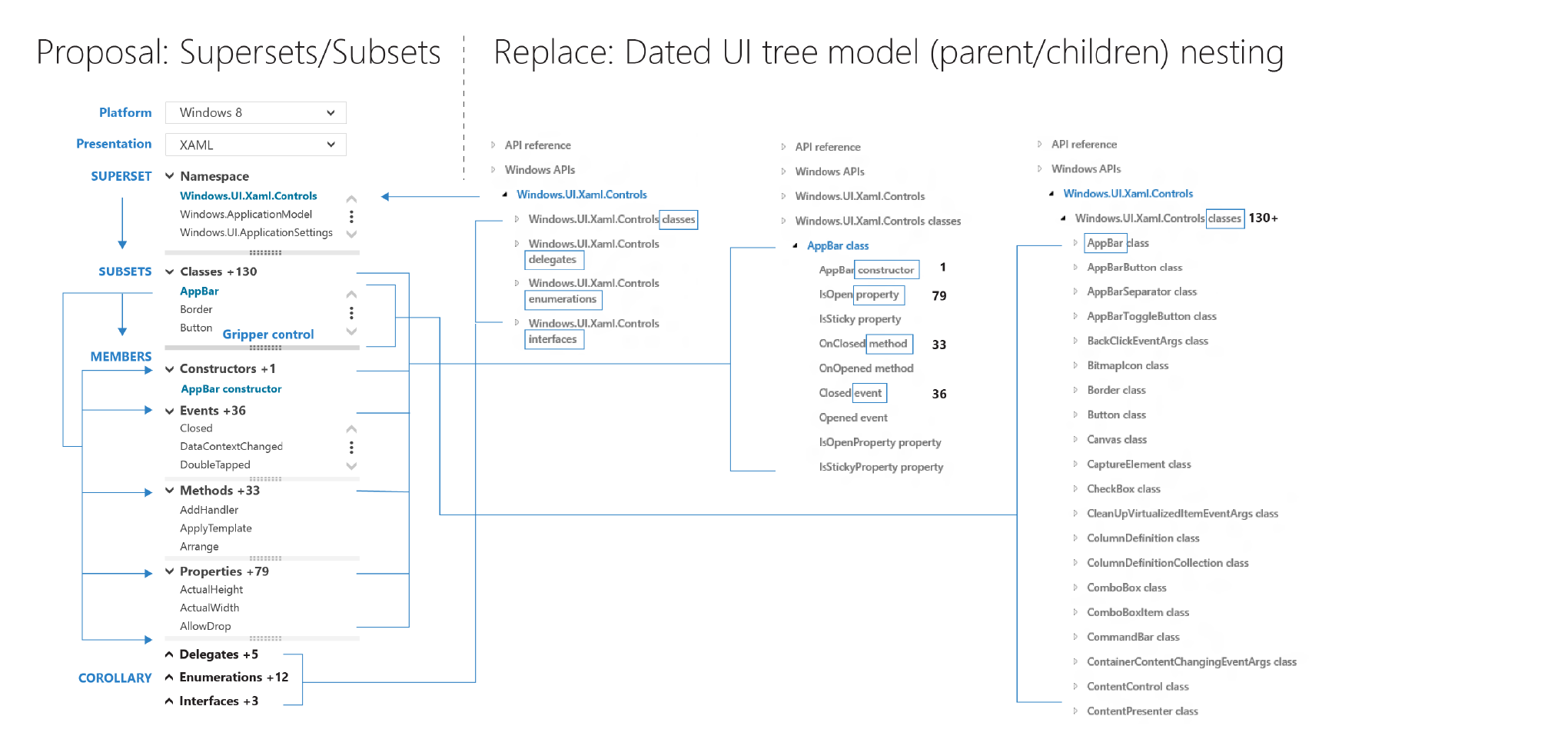
UX Solution – A comprehensive redesign of navigation and functionality updates using filter controls (drop-down menus), subset controls, and hide/show disclosure triangles. The result is a complete overhaul of an outdated tree model structure and the adoption of modern web controls. In an era of object-oriented programming, the tree navigation model (Parent/Child nesting) is unintuitive for development, especially when the related (sibling) APIs become disconnected from the context.
Navigation starts with the Superset/Subset filter controls. A drop-down menu allows users to select the Platform, and another allows them to choose the presentation model. The UX model supports the Windows 8 App platform, including presentation models such as JavaScript, HTML5, XAML, and DirectX.
Conceptual Overview
My proposal is a complete redesign of the navigation and functionality based on filter controls (drop menu) + Subset controls + Hide/show disclosure triangles. The outcome is a complete overhaul to a dated tree model structure and the use of modern web controls. In a world of object-oriented programming, the tree navigation model (Parent/Child nesting) is unintuitive for development, especially when the associated (siblings) APIs drop out of context.
In the proposed new navigation tool, the APIs seamlessly bucket together and vertically grouped. A dev can expand and scroll through every level of the TOC without navigating up or back down – all while using fewer clicks and keeping corollary APIs visible and clickable. I built POC prototypes to present concepts to internal developers to validate the model UI model.
UX Model – Supersets/Subsets: When a filter is selected, the navigation control loads related namespaces (the primary subset). Then, when a namespace is chosen, the APIs within it (the secondary subset) are displayed, making the secondary subset dependent on the primary selection.
1. Namespace – Primary subset
2. Classes/Objects – Secondary subset
3. Members – Tertiary subset
4. Corollary – Additional Reference
Comparison with the existing tree UI navigation model: The diagram below shows both the current model and the new one side by side. In the current “tree” model, you must expand parent nodes to see neighboring (also known as “corollary”) APIs. The expander needs to be clicked each time you load a new page. Many developers are unaware of the expander’s existence; without it, you have to go up a level (reloading the page) every time you want to see APIs alongside the one you landed on.
Top Customer Pain Points – The current reference section TOC frustrates developers and delays the development process. As hundreds of APIs continue to be added, the TOC will expand, making the existing tree UI model increasingly cumbersome for developers trying to locate specific APIs.
P1 – I need the Dev Center to keep basic information about my development environment
P1 – Show me related classes, properties, and members without losing context
P1 – Context is lost when levels are hidden and neighbors are used as references
P1 – I want to be able to sort and filter APIs by language
P2 – The fixed page width is restrictive due to lengthy documentation
Developer Research Feedback
1. I wish the Dev Center could retain basics about my dev environment, and when I search for content, the site should reflect the primary language I use.
2. Need the ability to filter on platform development – I want to see related classes, properties, and members without losing context. The TOC control takes a lot of time to load and find related APIs.
3. Search results are not what’s expected – Searching for an application programming interface (API) often doesn’t land within the top search results. There is a lack of trust due to cross-site navigation doesn’t behave as expected.
On-Premise Field Research – I was lucky enough to have a dedicated researcher assigned to understand the developer’s pain points. First, I outlined two likely scenarios in the ongoing search for the proper API.
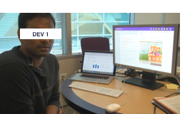
Developer 1 needs to identify and learn the correct JavaScript API to complete a specific development task. He begins by researching which API meets his needs. He starts by searching with keywords on Google until he finds an API that closely matches his requirements..
Then, he researches by browsing reference pages and all related “See Also” pages to create a mental map of the API landscape. Ultimately, Developer 1 aims to be confident that he’s selecting the most suitable, best-matched API for his task. For example, when implementing a fly-out menu, Developer 1 reviews related APIs to determine whether the best solution is a subclass of the API he initially considered.
Next, he learns the API by following links from the API page to relevant code samples, downloading them, and experimenting with the samples to understand the API — confirming that he has identified the right API. About 80% of the time, he succeeds in finding the correct API and understanding how to use it through this approach..
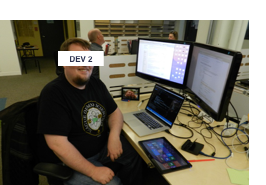
Developer 2 starts by identifying the correct class or API. When he’s unsure which JavaScript API or class to use, he begins by typing into Visual Studio to see if IntelliSense helps him, but it often only shows a list of all available objects, which isn’t very helpful..
If he cannot find the right API or class using IntelliSense, he then searches his browser bookmarks with autocomplete and continues with a Google search on MSDN. He picks the class or function that seems most relevant or high-level and reviews QuickStart guides, code samples, and documentation to gain a deeper understanding of the API.
If he still doesn’t understand how the API works, Developer 2 actively looks for code samples. He searches the Samples Gallery first, and if that doesn’t yield results, he searches through a downloaded ZIP file of code samples. If he remains unsure about how to use the API for his feature, he broadens his search to Google and Stack Overflow. If he still can’t figure it out, he abandons the feature..
Improve Search – A typical developer scenario is arriving on a search landing (parachuting in) on a deep API reference page and adding checkboxes to the navigation control to quickly and easily navigate to a different presentation API.
Overview & Scope – Windows Store APIs are essential for any app. To succeed, Windows app developers need to quickly and easily locate relevant APIs, which enhances app quality and speeds up development.
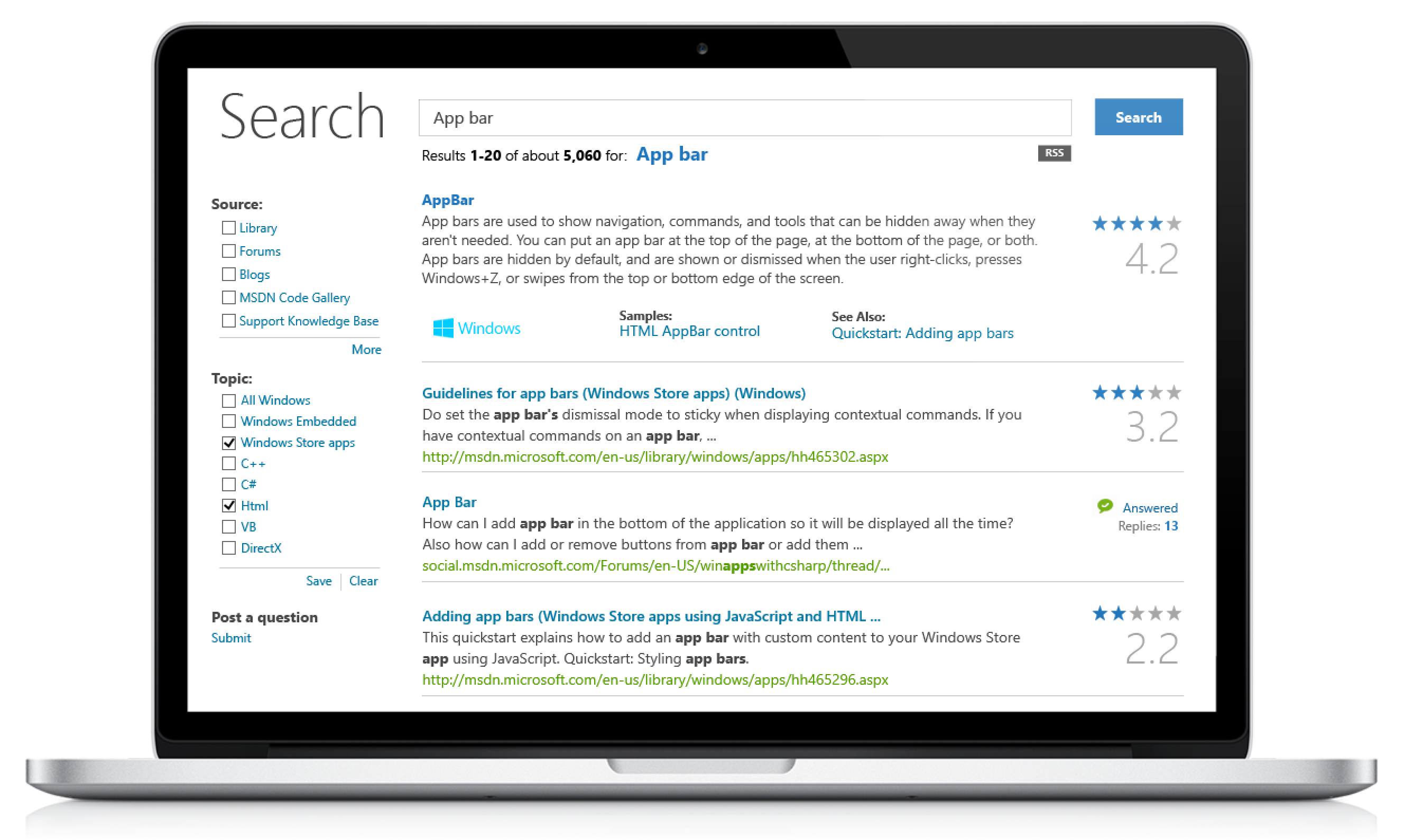
Research – Based on developer feedback, the AppBar API control uses similar namespaces across two different platforms. Developers are frustrated because they can’t easily switch between their platform types, whether in VB, XAML, HTML, JS, C, Win32, DirectX, or others, when searching. Research shows that developers are confused by Microsoft namespaces and struggle to find the right APIs for their projects.
Hypothesis – Developers find it difficult to quickly find relevant code examples. Their resources are spread across multiple sites, making discovery challenging. This hampers app quality due to limited documentation, and Windows depends on several outdated support systems.
Founder: INDIE SHOPPER – Online Marketplace
Indieshopper.com – The Vision
“IndieShopper is a boutique of up-and-coming designers with a little urban grit; Shop Independent is a great place for those who fancy accessories a little off the straight and narrow. In particular, their belts are hipster gear central. Indie Shopper is the hottest designer boutique for today’s freshest fashion designers in the county.” Quote: Style Magazine.

Indieshopper.com – The End
We’re dedicated to finding the hottest emerging fashion designer labels nationwide—no need to travel to Melrose Avenue in L.A. or SoHo in New York. You’ve come to the right place if you’re looking for something original, something hip (and sweatshop-free). This was the guiding principle.
The most surprising artist submission was from SteveO from Jack Ass. At that time JackAss was a considerable rave and SteveO was the movie star. I had to put that his image front and center of the website. That was a good time, but in 2007, when the economy collapsed, so did sales, so I decided to take my innovations to Microsoft.

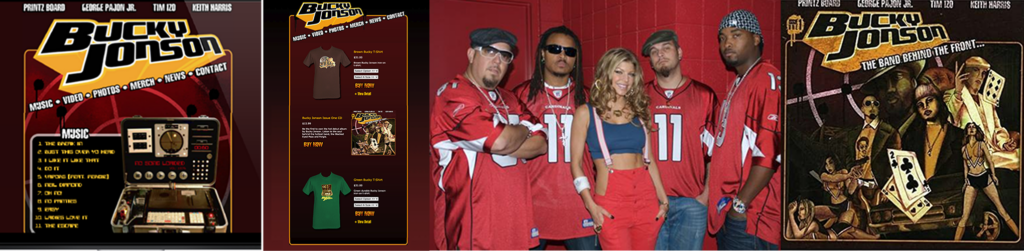
Black Eyed Peas Band
The most prominent Artist, BuckyJonson, and band members from the BlackEyed Peas agreed upon an exclusive partnership with indieshopper.com. The site featured an exclusive song by Fergie (Vapors). In exchange, Indieshopper.com would build a customer landing page to sell band merch and market to its fan base to validate proof of concept.
The Business Pivot – Jungle Green
The Big Bet – The Black-Eyed Peas band management contacted me, and they wanted to collaborate to sell band merch with independent artists. Up-and-coming bands would have a way to sell merch to Indie Artists. The vision is to build a cross-fusion of independent fashion and street culture for independent designers. The partnership with brands would be to create a co-branded site in exchange for your exclusive online merchandiser. In business mode, I continued to develop strategic partnerships with various music bands and urban clothing vendors.
Marketing: Free Press
Knowing you have product market fit when the site stats start showing traffic without doing any marketing. Free traffic without having to hire a publicist to write editorials. At IndieShoppers’ website peak, it had 2k brands and was cash-positive.
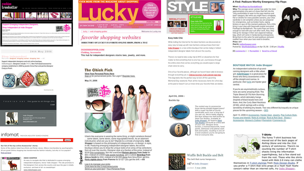
Wired.com (Press Mention) – The best seller was Ray Gun Buckle by “Han Cholo” which was featured in wired.com news article. Business 101- Partner with the best up-and-coming independent brands. My top vendor was Han Cholo the hottest jewelry designer coming out of LA. His jewelry is seen on many A-list celebrities, including his biggest fan, Snoop-Dogg. I sold a lot of Brass-Ring belt buckles.


Indieshopper.com – MVP/GTM
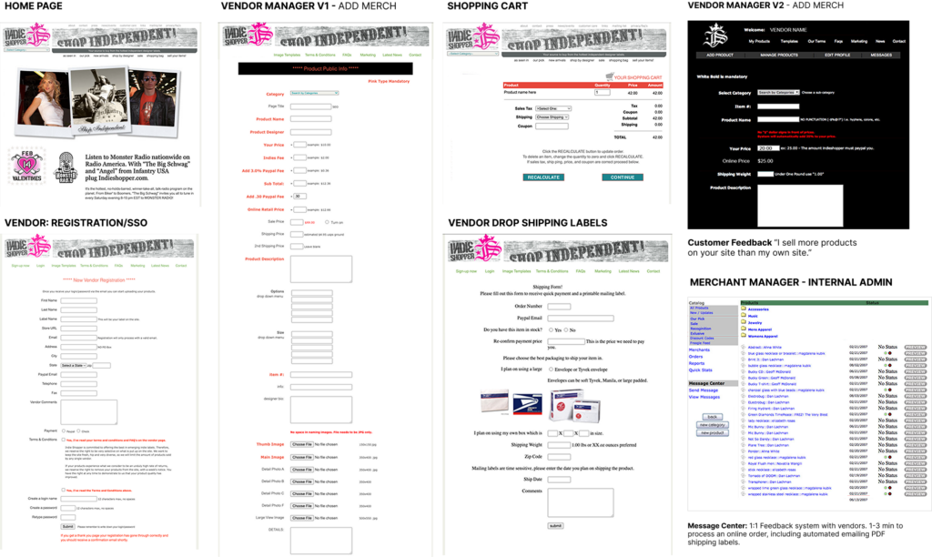
Phase Three: 10/31/05 (Halloween) site went live with only five vendors. 11/15/05: First online sale of BodyRocks necklace! 1/5/06: In a few months, 80 vendors. 3/23/06: Sales hit $10k with 240 vendors. The startup went from Crawl, Walk, to Run in under two years. My goal was to start leveling up the caliber of vendors and streamline the merchant’s internal tool systems. I added a Message Center to communicate with vendors 1:1. Reduced the order fulfillment to 1-3 min to process an online order, including automated emailing PDF shipping labels.

Indieshopper.com e-commerce site (9 months)
Phase Two – I cloned the directory site with over 10k prospective vendors. I hired developers to build all the features needed to complete a full e2e marketplace website. I was on a budget, so all code libraries must use open-source libraries and PHP. I was one of the early adopters using API’s from Woo Commerce, PayPal, USPS, and a custom CMS system. Vendors could register and publish products to the store in 10 minutes. I designed and prototyped the entire site using Image Maps and Dreamweaver to hardcode functioning pages, then published the designs for developers’ review. This is the best method to communicate functionality requirements to offshore developers. This is how InVision started and Figma perfected it.
ShopIndependent.com – Proof of Concept (3 months)
Phase One: The beginning from the sale of a dot com, I decided to build an Ad banner exchange directory to foster vendor relationships and understand the indie market. The goal was to find the hottest independent up-and-coming designers and market to them as a free resource to promote their website. In exchange, they would put a banner on their site for Free or pay to have direct placement. The number of new brands interested validated the POC and helped drive vendor awareness for indieshopper.com. I used all the questionable SEO tricks and cornered the search keyword term “indie” before Google changed its algorithm. At its peak, the site had over 10k referrers and half a million unique visitors. The site generates over $3k monthly from Google AdSense and placed ads.
