Responsible for contributing to the FY21 platform strategy.
Mgr. Quote: Becky S
“Geoff was the sole designer on a product that helped us manage our Vendor relationships. He was asked to deliver several features but also took ownership of user research and suggested additional user delight features. He was responsible for every aspect of the design and prototyping for testing and presented his work to leaders in design and products.”
Visionary Dashboards – Imagine AI/ML predictive analysis dashboards analyzing vendor relations for new customer potentials and opportunities to increase business efficiency. Experience improvements that keep the mothership fly-wheel offering increased transparency for customer (internal/external) relationships.
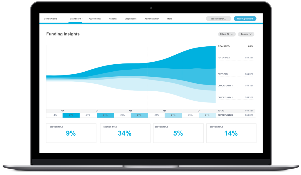
Customer interviews
Responsible for conducting 1:1 interviews with vendor managers to validate the experience hypothesis. Customer feedback directly affected the product roadmap, and some features in the PRFAQ were challenged by customer feedback.
Customer Quotes from UX findings:
Nine feature areas received positive feedback from customer interviews.
• “Frequently amount of codes are created by a different team, and I had no idea.”
• “Proactive suggestions would be great.”
• “The chart would save me time than going to Excel.”
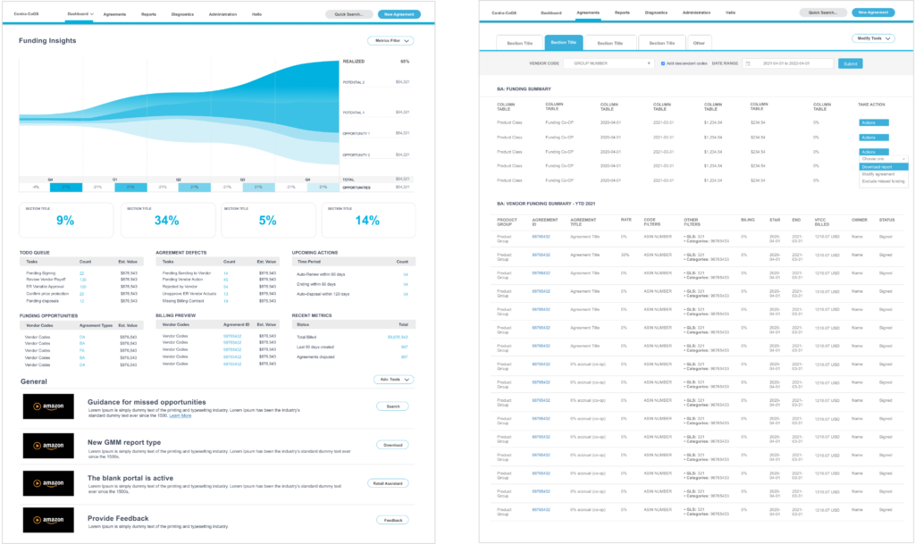
Customer Journeys – e2e Workflow Prototypes
The trend line represents suggested business decisions and missed opportunities. The speed and pace are unlike any other product machine. I was shipping new feature improvements on a consistent cadence.
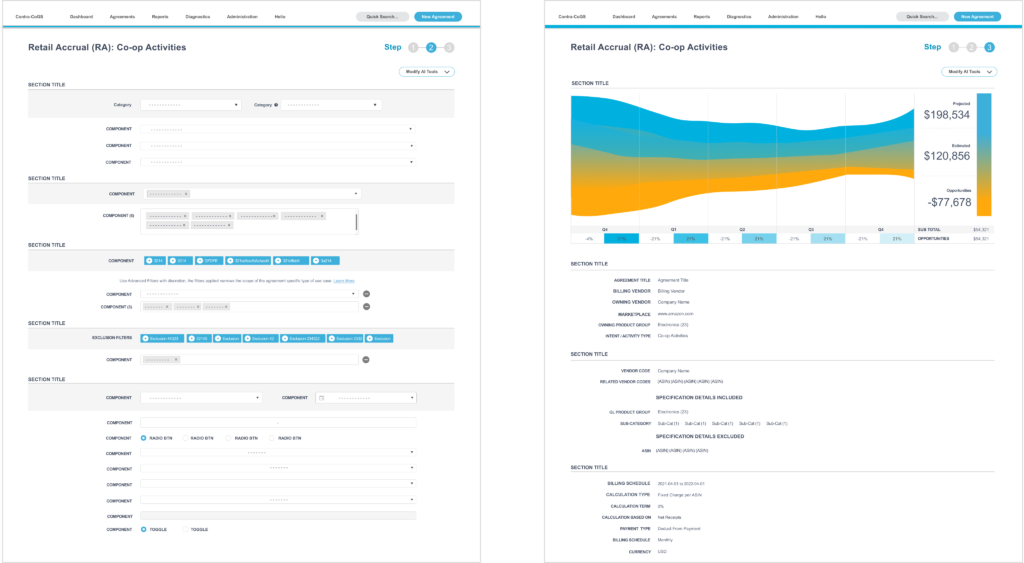
Customer Relations
At scale, the knobs that control the underlying business algorithms that directly affect vendor-customer relations through multiple channels. Using AI/ML alerts to Vendors increases efficiency potential and new opportunities to increase sales.

Vision OP1: Retail Media (CO-OP Incentives)
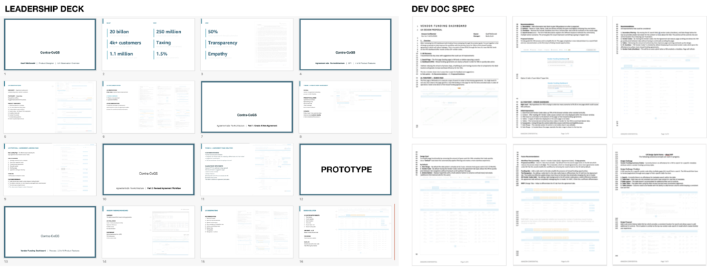
Design Presentation and contributed to OP1’s future innovation features. I was improving FCF from additional funding captured by lowering the number of tickets to decrease funding leakages. I presented a deck to leadership and a UX/UI spec outlining the proposed features.
Systems UI Kit (NEW) – Amazon was on a mission to transform internal platforms to reduce costs and increase efficiency digitally. I was on point to level up the platform and pressure-test the system library patterns/components designed to scale for the enterprise platforms.

Discovery – Beta Site
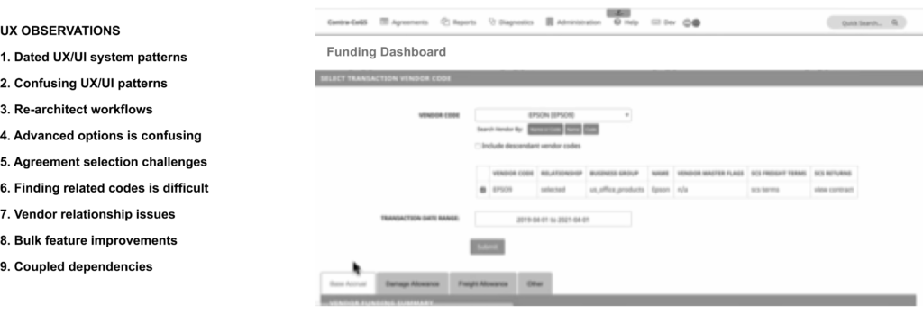
UX Challenge: Hypothesis building from customer touch points, data, and interviews. The experience goal is to simplify the overly complex to decrease missed opportunities and increase future monetization opportunities.
The Beginning: The Plan (PRFAQ)
Product Planning (The Amazon Way) – My journey starts with an Amazon PRFAQ, a descriptive doc describing the “What and Why” the business needs to invest in new feature improvements.

