Could Fan Signals disrupt the NPS SaaS industry?
The ROI from this unique data and customer feedback proved to be more valuable to understanding customer lifetime value (LTV), customer retention, and customer churn prediction modeling than Net Promotor Score (NPS).
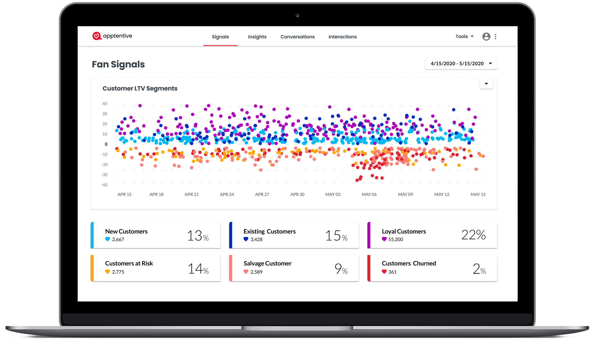
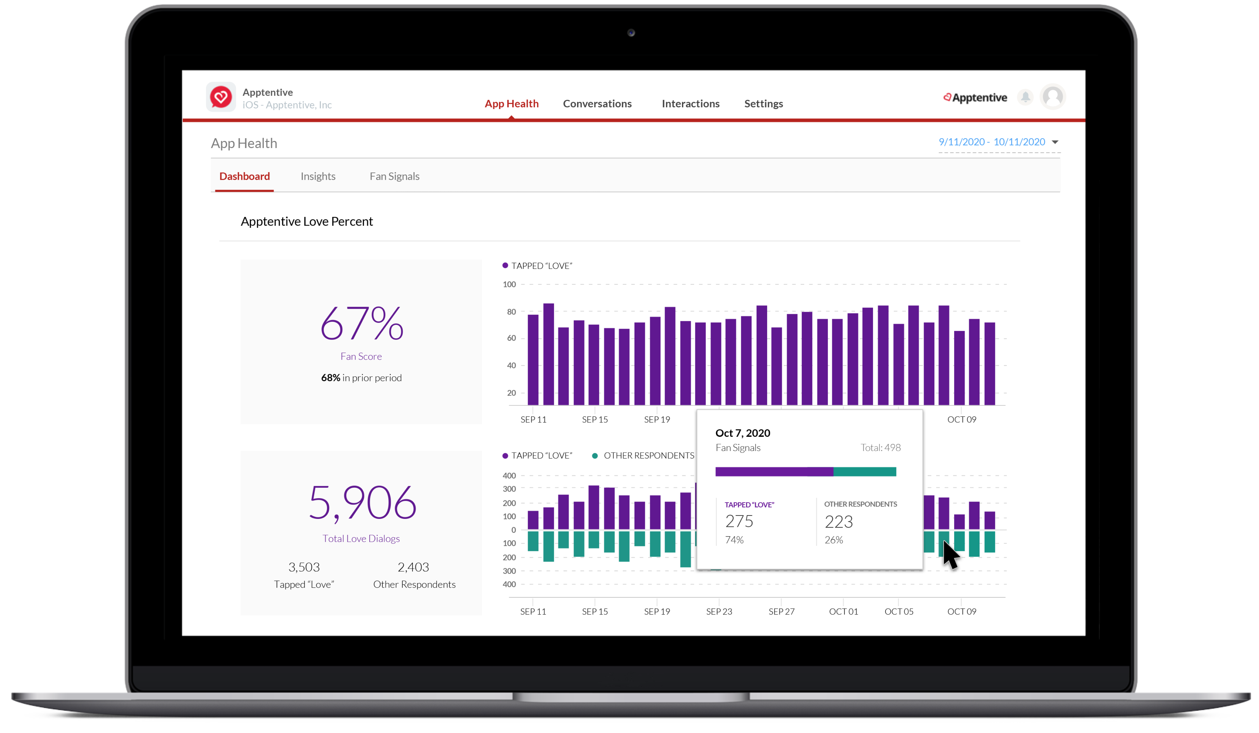
Fan Signals: Dashboard
The dashboard represents a plot chart showing customer segments through loyalty. Shifting loyalty is broken down into sentiment segments known as Fan Signals. At a high level, there are three types of customers: New Customers (CPA), Existing Customers (frequent users), and Customers who Churned (App abandonment). The business value is to connect with customers before they Churn and offer incentives (e.g., promotions, discounts, targeted ads) to bring back App loyalty.
Mike Saffitz – CTO
Quote: “Geoff reported to me (both directly and then indirectly) as part of our product team at Apptentive. He was a very talented UX designer, passionate about addressing users needs and eager to iterate amongst a variety of approaches to identify the best way to solve a particular problem. I was really impressed with Geoff’s energy and creativity– he had an infectious love of the creative build process.”
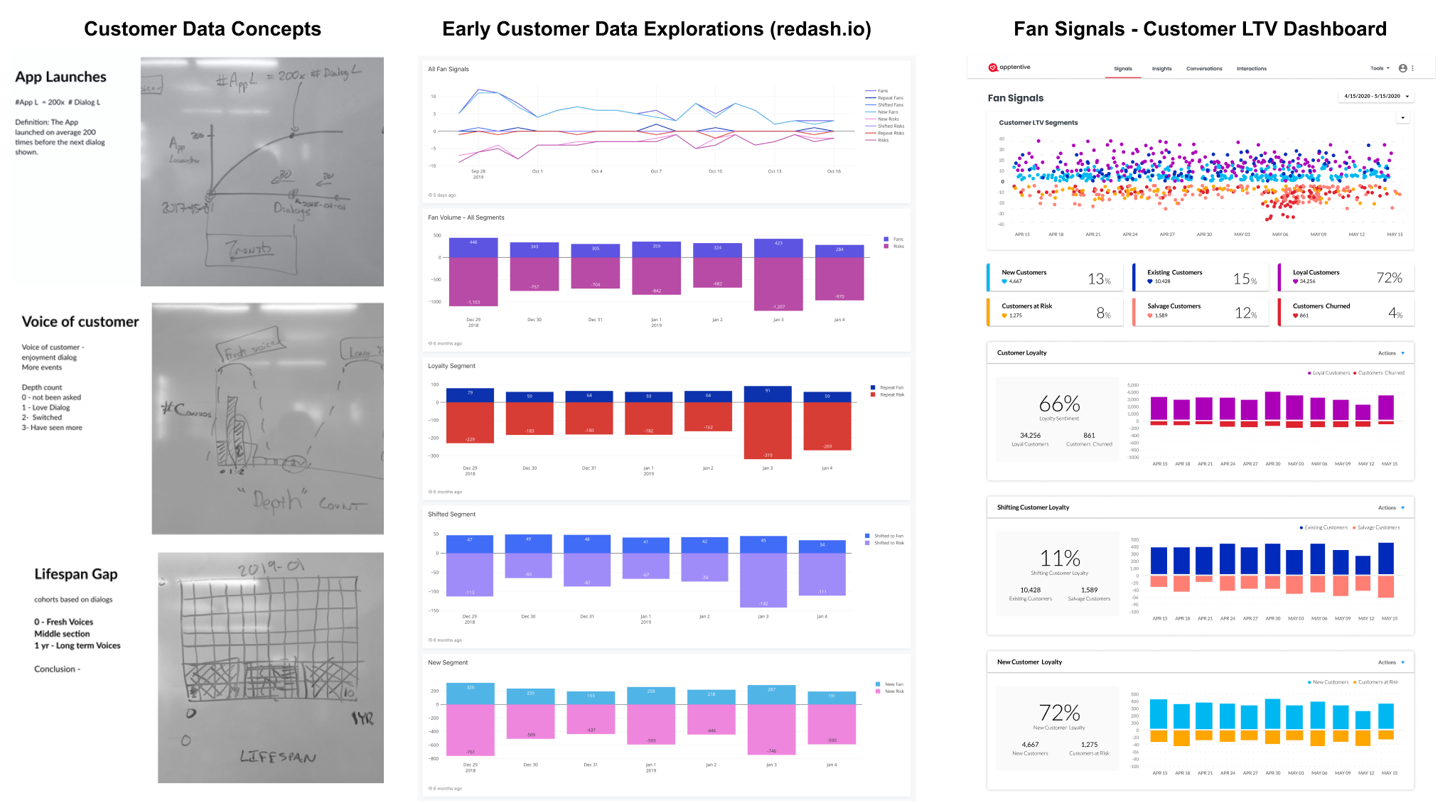
Fan Signals – Early Data Modeling
From inception to productization, the team shipped Fan Signals to all customers as a feature flipper. The POC from sales interviews received positive feedback as a new up-sell revenue stream. The left diagram shows a redash.io dashboard showing customer data before the font end work started. The insights began to show and classify consumers into segment cohorts known as Fan Signals, in which New Fans broke down, Switched Fans, and Repeat Fans, all of which correlated to customer behavior. Using AWS AI/ML to augment the feedback data was vital to feature success.
Business Results – Proprietary metrics
The tailored reports were designed to reveal more profound insights into how customers feel about the brand/product. When they reached the C-suite, they received tremendous praise. With continuous agile improvements, the 20+ page reports closed $100K+ deals.
Solution — I partnered with a data scientist to create a flexible template tailored for any customer. This unique solution was created in PowerPoint (instead of Excel or Word), and the document can be linked to an Excel data connector while keeping the visualization.
Executive Reports – At scale, the tailored reports were designed to reveal more profound insights into customers’ feelings about the brand/product before productization.

Fan Signals – MVP
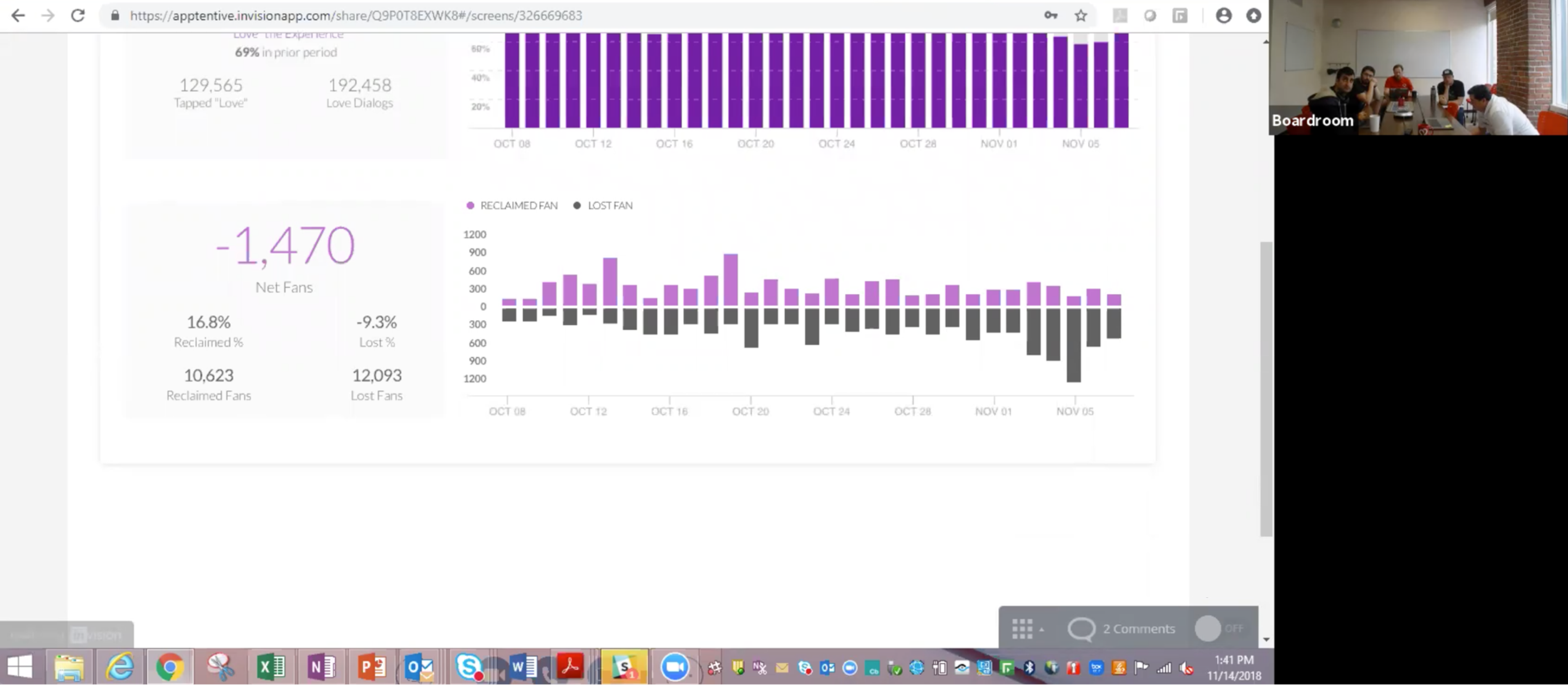
To get customer feedback, I shipped the first public view for Fan Signals as proof of concept. The green represents missed opportunities, or from a customer’s perspective, the business could be losing customers or money. The purple represents new, loyal, and repeat customers to ensure brand/product success; the purple symbolizes royalty. The customers wanted to know deeper insights into when a customer shifted loyalty or sentiment towards the business.
Customer Interview
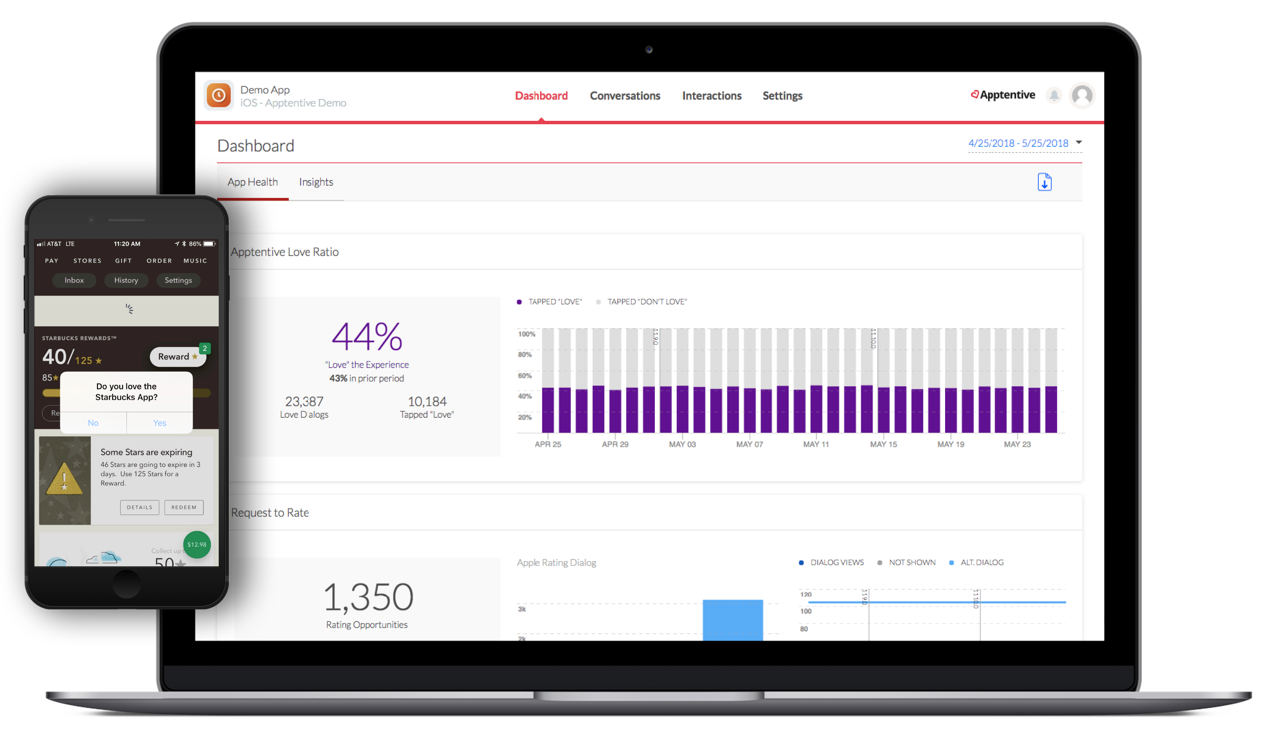
I spearheaded the first customer interview to validate the value and gauge the customer’s interest by aggregating all the feedback types. I conceptualized and iterated on various histogram chart designs and landed on a Pos. / Neg. The bar chart best represented the binary question “Do you love our brand?” (Yes/No), which customers intuitively understood. The design helped to visually solve the volume of responses and how the feedback was trending. The prototype and the number of positive customer feedback validated the POC.
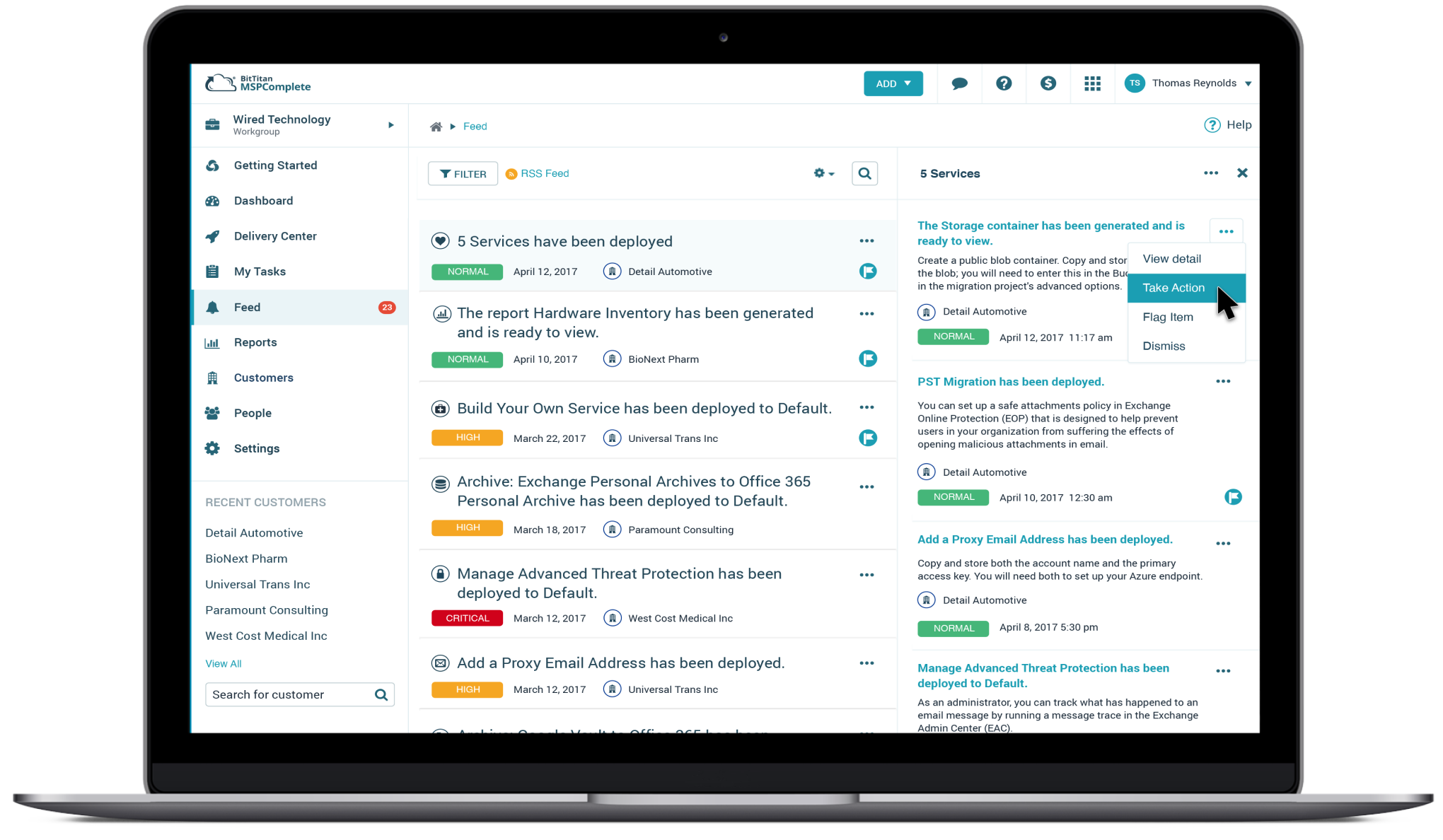
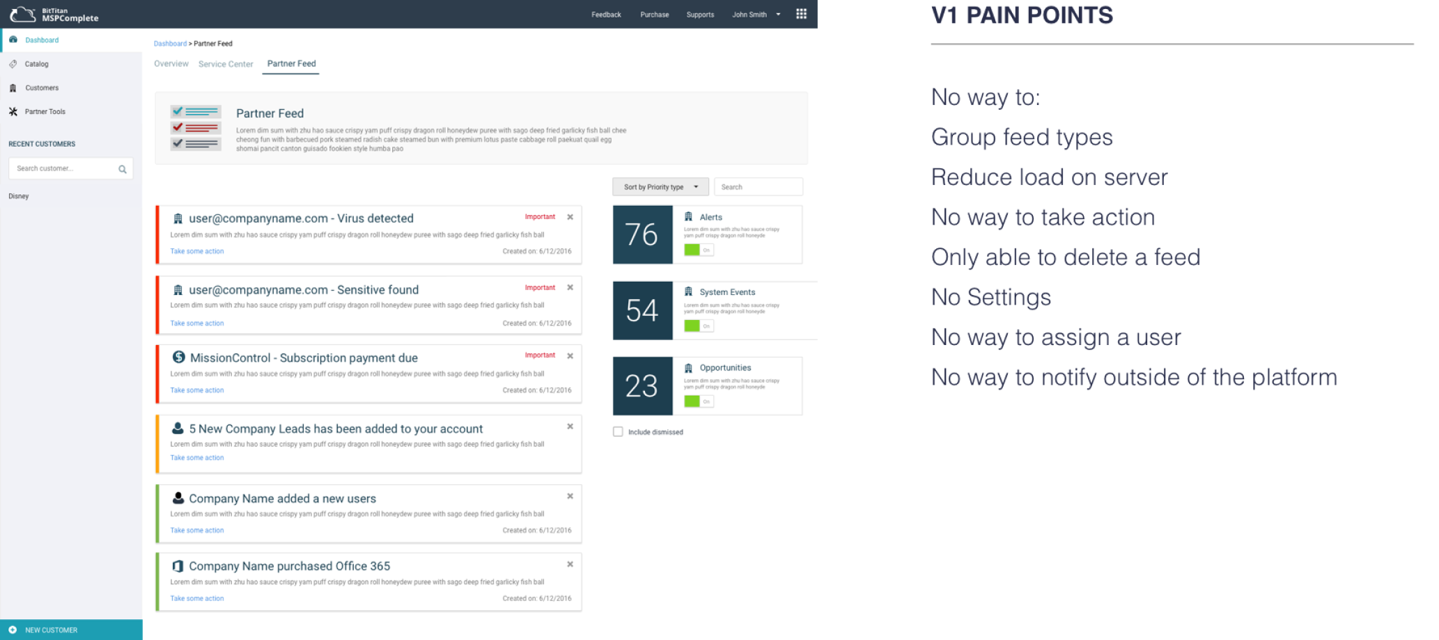
The Challenge
This is where my design journey begins – working with Apptentive’s Love Dialog flagship product as the Lead UX Designer. Customers wanted to see the underlying data contributing to the responses received, represented in a single bar chart. It was the start of an innovation hypothesis that the business was willing to invest in understanding the deeper metrics.
The Beginning –
The Love Dialog started with a simple question: “Do you love our brand?” – a query that generated a 90% response rate. Based on their answers, consumers are redirected to another type of feedback interaction (survey, message center, rating R&R, etc.), which captures even more VOC feedback at scale.
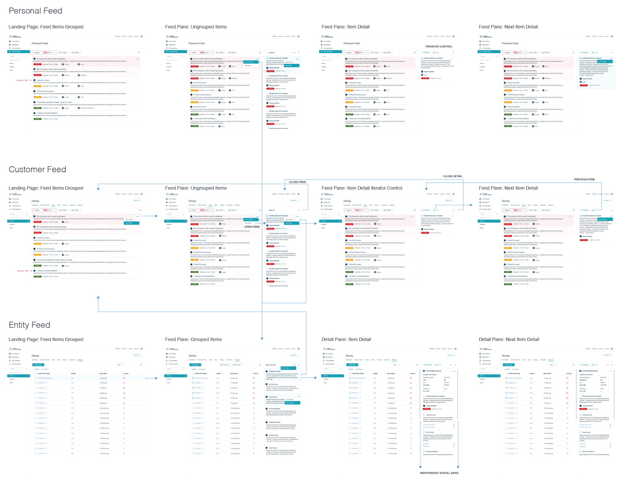
Segment Builder (pt2.): Customer Targeting
The Love Dialog did well in soliciting and capturing various feedback interactions (surveys, messages, ratings, NPS), but only in one-way communication. Most feedback SaaS platforms capture feedback and never return feedback to the customers. At scale, customers would like to know that their VOC was heard.
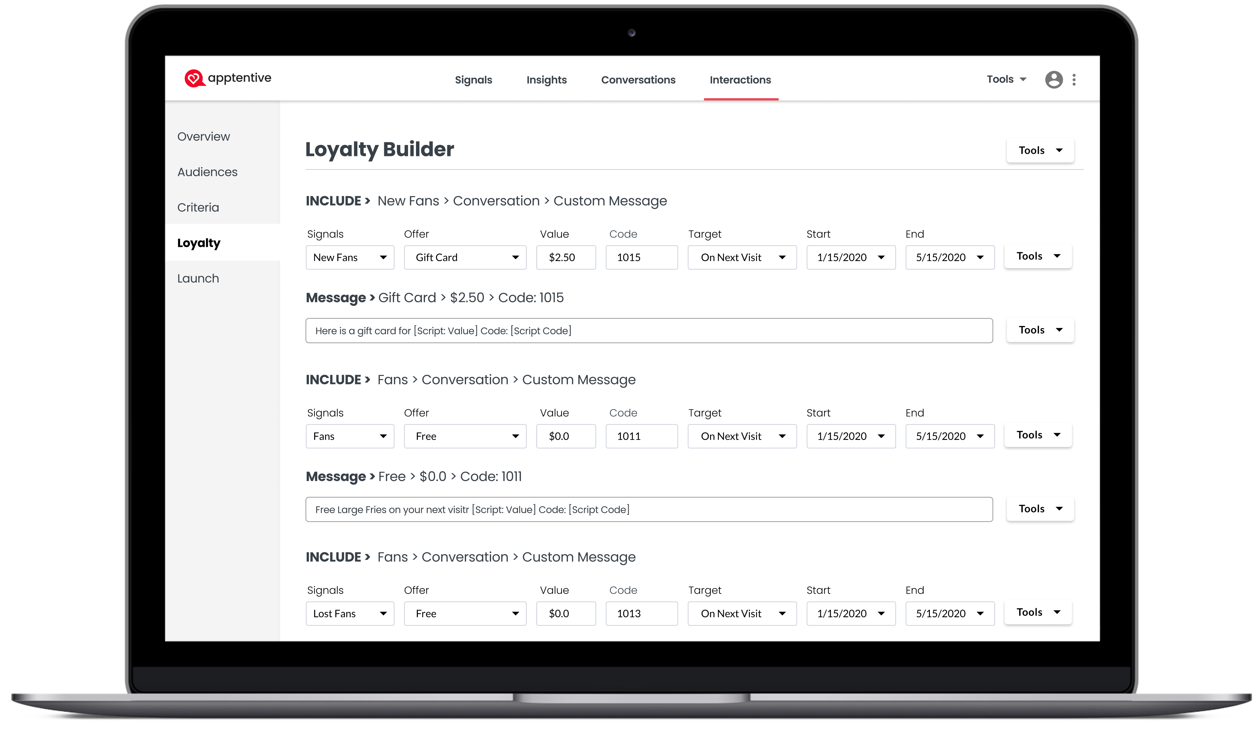
Loyalty Builder
The product goal was to close the feedback loop. At a high level, the system is like an Entity Management, Crud system, and Query builder that allows customers to re-engage with them through automation. In customer interviews, customers told us they wanted the ability to reconnect with their customers through some interaction, promotion, or advertisement. The Game changer…
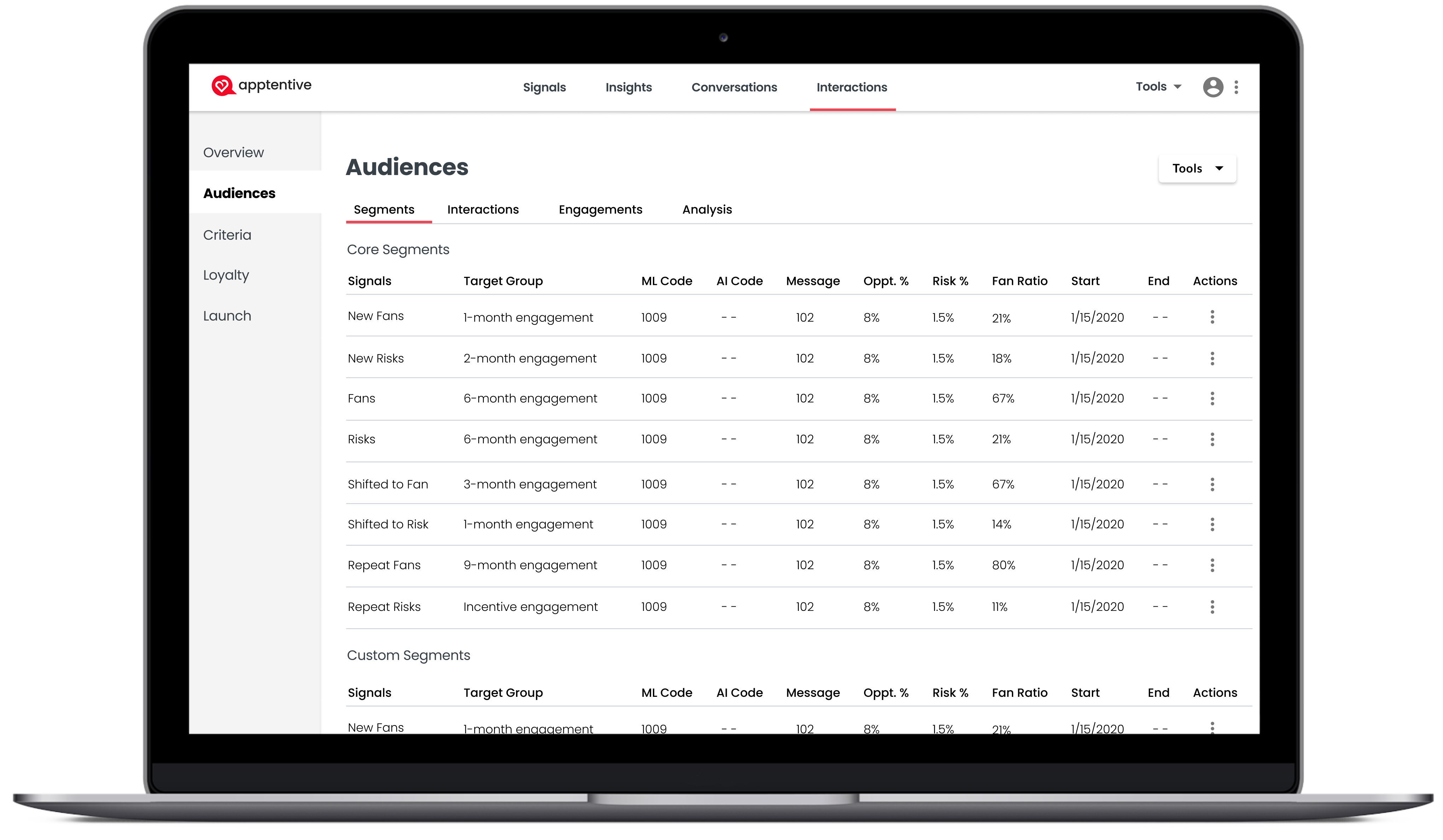
Audience Segments
The platform’s real power was identifying a Customer ID and advertiser ID and augmenting the data supplied by the customer UUID. Customers can send custom key-value pairs, Zip Codes, DMAs, Devices, Locations, memberships, loyalty, and other metadata. Then, Fan Signals augments the data and builds segment cohorts for the most accurate re-targeting.
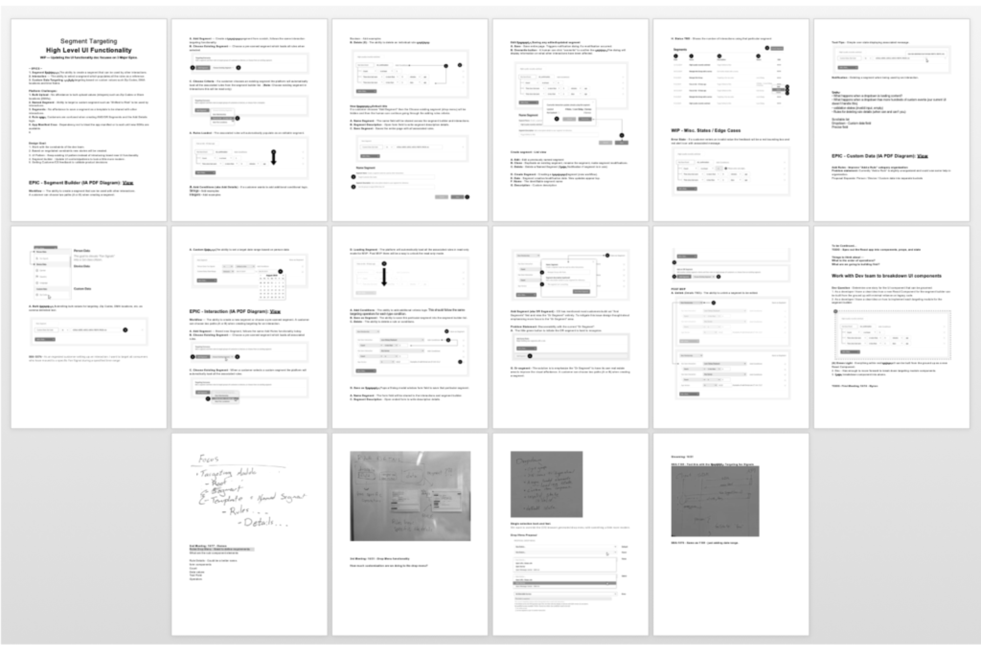
UX/UI functionality Spec
Part of my process is documenting high-level UI functionality from a designer’s POV, covering scenarios, use cases, and high-level functionality requirements. The working doc covers a variety of product scenarios to help uncover or determine any unforeseen edge cases.
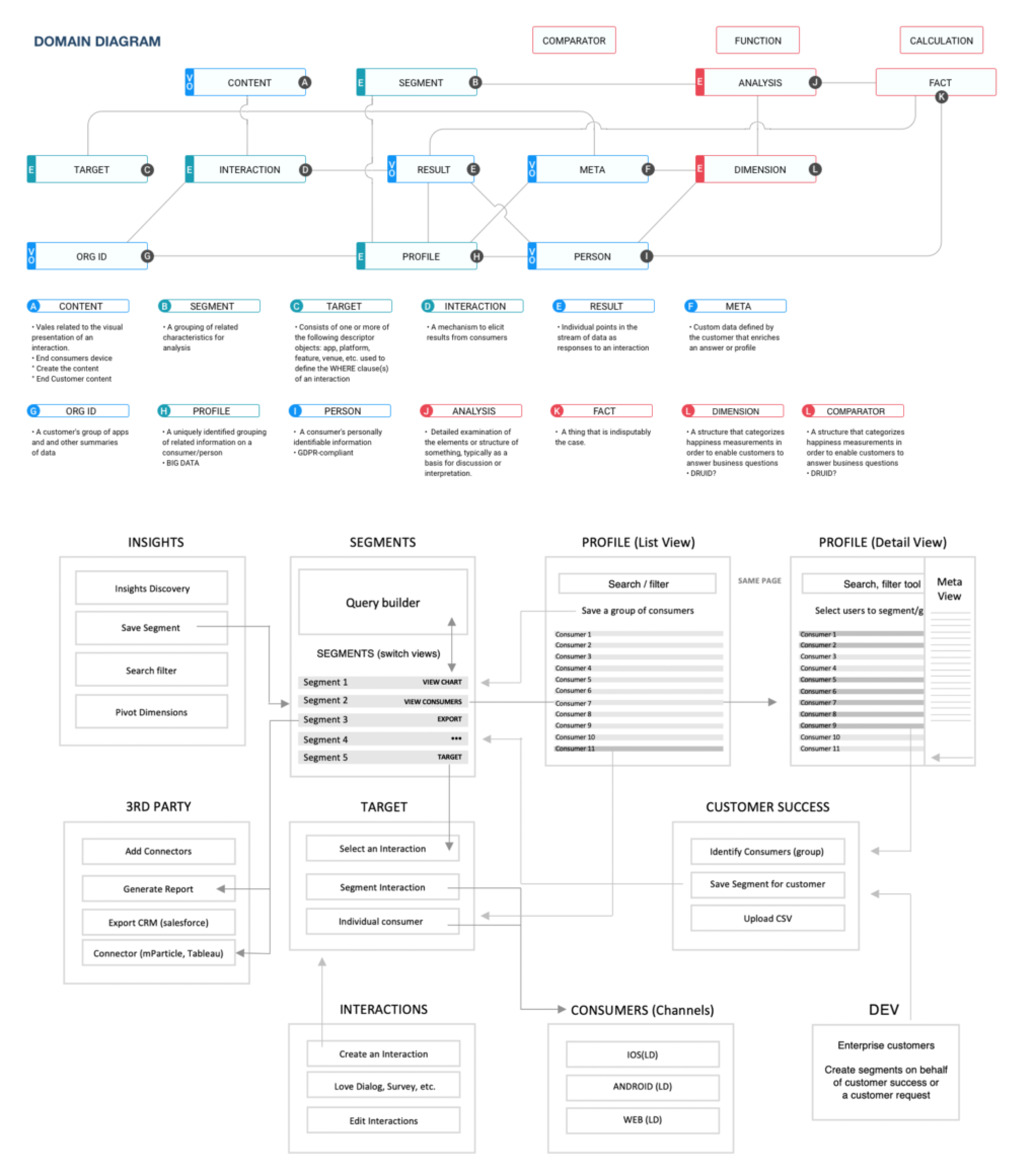
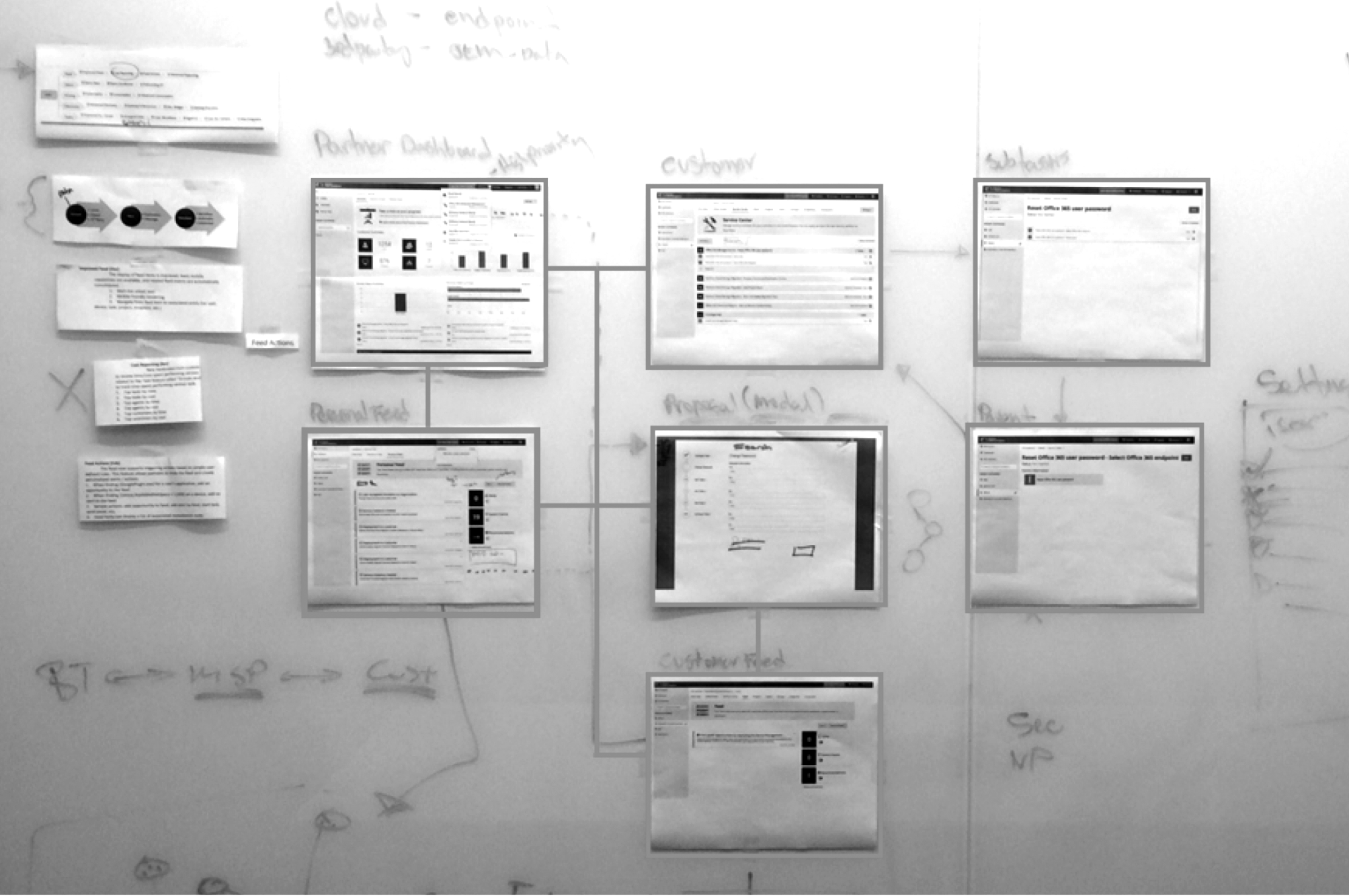
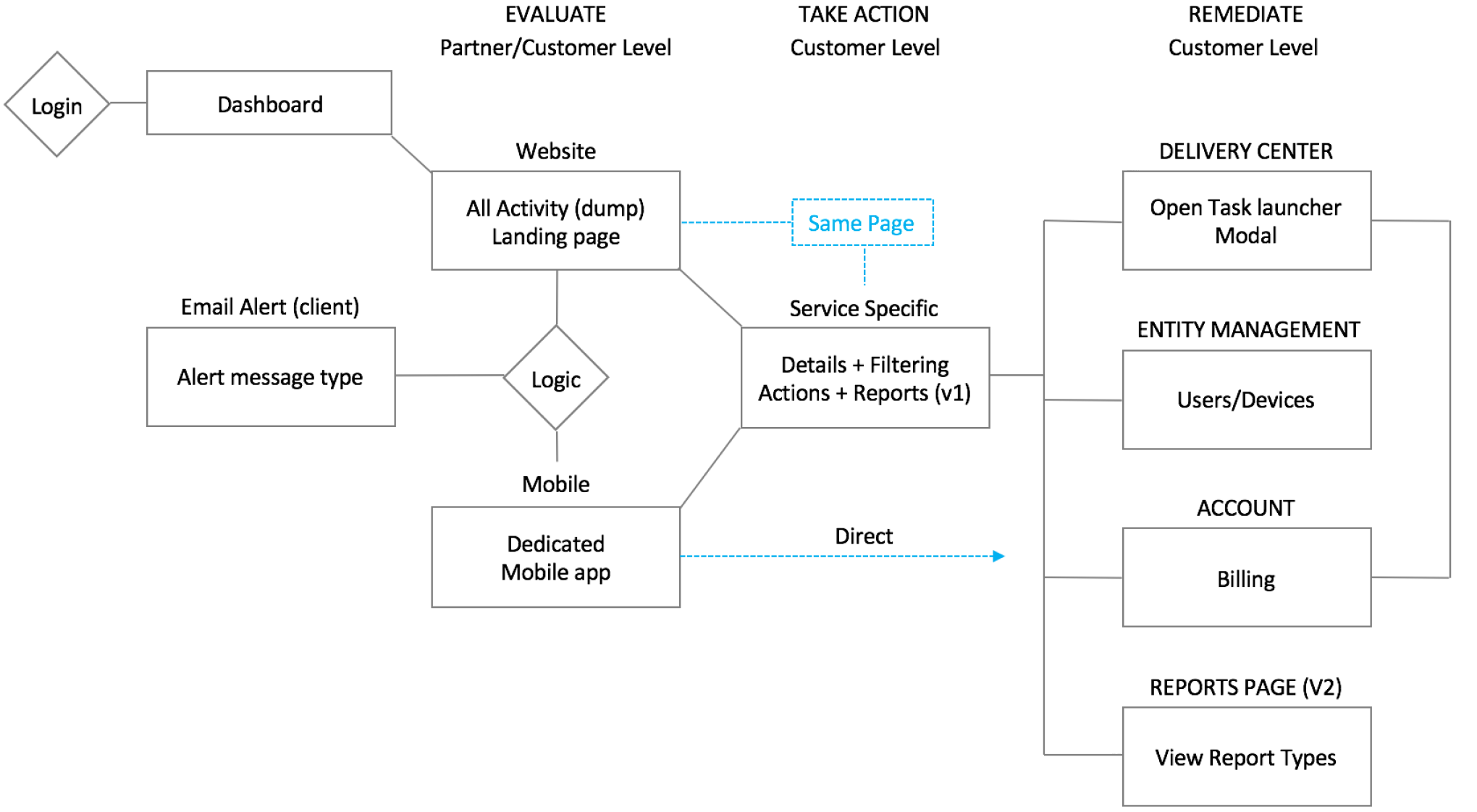
Domain Diagram
I worked closely with a systems architect to understand the system’s design; then, I created the UX/UI/IA visualization for an intuitive customer journey. The art of the discovery process is creating a wiring diagram to help visualize the data before the UX process begins—the making of Fan Signals.