As on-premises servers are being phased out, BitTitan is developing services to facilitate easy migration to the cloud. Entire organizations can transfer a variety of files (emails, documents, databases, systems, etc.). In the modern age of cloud computing, customers can save costs by migrating from Azure, Google Cloud, AWS, and full-platform systems in weeks, rather than the traditional 3-6 month migration. No more loyalty to be gated by one enterprise system.
Public Launch (GTM): Two Years
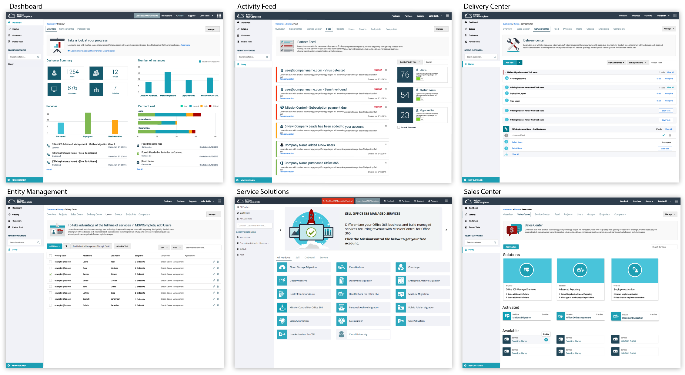
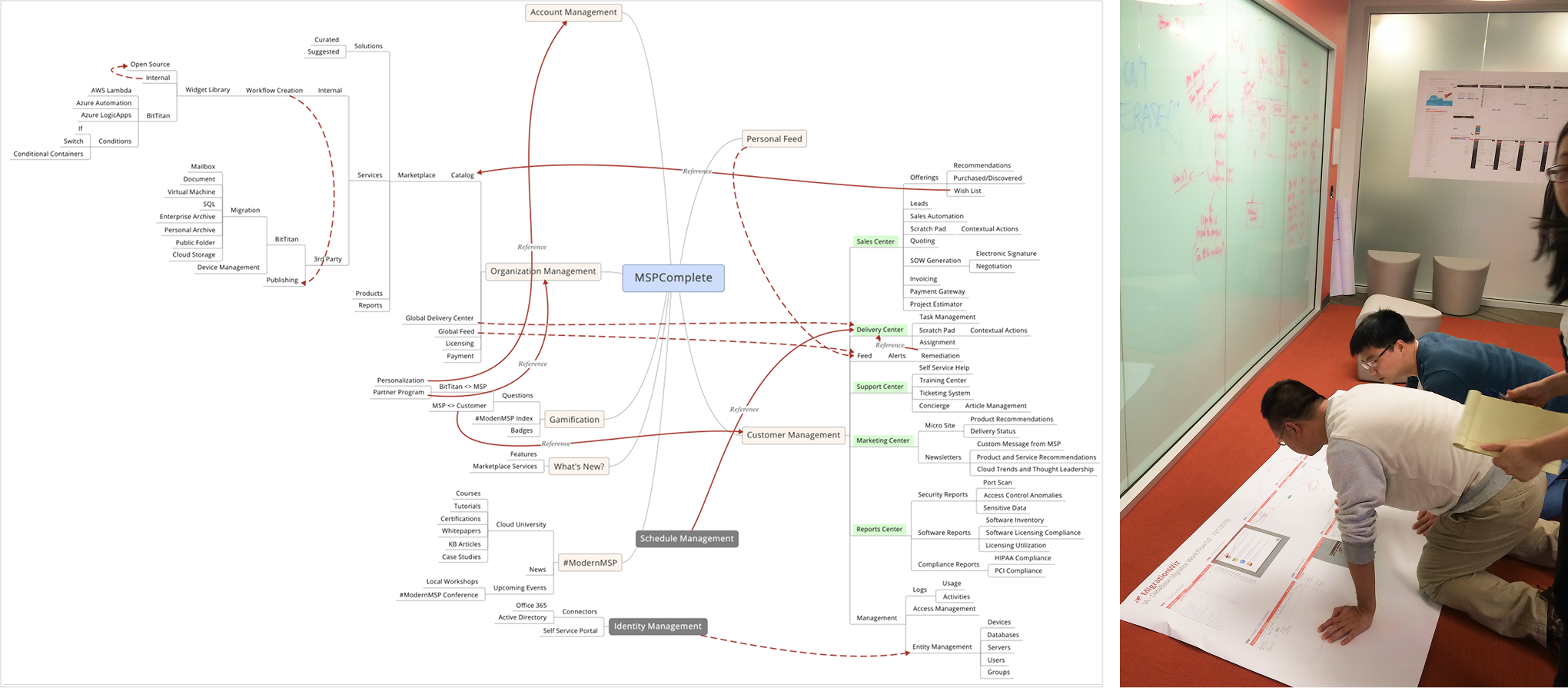
As the lead design manager, I was responsible for the entire user experience. I owned key platform features, and once the UI Models (MVP) were established, I interviewed and hired three UX designers to facilitate the handoff of new features, enabling rapid platform scaling. Subsequently, I concentrated on updating the Dashboard, Delivery Center, Entity Management, Activity Feed, Subscription Billing, and third-party OEM task workflows.
Results – Sold for 16x
Building a new platform from scratch in two years is a challenging task. Still, by employing design-level thinking methods and modern design principles, I created a sleek, user-friendly platform that has the potential to transform the IT industry.
Seattle Business Magazine
I was on stage when BitTitan received the #1 award for Best Company to Work For. The team culture and product focus were among the highest-performing software teams I have worked with. As Employee #24, I helped the company grow to over 200 employees and managed a team of four designers.

Dominic Pouzin – CTO
Quote: “Geoffrey is a very talented senior UX designer and would be a huge asset to any company, especially those with a focus on enterprise products. At BitTitan, Geoffrey helped our product UI evolve from “amateurish” to professional / on-par with top SaaS solutions. Geoffrey’s key strength is creation of new UX concepts and high-level look-and-feel experience for enterprise products.
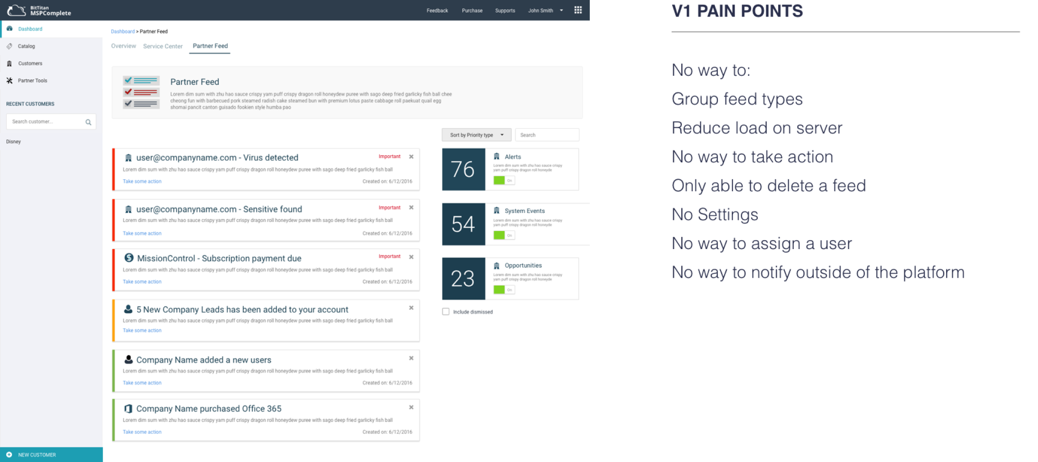
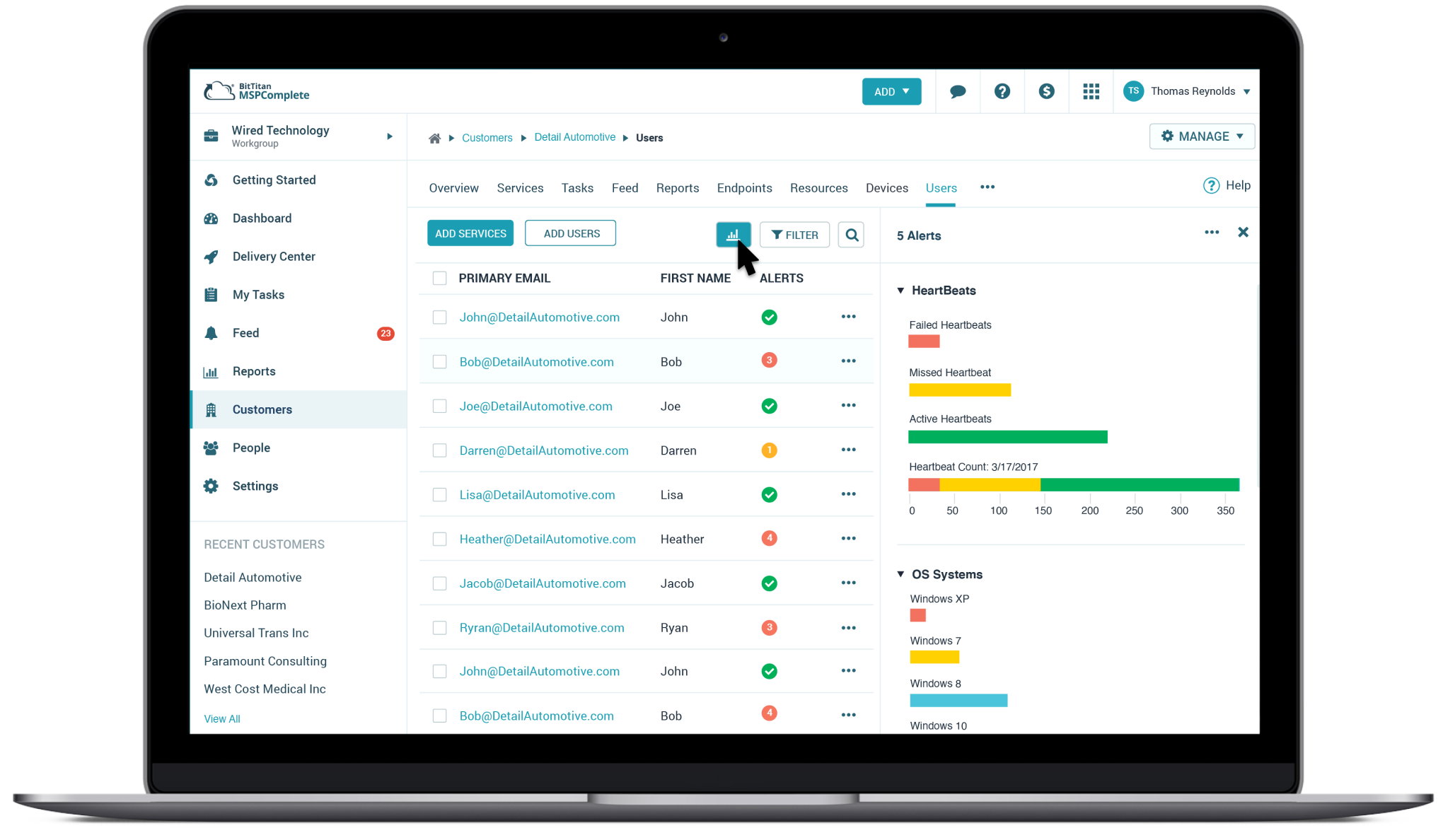
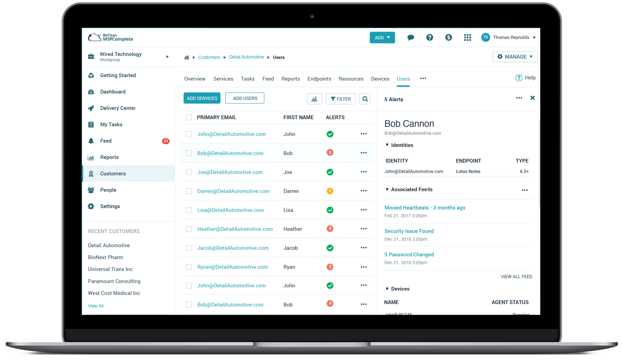
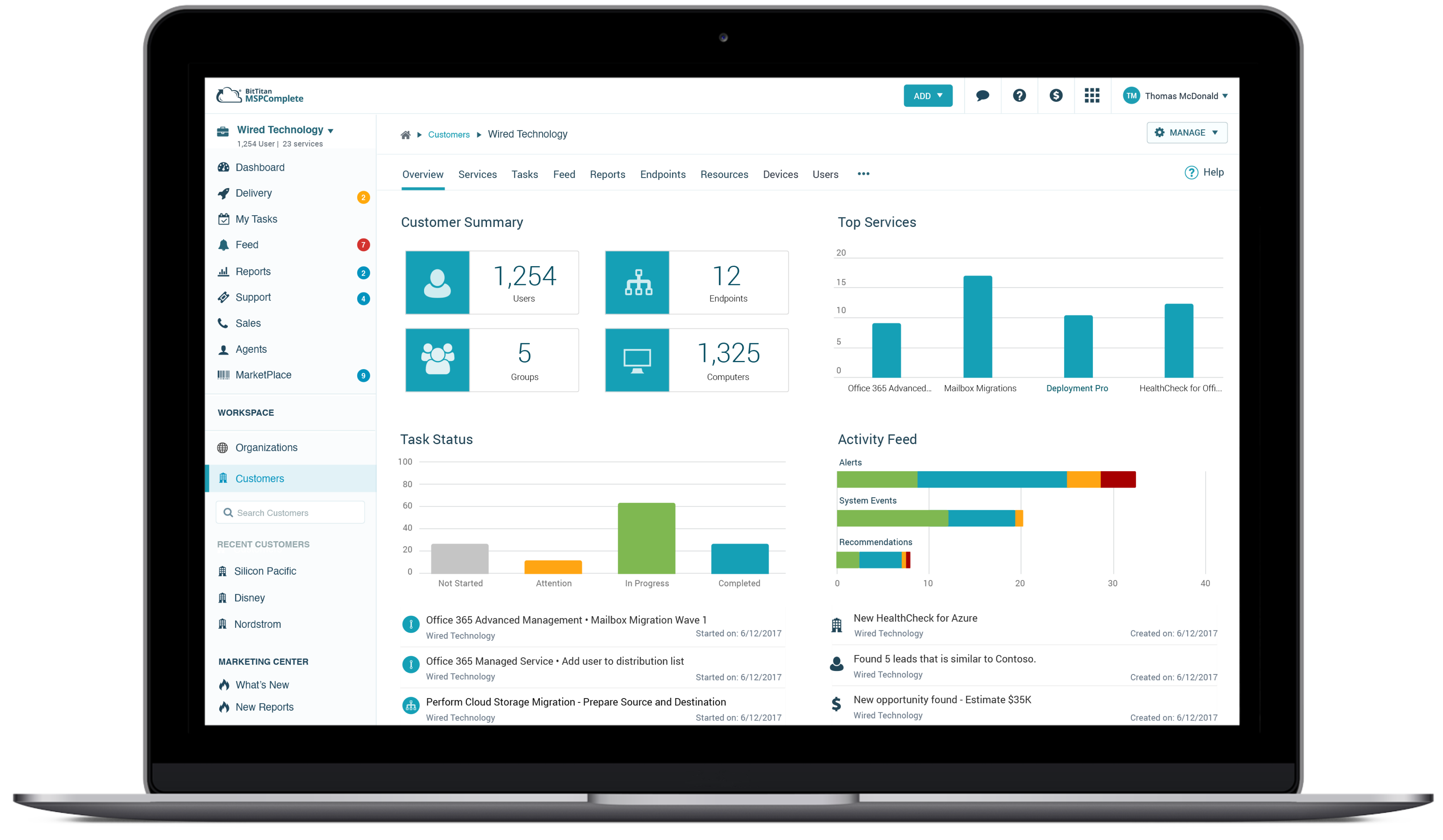
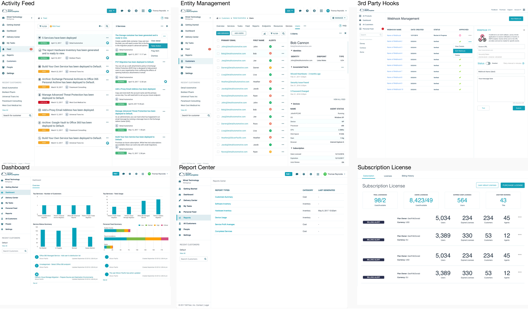
Beta Launch – Among the improvements made by adopting the new UI-Kit were the Dashboard, Service Center, Activity Feed, Subscription Billing, Delivery Center, and Cost Reporting, along with the implementation of approximately 20 new IT service solutions.
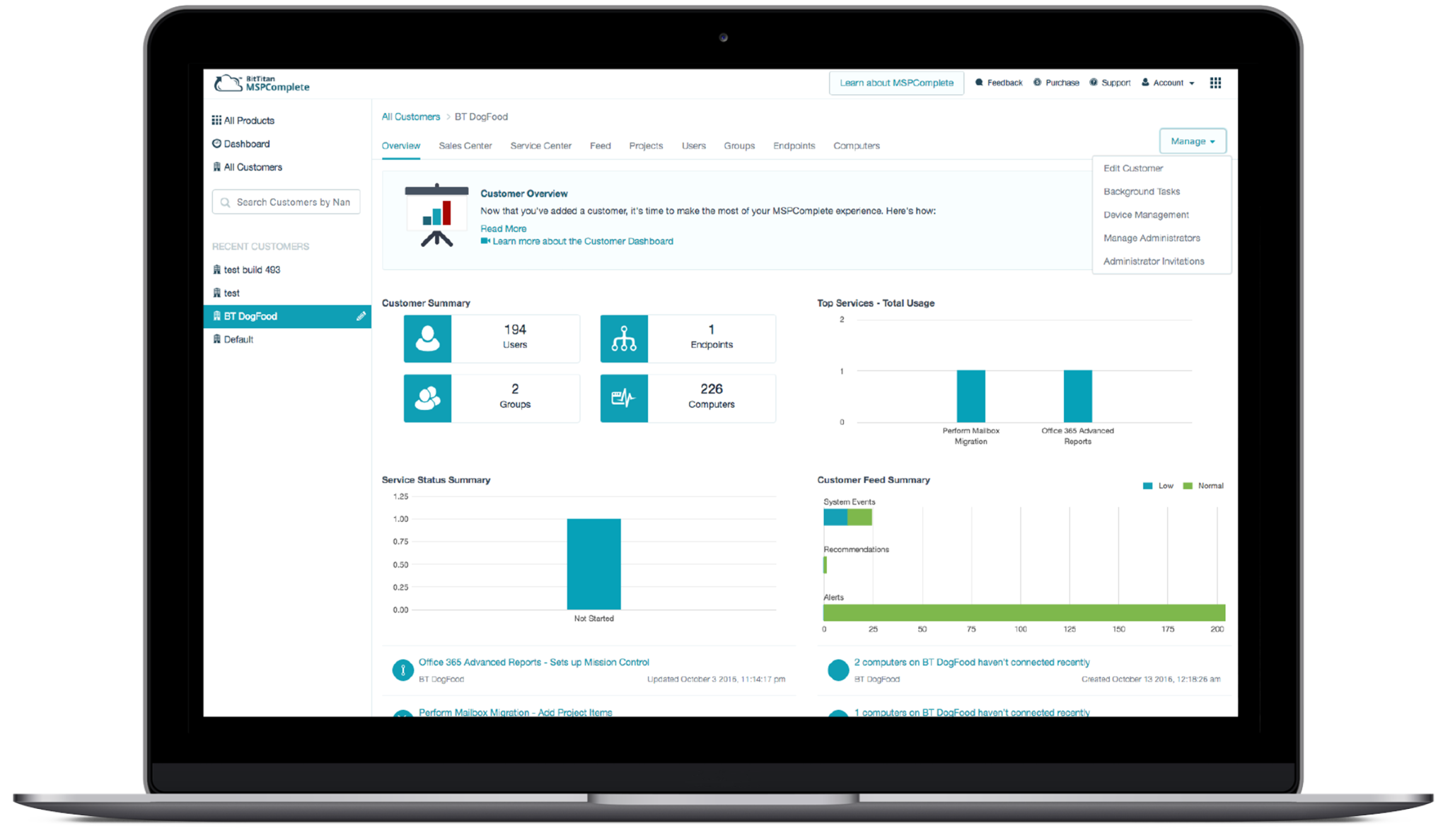
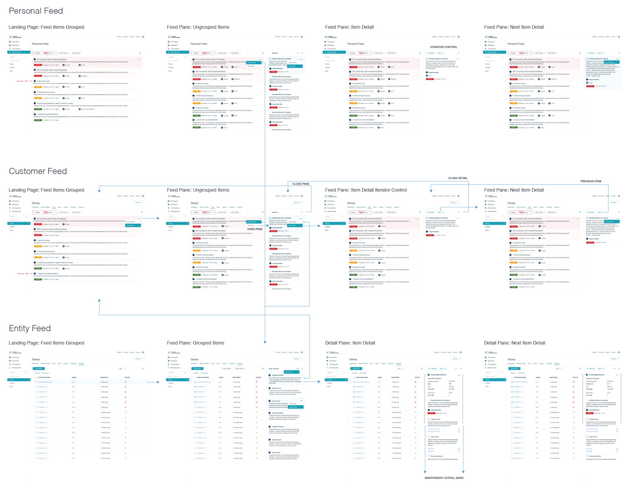
Key Page Integrations – Once a new UI kit was implemented, the platform started to come alive. The new kit helped speed up design and development time since UI system patterns and common controls were consistent across the platform. We also made additional layout changes to simplify the experience by adding detailed fly-out panels and inline accordions.
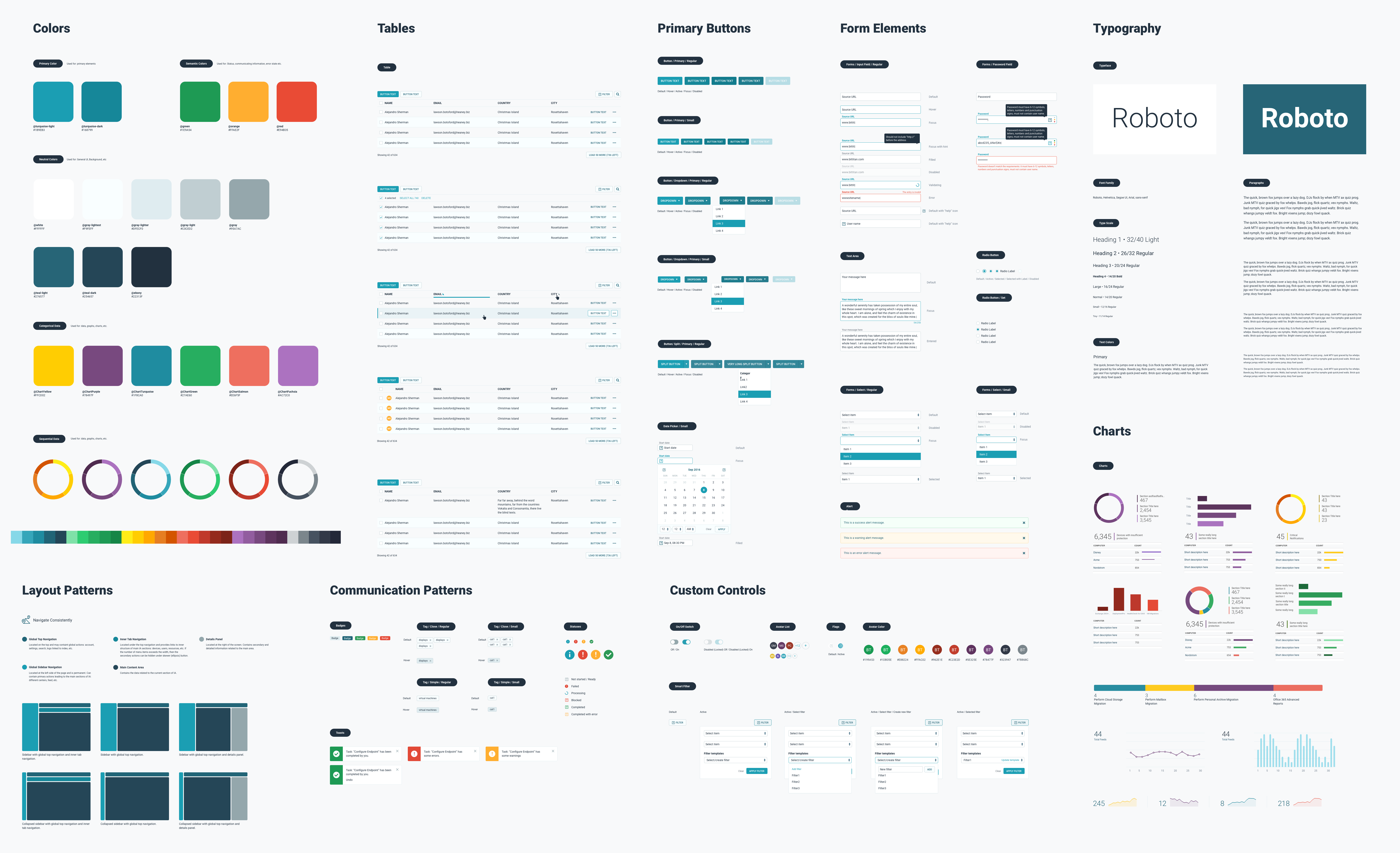
Systems Library Redesign – One challenge was created with an old UI kit. I knew I had to modernize the platform to help BitTitan serve as a trusted SaaS application. I made it a company goal to develop a modern UI Kit—since the existing gray navigation and overall site felt like a typical Seattle day to me. I always knew the future of the site would need to be much more modern.
Preview Launch – Once the platform MVP framework was in place, it was time to start integrating new feature services and onboarding new customers. The first step is to go external and begin dog fooding the product to gather real customer feedback. This was an exciting time for the company, working with a fast-paced, high-performance, phased-agile development team. The culture and collaboration fostered solutions that benefited the greater company interests. BitTitans’ motto was: “Get Shit Done!”
New Feature Development – Once the platform MVP framework was in place, it was time to start integrating new business service workflows into the platform. One challenge was built using an old UI kit. I knew I had to modernize the platform to help BitTitan serve as a trustworthy SaaS application. I began visually exploring new designs and hired a few top-tier UX designers, while we also focused on designing new features such as Dashboard, Service Center, Device Management, OEM Services, and Activity Center. The product machine operated at high performance, utilizing remote development shipping features in 2-3-week sprints.
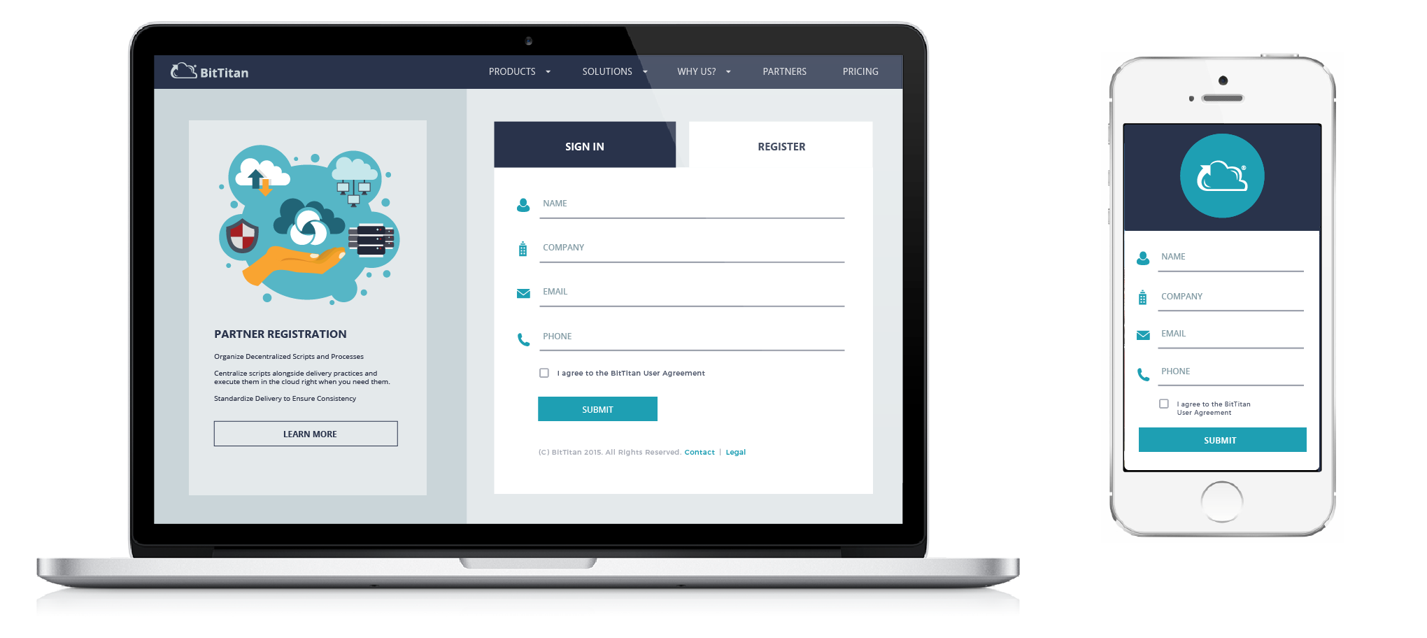
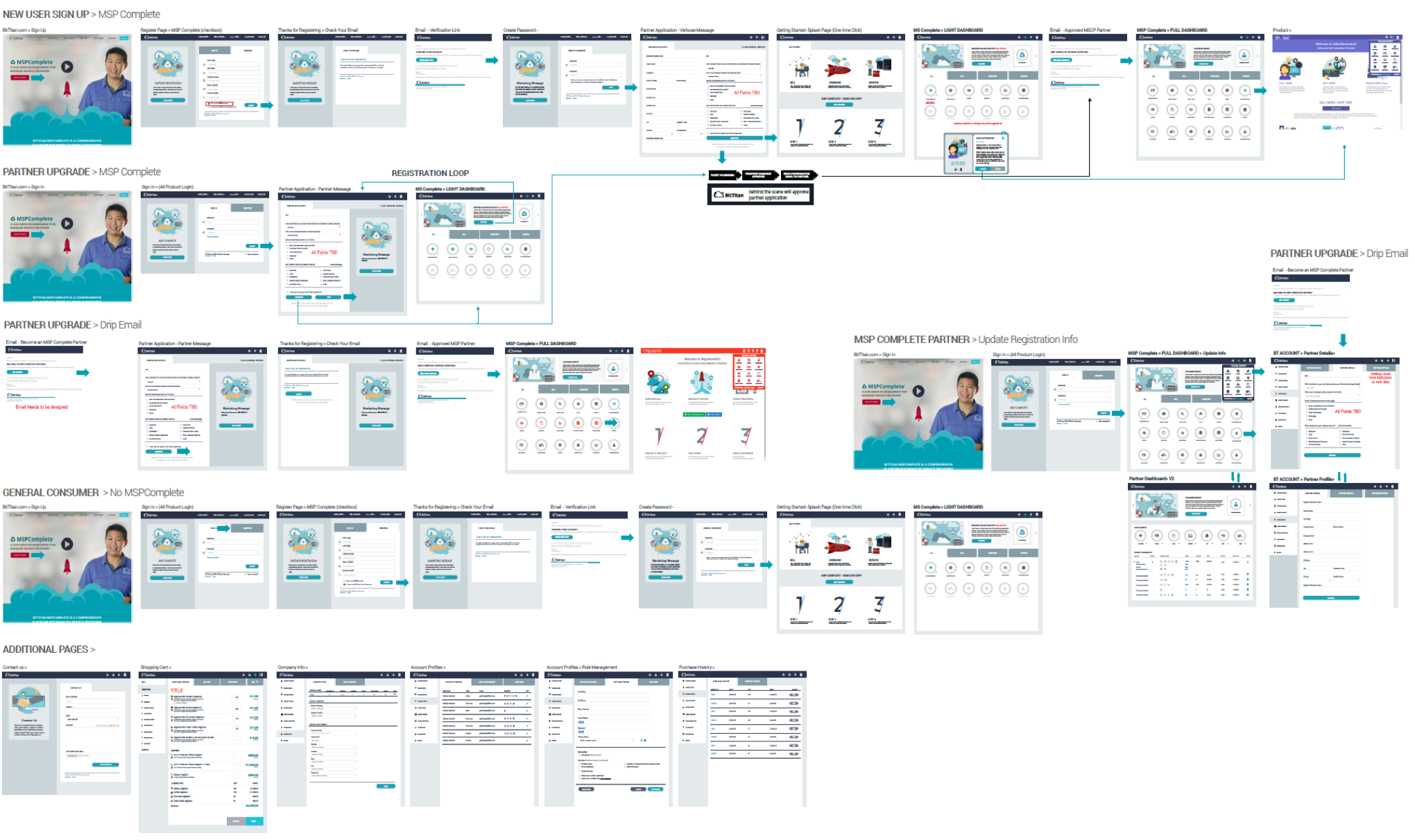
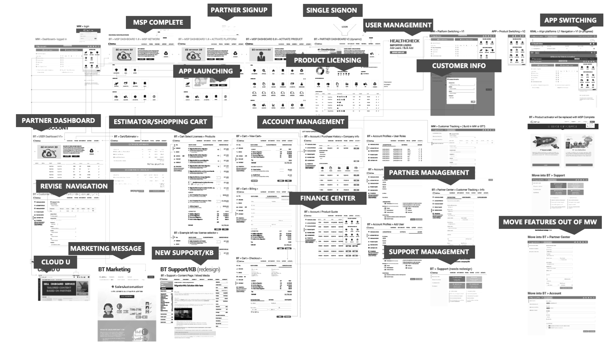
Alpha Platform (Customer Onboarding) – After several requirement meetings, presentations, and wireframes, we launched the Alpha platform UI, delivering the minimal set of features needed to achieve an MVP. Simultaneously, I supported the development of numerous new services on the existing platform. The system needed to scale for new services while enabling App-Switching (drop-down menu) into MigrationWiz, Sales Automation, Deployment Pro, Data Encryption, SSO/Registration, User Management, App Launcher, Purchasing, and the ongoing development of new Cloud Services.
The Big Picture (Discovery) – A lot of research went into understanding the new business direction. BitTitan’s flagship product MigrationWiz (MW) had six-plus years of technology behind it, including multiple types of Migration services, Shopping Cart, Licensing, Support, SSO/rBac, and Account Management. It would be too risky for the company to build on the current MW platform to avoid service disruptions.
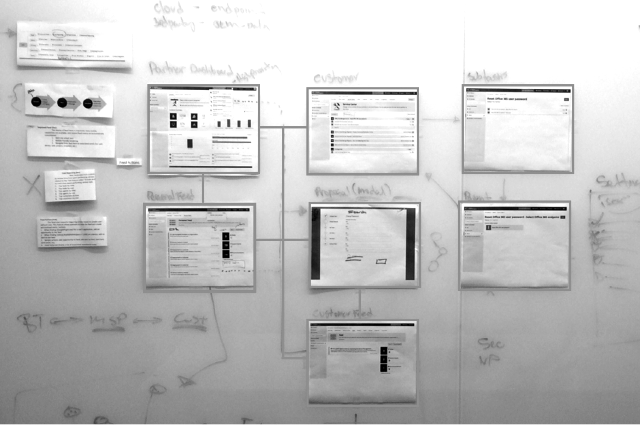
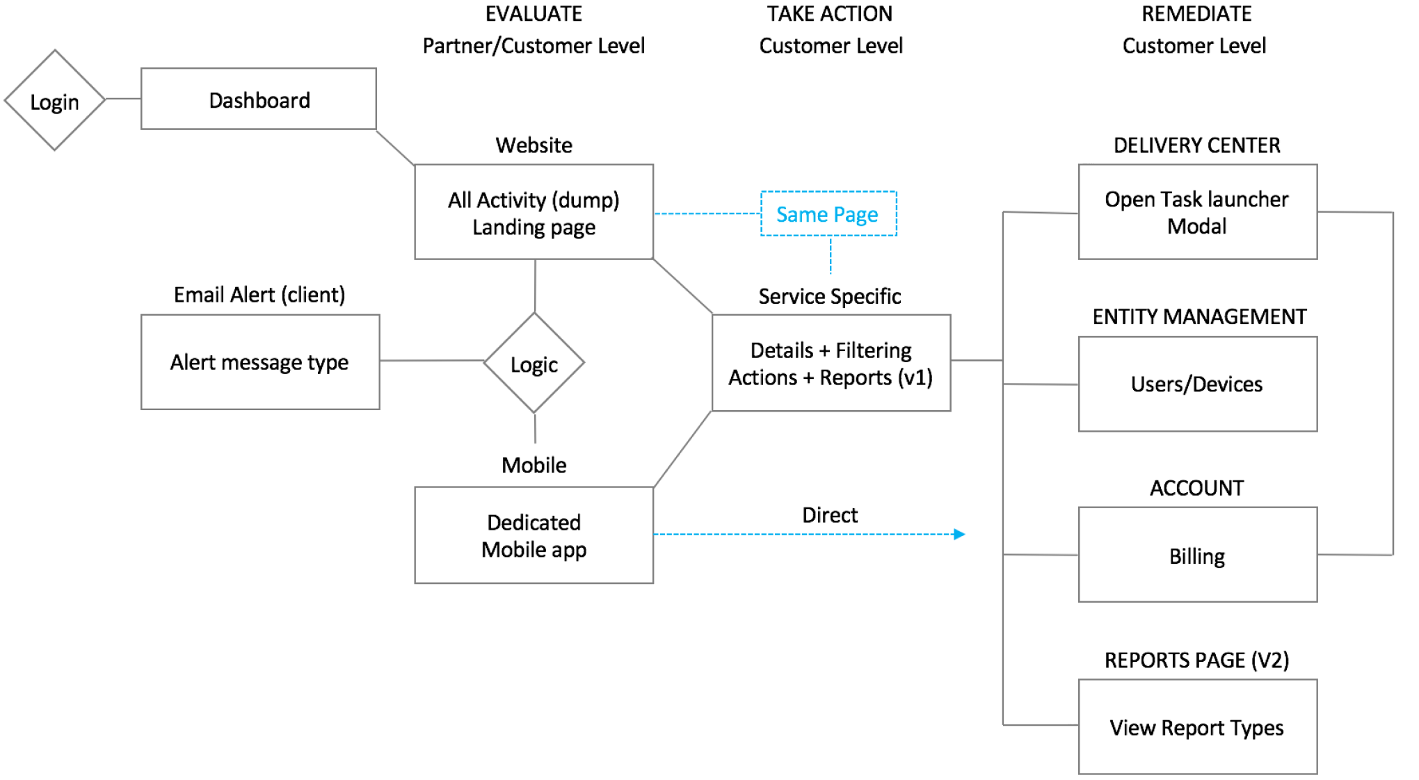
The Process – The decision was made to create a new platform from scratch, use the latest framework (ember.js), but still be on a cloud platform (Azure). The wireframe below shows the initial breakdown of how the two platforms could co-exist as features need to be migrated or re-architected to the new platform. We needed hooks to other systems using Federated SSO while being Hippo compliant. This was a data migration platform that migrates Fortune 500 companies. Customers wanted to reduce costs by switching cloud providers seamlessly.
The Business Pivot – The CEO made a business decision to leverage MigrationWiz (cash cow + partner base) and pivot the company to Managed Service Provider (MSP). This was perfect for enterprise customers needing a way to migrate legacy data to the cloud to be on a modern tech stack (AWS, Google, Azure, etc.)
The Collaboration: UX + CEO
The CEO, who came from Microsoft, quickly recognized the importance of UX in the process and understood the value of design. He had a clear vision for the business and realized that the on-premises computer landscape would be phased out, with the focus shifting toward cloud computing and AI. Since UX lacked a technical background, he spent a few weeks working closely with UX designers to fully understand his vision. UX was able to quickly develop a comprehensive map of the entire platform, including all key features. We then presented this vision to the product and development teams using prototypes and customer journey workflows.
The Collaboration
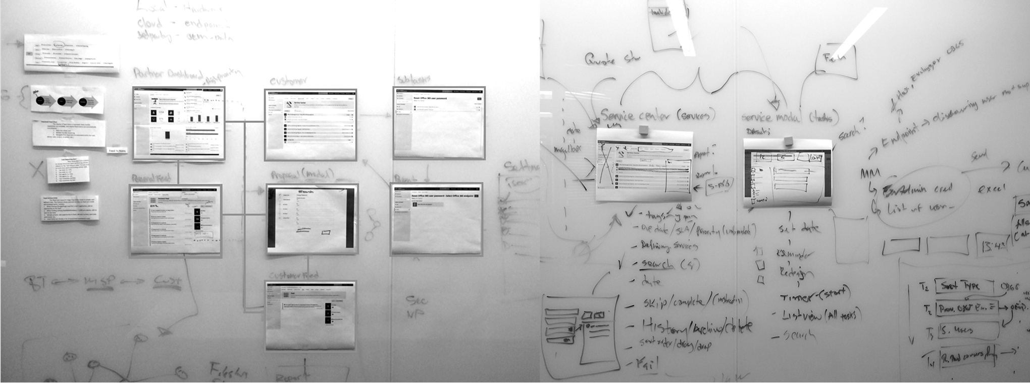
UX design was embedded in the development team. I asked the CEO if we could buy a large-format printer to print out the experiences based on the dev sprint the team was on. We were shipping features every month. I took this picture when the developers collaborated on the floor on how best to solve the development challenge. It was incredible that we were shipping features every month.
MigrationWiz: UX/UI Refactor
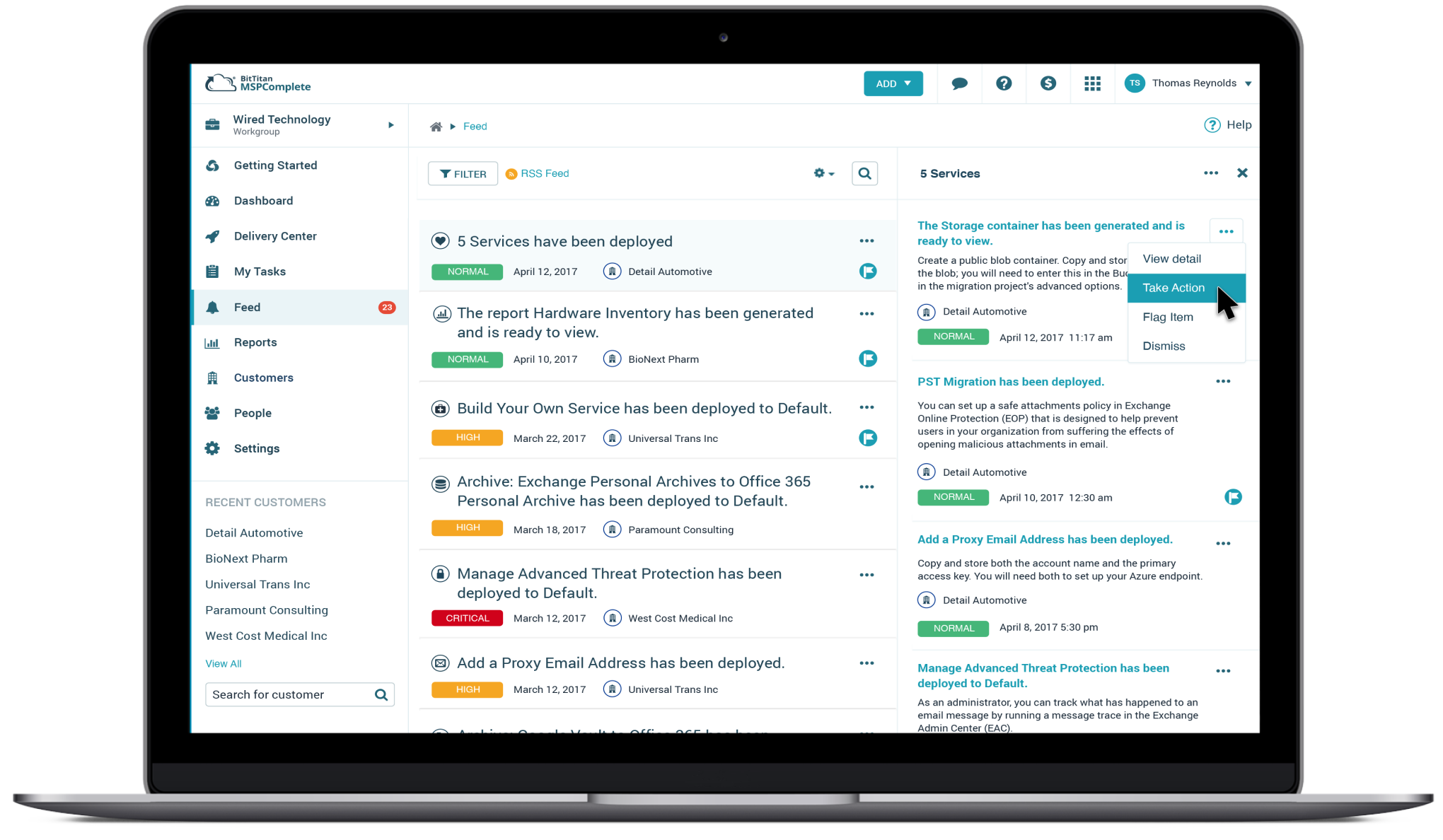
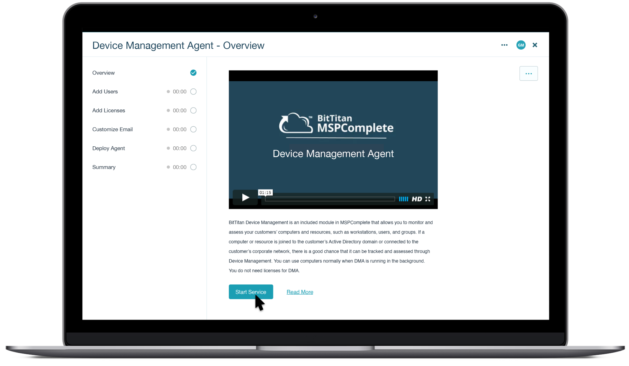
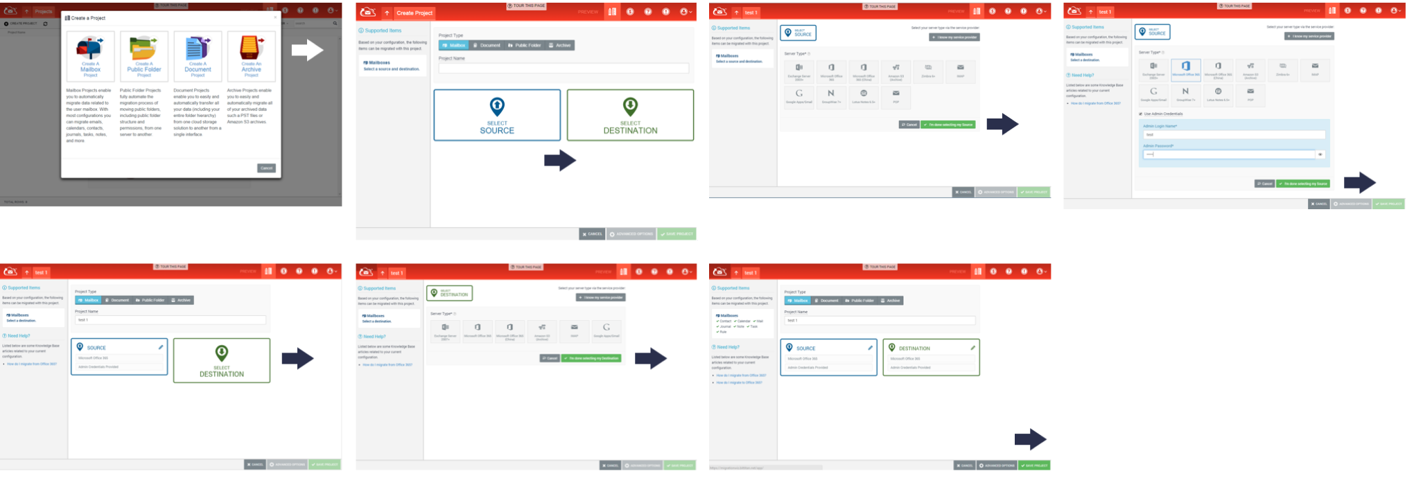
My solution is redesigning the task management workflow to be a vertical list on the left navigation rail to track completed steps. This has been highly successful, reducing the number of support tickets and increasing customer confidence in achieving a migration. The introduction of the left navigation for task management provided the baseline for future workflows for MSP Complete.
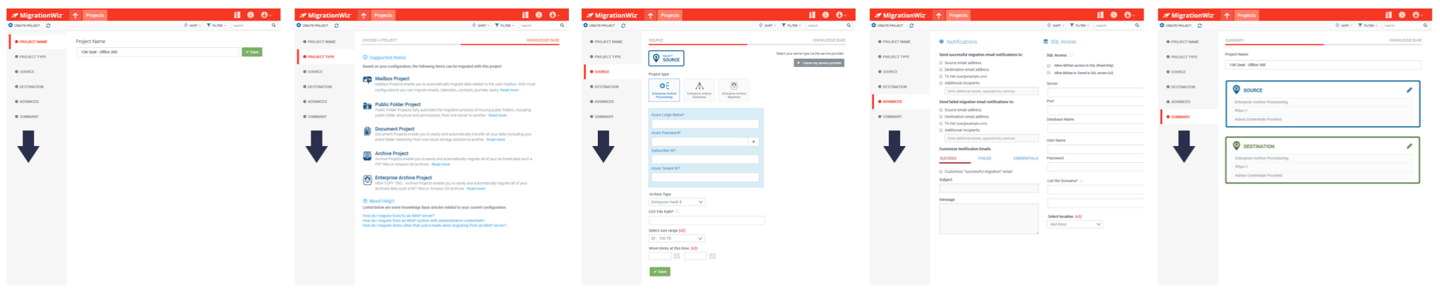
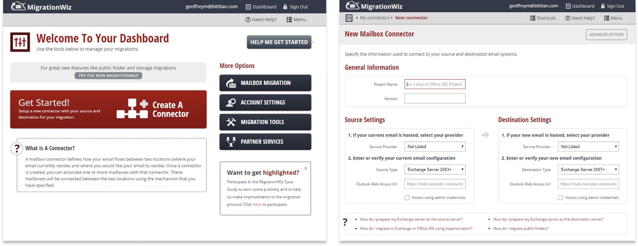
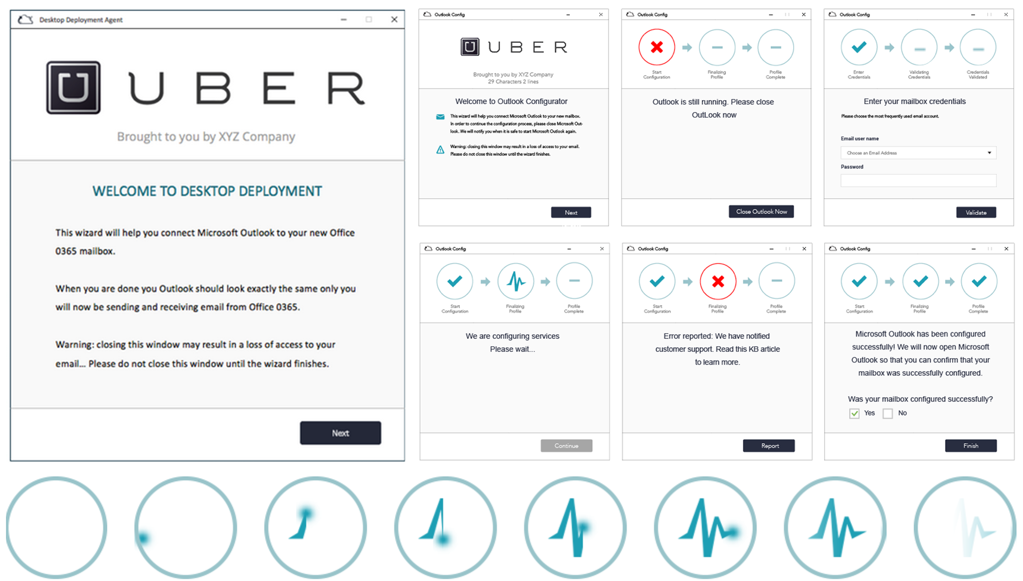
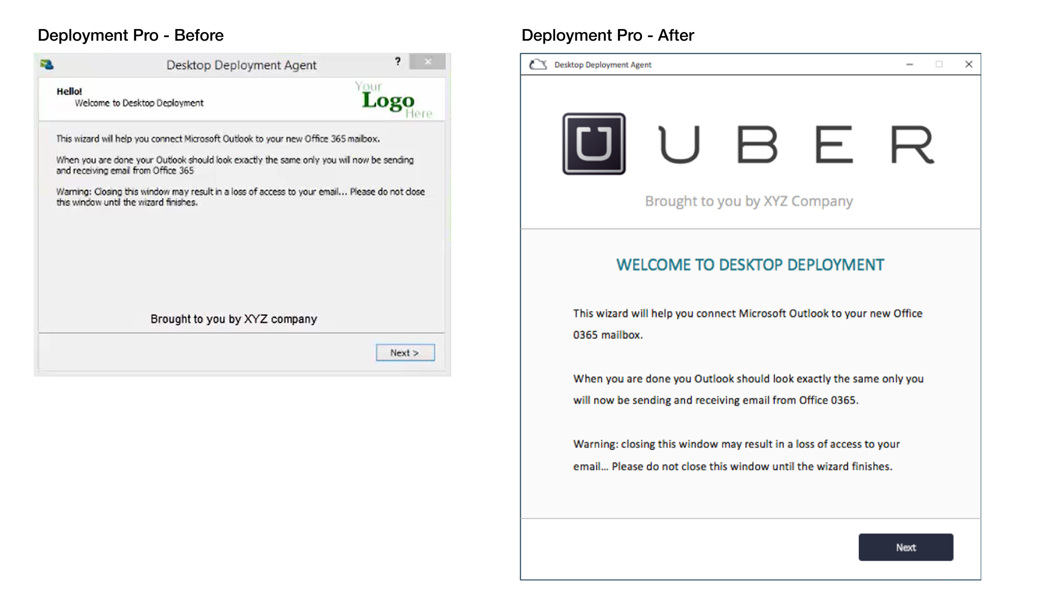
The Platform (Discovery) – The original MigrationWiz functionality was a wizard-type UI model. The amount of customer confusion and support tickets was a real pain point for customer support. The platform served well (initially) as an email migration service. However, the UI model was never expected to scale beyond that as the business grew. The UX started to break down when new features were bolted on. I was the sole designer responsible for re-architecting and modernizing the migration workflow experiences.
The Beginning – When I joined the company, the original MigrationWiz platform appeared amateurish and was built on an outdated tech stack, which hindered innovation. The business decided to redesign the tech stack using a more modern framework.